Chromatin accessibility II
Meta-plots and heatmaps
RNA Bioscience Initiative | CU Anschutz
2026-03-27
Genomewide chromatin analysis with meta-plots and heatmaps
Last class we saw what the different methods to profile chromatin accessibility can tell us about general chromatin structure and possible regulation at specific regions in a small portion of a chromosome.
We also want to make sure these conclusions are valid throughout the genome. Since we want to keep the file sizes small, we will ask if they are valid across an entire chromosome.
Load libraries
First we will plot the profiles of all our data sets relative to the transcription start site (TSS), where all the action seems to be happening.
Load data
First, we need to load relevant files:
yeast_tss_chrII.bed.gzcontains transcription start sites (TSS) for genes on yeast chromosome 2.sacCer3.chrom.sizescontains the sizes of all yeast chromosomes, needed for some of the calculations we’ll do. We’ll grab this from the UCSC download site.
read_bed() and read_genome() are valr functions.
# A tibble: 337 × 6
   chrom start   end name    score strand
   <chr> <int> <int> <chr>   <chr> <chr>
 1 chrII 10550 10551 YBL107C .     -
 2 chrII 13945 13946 YBL106C .     -
 3 chrII 17965 17966 YBL105C .     -
 4 chrII 21297 21298 YBL104C .     -
 5 chrII 23789 23790 YBL103C .     -
 6 chrII 24009 24010 YBL102W .     +
 7 chrII 28582 28583 YBL101C .     -
 8 chrII 36765 36766 YBL099W .     +
 9 chrII 39124 39125 YBL098W .     +
10 chrII 40780 40781 YBL097W .     +
# ℹ 327 more rows# A tibble: 17 × 2
chrom size
<chr> <dbl>
1 chrIV 1531933
2 chrXV 1091291
3 chrVII 1090940
4 chrXII 1078177
5 chrXVI 948066
6 chrXIII 924431
7 chrII 813184
8 chrXIV 784333
9 chrX 745751
10 chrXI 666816
11 chrV 576874
12 chrVIII 562643
13 chrIX 439888
14 chrIII 316620
15 chrVI 270161
16 chrI 230218
17 chrM 85779Load signals
Next we’ll load bigWigs for the ATAC and MNase experiments, containing either short or long fragments.
Recall that the information encoded in short and long fragments should be reflected in our interpretations.
First, we make a tibble of file paths and metadata.
Load signals
# A tibble: 4 × 3
  file_name              sample_type file_path
  <chr>                  <chr>       <chr>
1 yeast_mnase_lt50.bw    MNase_Short /Users/jayhesselberth/…
2 yeast_mnase_134_160.bw MNase_Long  /Users/jayhesselberth/…
3 yeast_atac_lt120.bw    ATAC_Short  /Users/jayhesselberth/…
4 yeast_atac_gt120.bw    ATAC_Long   /Users/jayhesselberth/…
Next, we need to read in the bigWig files. We use purrr::map to apply read_bigwig() to each of the bigWig files, and store the results in a new column called big_wig.
# A tibble: 4 × 2
  sample_type big_wig
  <chr>       <list>
1 MNase_Short <tibble [17,738 × 4]>
2 MNase_Long  <tibble [69,120 × 4]>
3 ATAC_Short  <tibble [44,852 × 4]>
4 ATAC_Long   <tibble [51,906 × 4]>
Meta-plots
WHY meta-plots and heatmaps?
Meta-plots and heatmaps are useful for visualizing patterns of signal across many loci at the same time.
This is particularly useful for chromatin data, where we often want to understand how chromatin structure varies across many genes or regulatory elements that share a common reference point, like transcription start sites (TSS) or nucleosomal midpoints.
Setting up regions for a meta-plot
Next, we need to set up some windows for analyzing signal relative to each TSS. This is an important step that will ultimately impact our interpretations.
In genomic meta-plots, you first decide on a window size relevant to the features you are measuring, and then make “windows” around a reference point, spanning some distance both up- and downstream. If the features involve gene features, we also need to take strand into account.
Setting up regions for a meta-plot
Reference points could be:
- transcription start or end sites
- boundaries of exons and introns
- enhancers
- centromeres and telomeres
Setting up regions for a meta-plot
The window size should be relevant the reference points, such that small- or large-scale features are emphasized in the plot. Moreover, the window typically spans some distance both up- and downstream of the reference points.
Setting up regions for a meta-plot
Once the window size has been decided, the next step is to make “sub-windows” around a reference point. If gene features are involved, we also need to take strand into account.
Setting up regions for a meta-plot
For small features like transcription factor binding sites (8-20 bp), you might set up smaller windows (maybe 1 bp) at a distance ~20 bp up- and downstream of a reference point.
For larger features like nucleosome positions or chromatin domains, you might set up larger windows (~200 bp) at distances up to ~10 kbp up- and downstream of a set of reference points.
Metaplot workflow
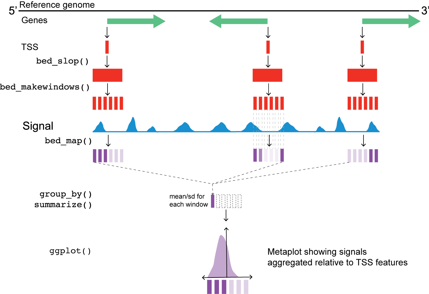
Metaplot workflow overview
Chromatin accessibility around transcription start sites (TSSs)
  [1] -750 -740 -730 -720 -710 -700 -690 -680 -670 -660 -650
 [12] -640 -630 -620 -610 -600 -590 -580 -570 -560 -550 -540
 [23] -530 -520 -510 -500 -490 -480 -470 -460 -450 -440 -430
 [34] -420 -410 -400 -390 -380 -370 -360 -350 -340 -330 -320
 [45] -310 -300 -290 -280 -270 -260 -250 -240 -230 -220 -210
 [56] -200 -190 -180 -170 -160 -150 -140 -130 -120 -110 -100
 [67]  -90  -80  -70  -60  -50  -40  -30  -20  -10    0   10
 [78]   20   30   40   50   60   70   80   90  100  110  120
 [89]  130  140  150  160  170  180  190  200  210  220  230
[100]  240  250  260  270  280  290  300  310  320  330  340
[111]  350  360  370  380  390  400  410  420  430  440  450
[122]  460  470  480  490  500  510  520  530  540  550  560
[133]  570  580  590  600  610  620  630  640  650  660  670
[144]  680  690  700  710  720  730  740  750
Chromatin accessibility around transcription start sites (TSSs)
Next, we’ll use two valr functions to expand the window of the reference point (bed_slop()) and then break those windows into evenly spaced intervals (bed_makewindows()).
# A tibble: 50,887 × 7
   chrom start   end name    score strand .win_id
   <chr> <int> <int> <chr>   <chr> <chr>    <int>
 1 chrII  9800  9810 YBL107C .     -            1
 2 chrII  9810  9820 YBL107C .     -            2
 3 chrII  9820  9830 YBL107C .     -            3
 4 chrII  9830  9840 YBL107C .     -            4
 5 chrII  9840  9850 YBL107C .     -            5
 6 chrII  9850  9860 YBL107C .     -            6
 7 chrII  9860  9870 YBL107C .     -            7
 8 chrII  9870  9880 YBL107C .     -            8
 9 chrII  9880  9890 YBL107C .     -            9
10 chrII  9890  9900 YBL107C .     -           10
# ℹ 50,877 more rows
Chromatin accessibility around transcription start sites (TSSs)
At this point, we also address the fact that the TSS data are stranded. Can someone describe what the issue is here, based on the figure above?
Chromatin accessibility around transcription start sites (TSSs)
# A tibble: 50,887 × 5
   chrom start   end name    win_coord
   <chr> <int> <int> <chr>       <dbl>
 1 chrII  9800  9810 YBL107C       750
 2 chrII  9810  9820 YBL107C       740
 3 chrII  9820  9830 YBL107C       730
 4 chrII  9830  9840 YBL107C       720
 5 chrII  9840  9850 YBL107C       710
 6 chrII  9850  9860 YBL107C       700
 7 chrII  9860  9870 YBL107C       690
 8 chrII  9870  9880 YBL107C       680
 9 chrII  9880  9890 YBL107C       670
10 chrII  9890  9900 YBL107C       660
# ℹ 50,877 more rows
Chromatin accessibility around transcription start sites (TSSs)
This next step uses valr bed_map(), to calculate the total signal for each window by intersecting signals from the bigWig files.
Chromatin accessibility around transcription start sites (TSSs)
# A tibble: 4 × 3
  sample_type big_wig               tss_win_sum
  <chr>       <list>                <list>
1 MNase_Short <tibble [17,738 × 4]> <tibble [50,887 × 6]>
2 MNase_Long  <tibble [69,120 × 4]> <tibble [50,887 × 6]>
3 ATAC_Short  <tibble [44,852 × 4]> <tibble [50,887 × 6]>
4 ATAC_Long   <tibble [51,906 × 4]> <tibble [50,887 × 6]>
Chromatin accessibility around transcription start sites (TSSs)
Once we have the values from bed_map(), we can group by win_coord and calculate a summary statistic for each window.
Remember that win_coord is the same relative position for each TSS, so these numbers represent a composite signal a the same position across all TSS.
Chromatin accessibility around transcription start sites (TSSs)
# A tibble: 604 × 4
   win_coord sample_type win_mean win_sd
       <dbl> <chr>          <dbl>  <dbl>
 1       750 MNase_Short     260.   301.
 2       740 MNase_Short     264.   243.
 3       730 MNase_Short     251.   218.
 4       720 MNase_Short     244.   205.
 5       710 MNase_Short     239.   231.
 6       700 MNase_Short     238.   247.
 7       690 MNase_Short     245.   231.
 8       680 MNase_Short     255.   219.
 9       670 MNase_Short     250.   282.
10       660 MNase_Short     281.   360.
# ℹ 594 more rows
Meta-plot of signals around TSSs
Finally, let’s plot the data relative to TSS for each of the windows.
n_tss <- length(unique(yeast_tss$name))

ggplot(
  tss_meta_tbl,
  aes(
    x = win_coord,
    y = win_mean
  )
) +
  geom_line(linewidth = 1, color = "red") +
  facet_wrap(
    ~sample_type,
    nrow = 2,
    scales = "free_y"
  ) +
  theme_minimal_grid() +
  theme(
    axis.text.x = element_text(
      angle = 45,
      vjust = 1,
      hjust = 1
    )
  ) +
  labs(
    x = "Position relative to TSS (bp)",
    y = "Signal (mean of window sums)",
    title = "Chromatin accessibility around transcription start sites",
    subtitle = glue("{n_tss} features on S. cerevisiae chrII")
  )
Meta-plot of signals around TSSs
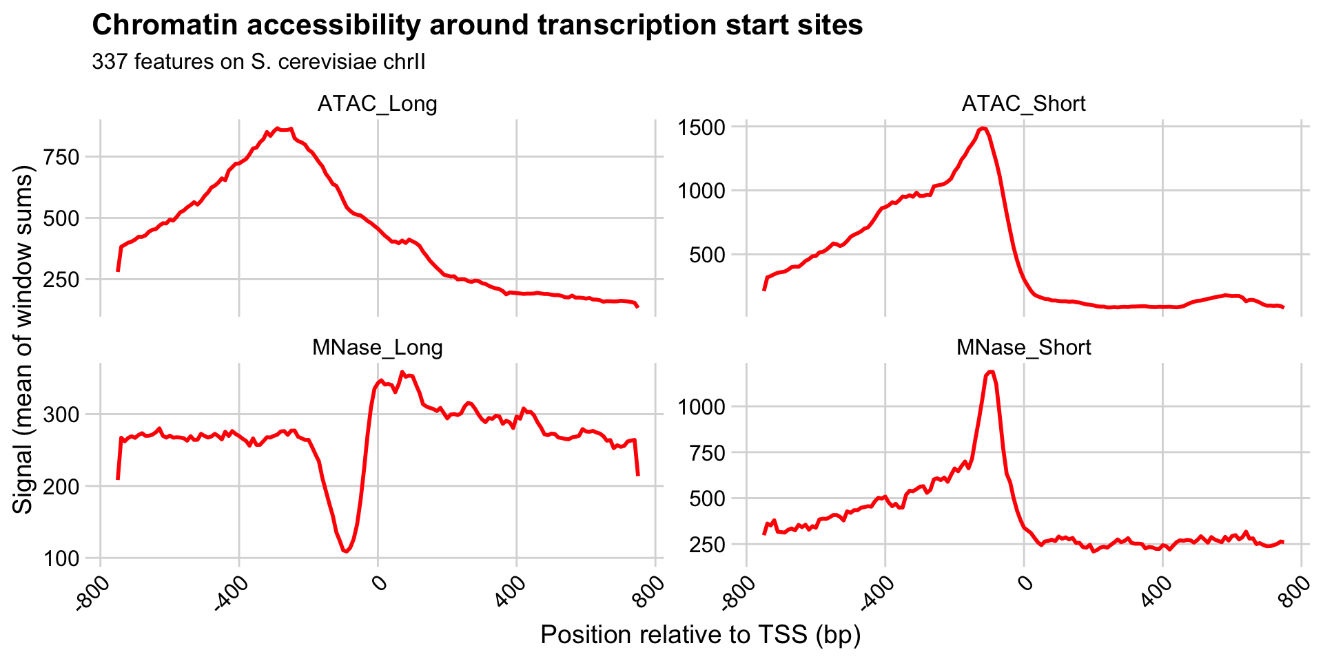
Interpreting the meta-plots
What is the direction of transcription in these meta-plots?
What are the features of chromatin near TSS measured by these different experimental conditions?
How do you interpret the increased signal of the +1 nucleosome in the “MNase_Long” condition, relative to e.g. -1, +2, +3, etc.?
What are the differences in ATAC and MNase treatments that lead to these distinctive patterns?
Heatmaps
Heatmap of signals around TSSs
To generate a heatmap, we need to reformat our data slightly.
Take a look at acc_tbl and think about how you might reorganize the following way:
- rows contain the data for individual loci (i.e., each TSS)
- columns are ordered positions relative to the TSS (i.e., most upstream to most downstream)
Heatmap of signals around TSSs
We’re going to plot a heatmap of the “MNase_Long” data. There are two ways to get these data
# A tibble: 50,887 × 6
   chrom start   end name    win_coord win_signal
   <chr> <int> <int> <chr>       <dbl>      <dbl>
 1 chrII  9800  9810 YBL107C       750       206.
 2 chrII  9810  9820 YBL107C       740       410.
 3 chrII  9820  9830 YBL107C       730       406.
 4 chrII  9830  9840 YBL107C       720       406.
 5 chrII  9840  9850 YBL107C       710       404.
 6 chrII  9850  9860 YBL107C       700       370.
 7 chrII  9860  9870 YBL107C       690       330.
 8 chrII  9870  9880 YBL107C       680       269.
 9 chrII  9880  9890 YBL107C       670       242.
10 chrII  9890  9900 YBL107C       660       276.
# ℹ 50,877 more rows
Or, using dplyr / tidyr:
# A tibble: 50,887 × 7
   sample_type chrom start   end name   win_coord win_signal
   <chr>       <chr> <int> <int> <chr>      <dbl>      <dbl>
 1 MNase_Long  chrII  9800  9810 YBL10…       750       206.
 2 MNase_Long  chrII  9810  9820 YBL10…       740       410.
 3 MNase_Long  chrII  9820  9830 YBL10…       730       406.
 4 MNase_Long  chrII  9830  9840 YBL10…       720       406.
 5 MNase_Long  chrII  9840  9850 YBL10…       710       404.
 6 MNase_Long  chrII  9850  9860 YBL10…       700       370.
 7 MNase_Long  chrII  9860  9870 YBL10…       690       330.
 8 MNase_Long  chrII  9870  9880 YBL10…       680       269.
 9 MNase_Long  chrII  9880  9890 YBL10…       670       242.
10 MNase_Long  chrII  9890  9900 YBL10…       660       276.
# ℹ 50,877 more rows
Heatmap of signals around TSSs
Either way, now we need to reformat the data.
Heatmap of signals around TSSs
# A tibble: 337 × 152
   name    `-750` `-740` `-730` `-720` `-710` `-700` `-690`
   <chr>    <dbl>  <dbl>  <dbl>  <dbl>  <dbl>  <dbl>  <dbl>
 1 YBL001C   81.9   81.9   81.9   81.9   81.9   81.9  166.
 2 YBL002W  368.   370.   364.   353.   175.   353.   349.
 3 YBL003C  229.   459.   457.   452.   459.   465.   457.
 4 YBL004W  284.   267.   269.   137.   259.   229.   208.
 5 YBL005W  299.   314.   164.   164.   326.   322.   314.
 6 YBL006C  173.   173.   339.   330.   333.   332.   353.
 7 YBL009W  265.   265.   261.   250.   225.   213.   229.
 8 YBL010C  225.   455.   459.   446.   427.   404.   381.
 9 YBL011W  368.   328.   255.   196.   160.   141.   156.
10 YBL014C   68.6  139.   133.   124.   124.   131.    68.6
# ℹ 327 more rows
# ℹ 144 more variables: `-680` <dbl>, `-670` <dbl>,
#   `-660` <dbl>, `-650` <dbl>, `-640` <dbl>, `-630` <dbl>,
#   `-620` <dbl>, `-610` <dbl>, `-600` <dbl>, `-590` <dbl>,
#   `-580` <dbl>, `-570` <dbl>, `-560` <dbl>, `-550` <dbl>,
#   `-540` <dbl>, `-530` <dbl>, `-520` <dbl>, `-510` <dbl>,
#   `-500` <dbl>, `-490` <dbl>, `-480` <dbl>, …
Heatmap of signals around TSSs
Once we have the data reformatted, we just convert to a matrix and feed it to ComplexHeatmap::Heatmap().
Heatmap of signals around TSSs
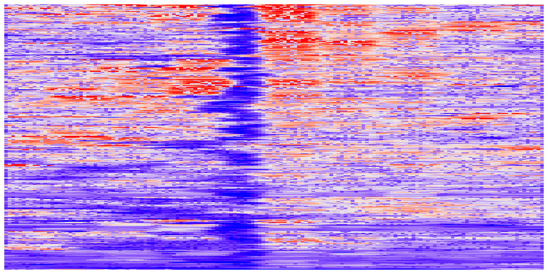
Interpreting meta-plots and heatmaps
It’s worth considering what meta-plots and heatmaps can and can’t tell you.
What are the similarities and differences between heatmaps and meta-plots?
What types of conclusions can you draw from each type of plot?
What are some features of MNase-seq and ATAC-seq that become more clear when looking across many loci at the same time?
What are some hypotheses you can generate based on these plots?