     carat               cut        color
 Min.   :0.2000   Fair     : 1610   D: 6775
 1st Qu.:0.4000   Good     : 4906   E: 9797
 Median :0.7000   Very Good:12082   F: 9542
 Mean   :0.7979   Premium  :13791   G:11292
 3rd Qu.:1.0400   Ideal    :21551   H: 8304
 Max.   :5.0100                     I: 5422
                                    J: 2808
    clarity          depth           table
 SI1    :13065   Min.   :43.00   Min.   :43.00
 VS2    :12258   1st Qu.:61.00   1st Qu.:56.00
 SI2    : 9194   Median :61.80   Median :57.00
 VS1    : 8171   Mean   :61.75   Mean   :57.46
 VVS2   : 5066   3rd Qu.:62.50   3rd Qu.:59.00
 VVS1   : 3655   Max.   :79.00   Max.   :95.00
 (Other): 2531
     price             x                y
 Min.   :  326   Min.   : 0.000   Min.   : 0.000
 1st Qu.:  950   1st Qu.: 4.710   1st Qu.: 4.720
 Median : 2401   Median : 5.700   Median : 5.710
 Mean   : 3933   Mean   : 5.731   Mean   : 5.735
 3rd Qu.: 5324   3rd Qu.: 6.540   3rd Qu.: 6.540
 Max.   :18823   Max.   :10.740   Max.   :58.900

       z
 Min.   : 0.000
 1st Qu.: 2.910
 Median : 3.530
 Mean   : 3.539
 3rd Qu.: 4.040
 Max.   :31.800
R Bootcamp - Day 4
ggplot2
2026-04-14
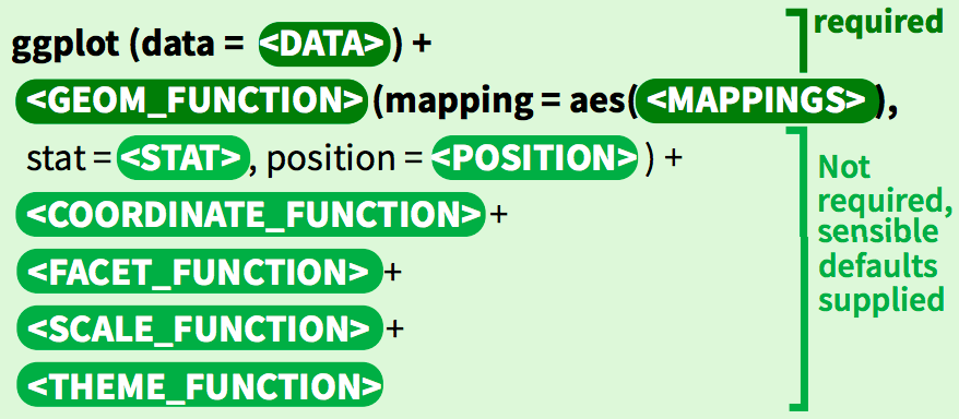
The syntax of ggplot()
ggplot() builds plots piece by piece.
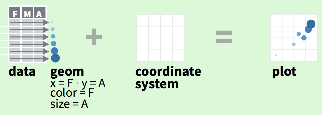
ggplot divides a plot into three different fundamental parts:
plot = data + coordinate-system + geometry.
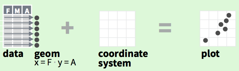
aesthetics map variables in the data to visual properties of the geom like size, color, and x and y locations.

ggplot is powerfully simple for making complex plots
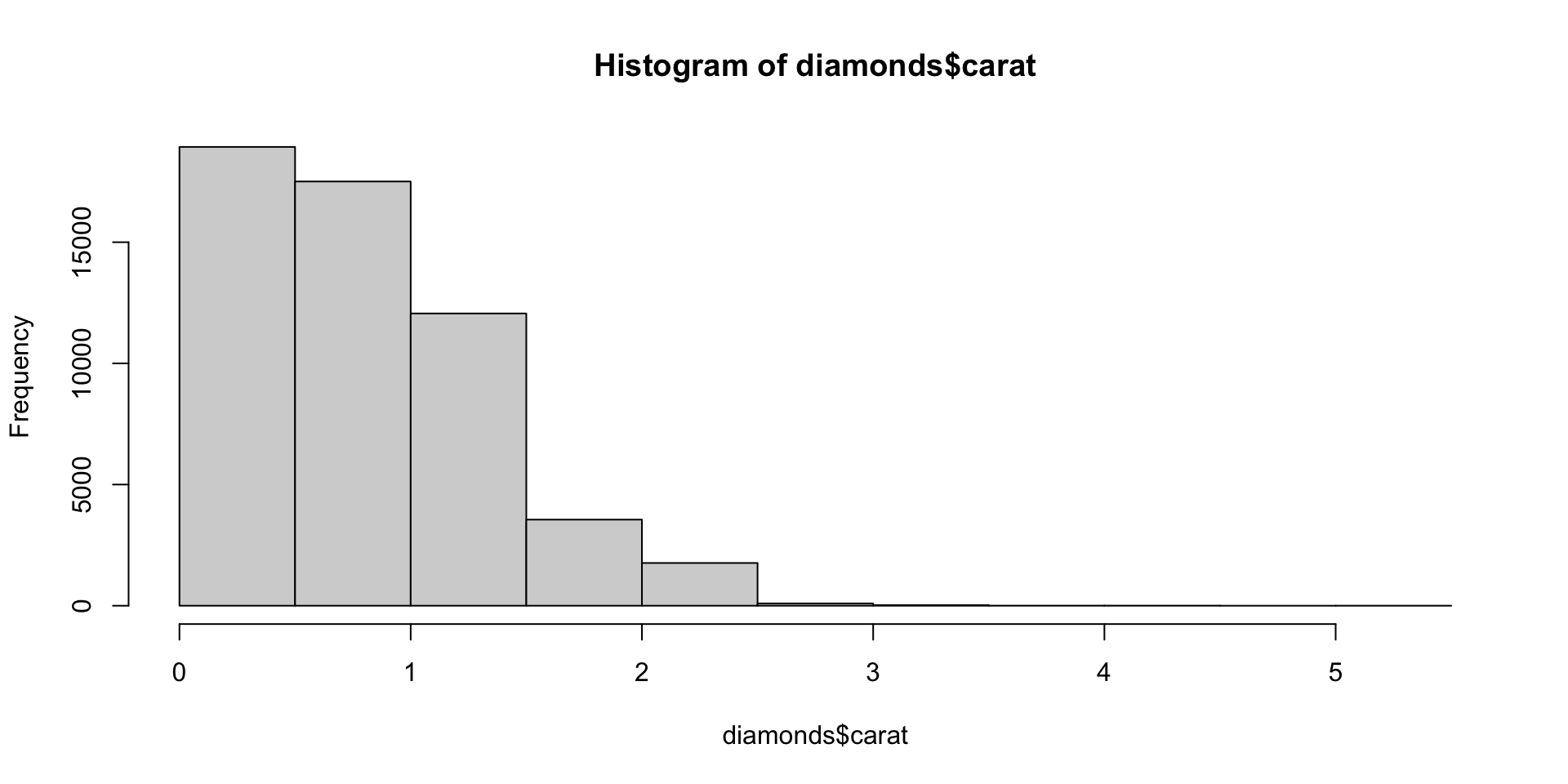
`stat_bin()` using `bins = 30`. Pick better value
`binwidth`.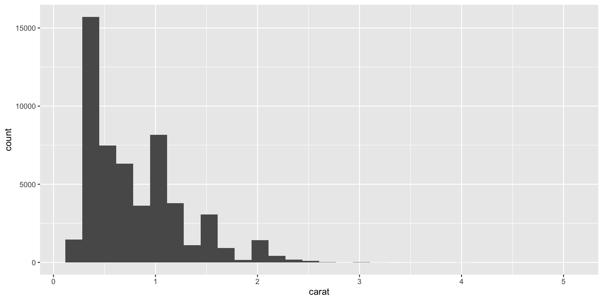
Note you can drop the data and mapping specifications, as ggplot expects these as the first two arguments. See ?ggplot.
Why can’t I just do this?
You can. But the advantage of ggplot is that it is equally “simple” to make basic and complex plots.
The underlying grammar lets you exquisitely customize the appearance of your plot and easily generate reproducible & publishable figures.
Creating more complex plots
Geom functions for one variable - Exercise 4
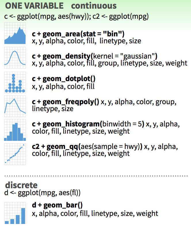
Make a bar plot.
Update the bar plot aesthetics.
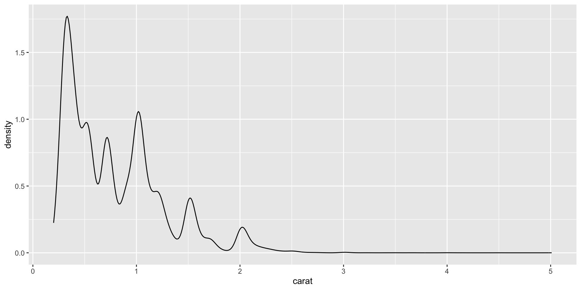
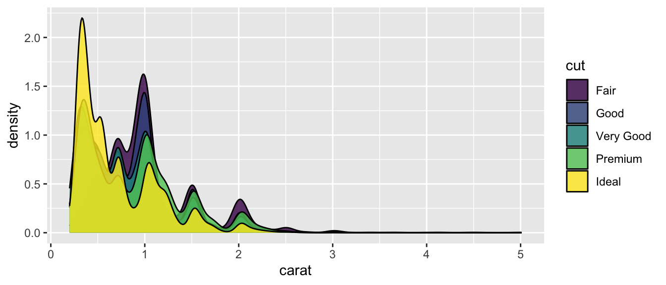
Change to a density plot.
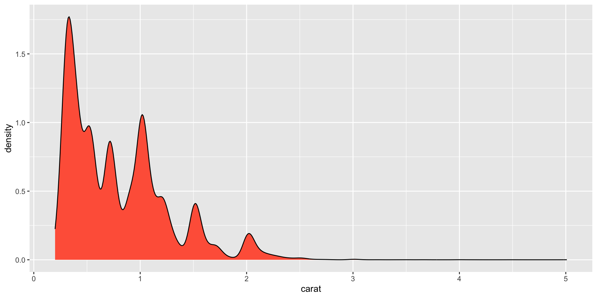
Color the density plot.
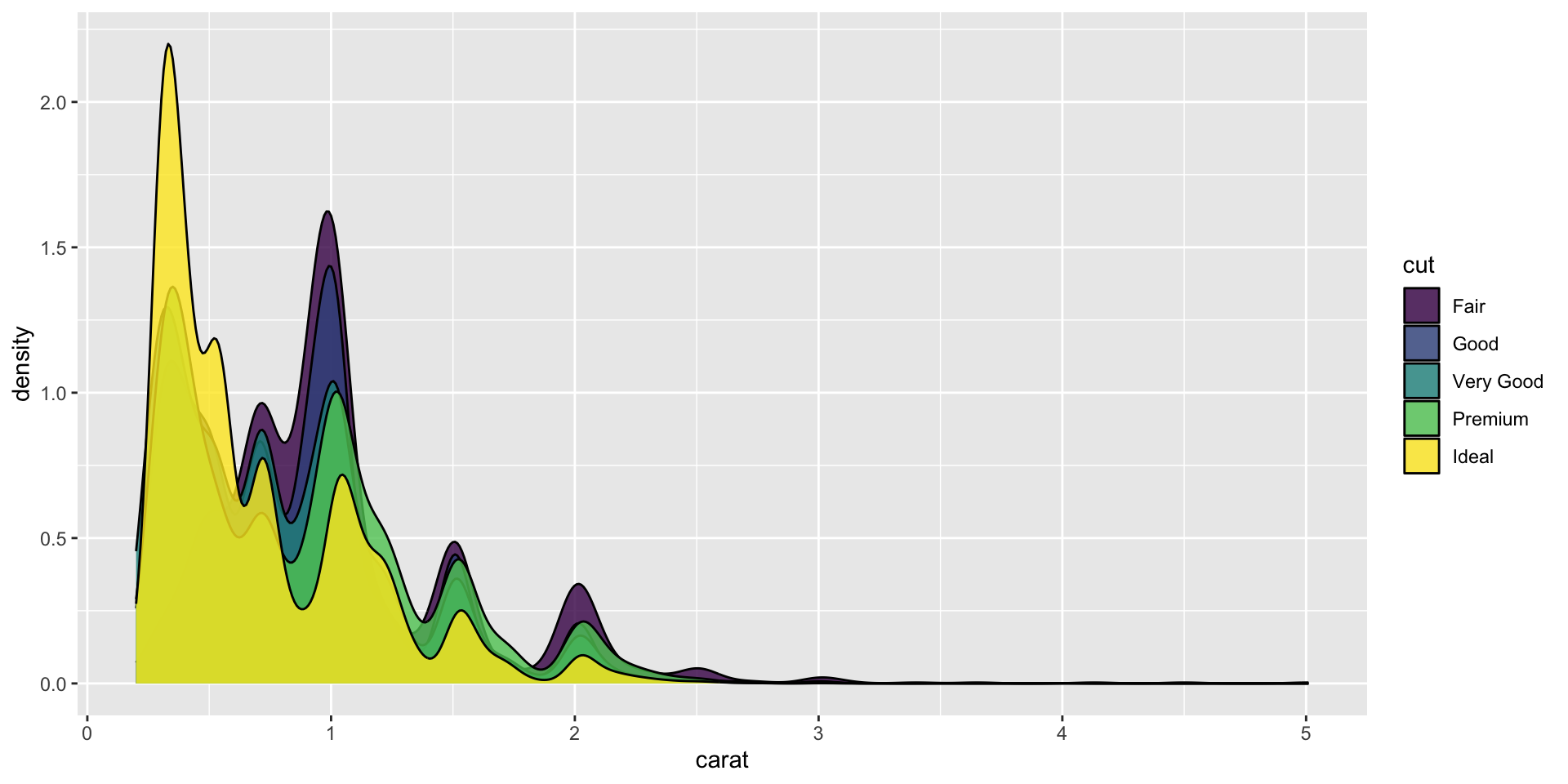
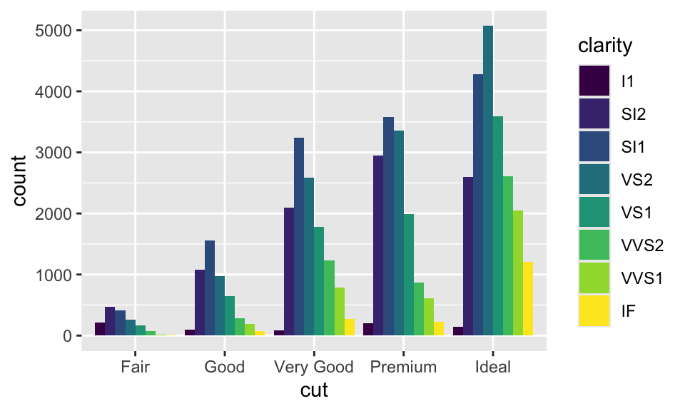
Plot subsets by mapping fill to cut
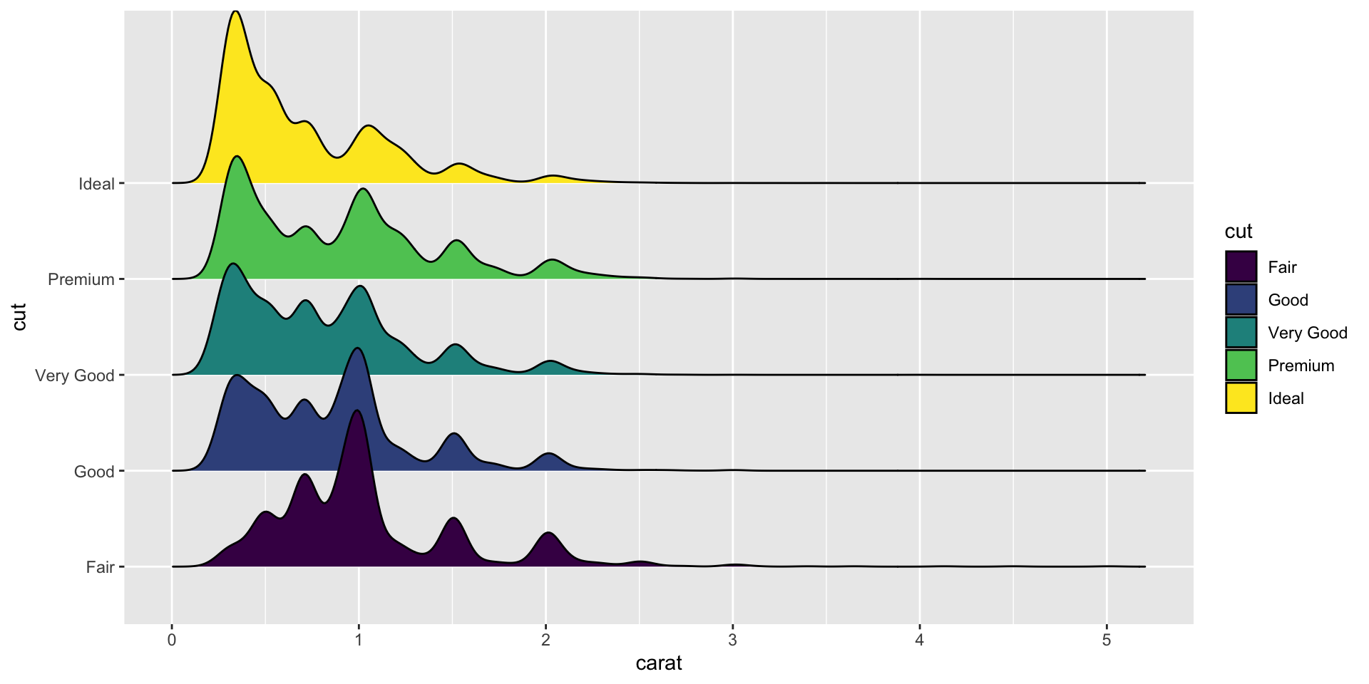
Use ggridges to plot staggered subsets.
https://wilkelab.org/ggridges/
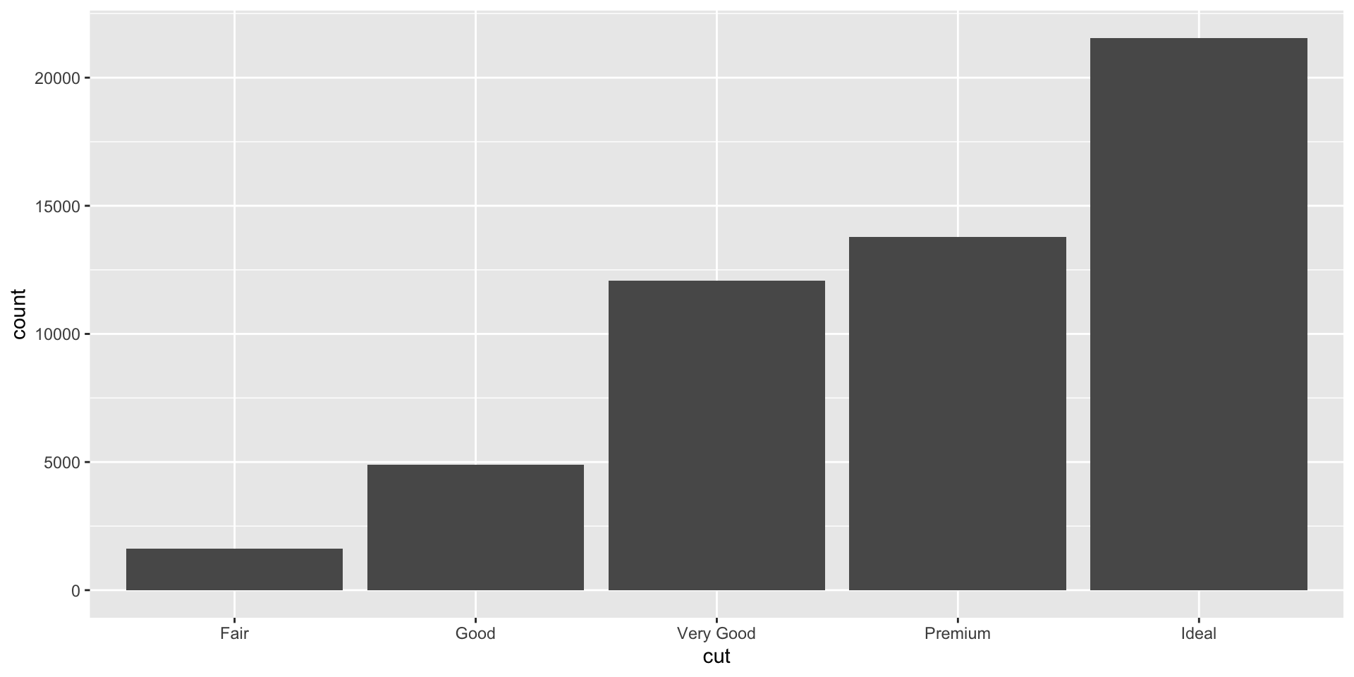
discrete x, continuous y - Exercise 5
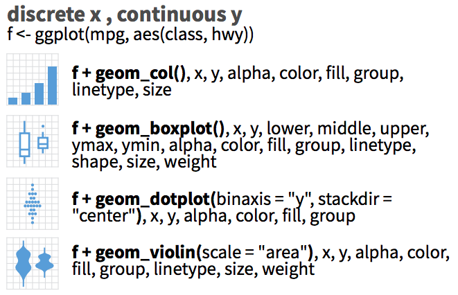
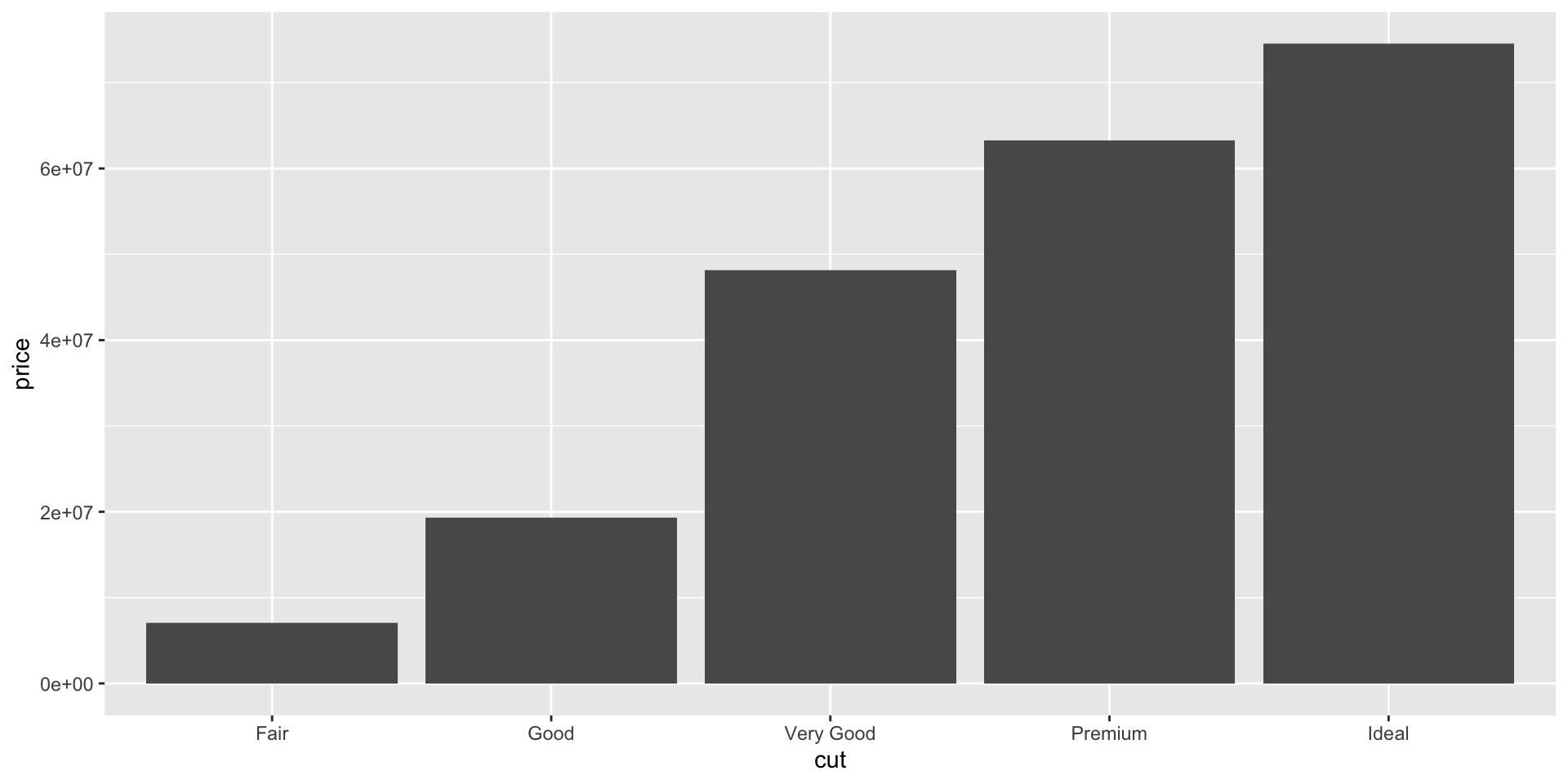
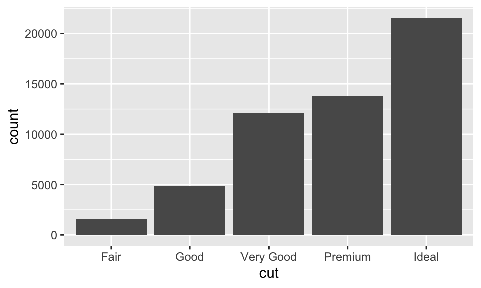
Make a column plot.
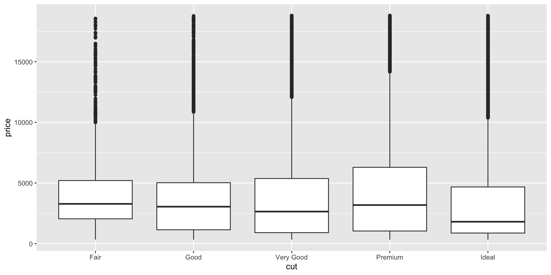
Same data with a box plot.
Box plot, with fill color by cut.
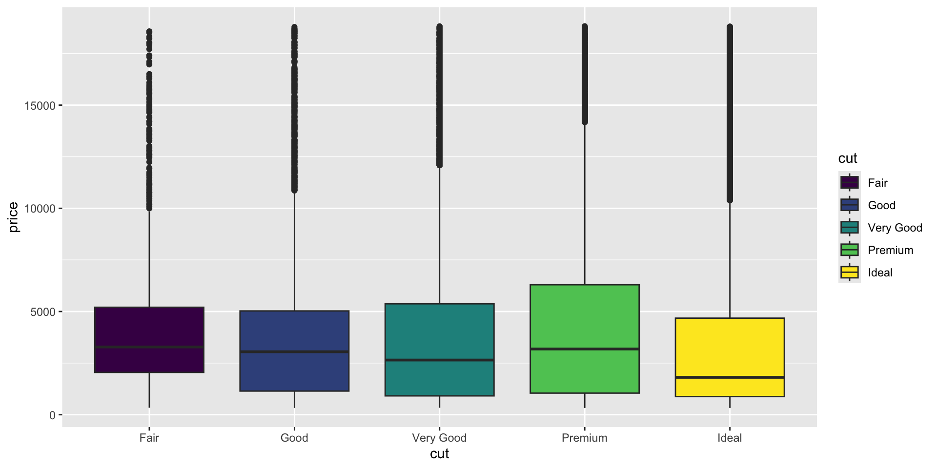
What about this plot is not ideal? (hint: how many ways is cut represented?)
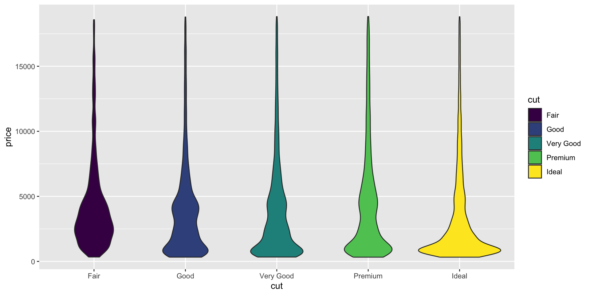
Violin plot with fill color by cut.
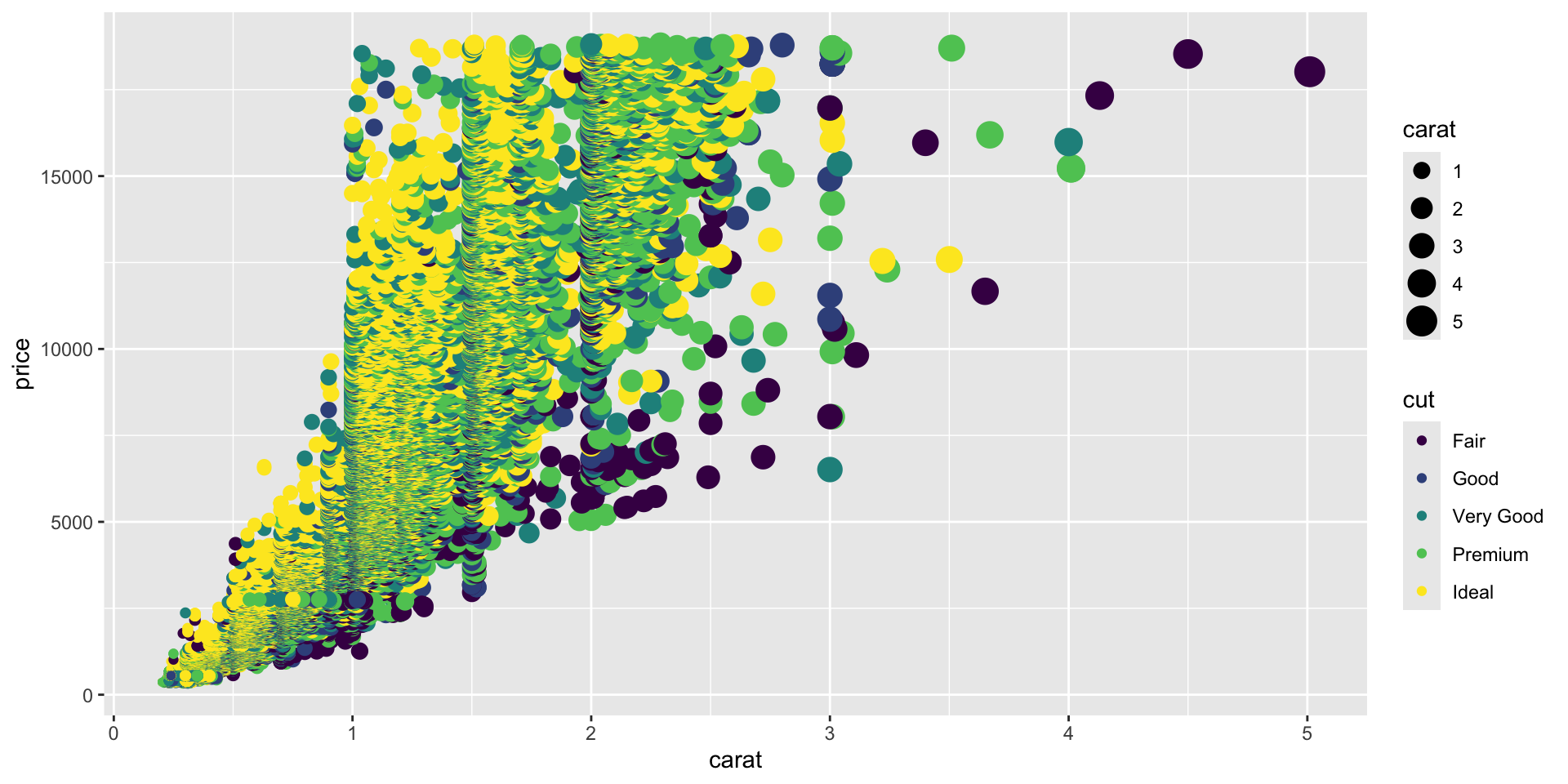
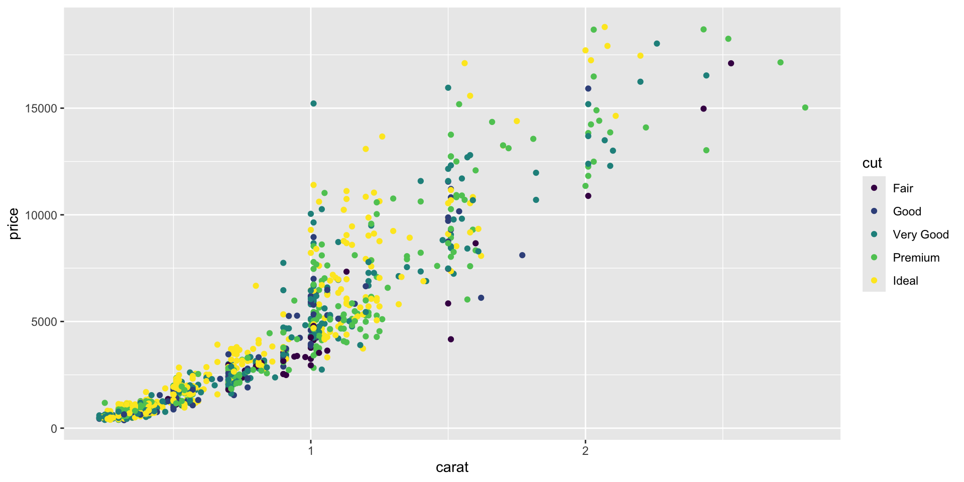
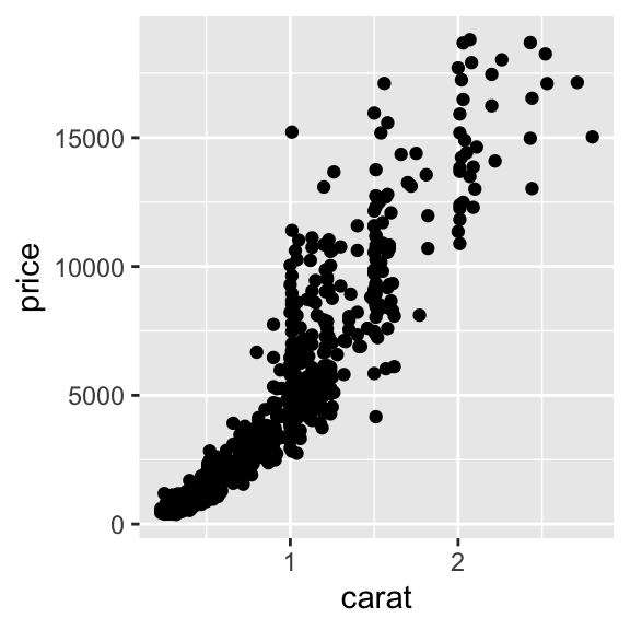
continuous x, continuous y - Exercise 6
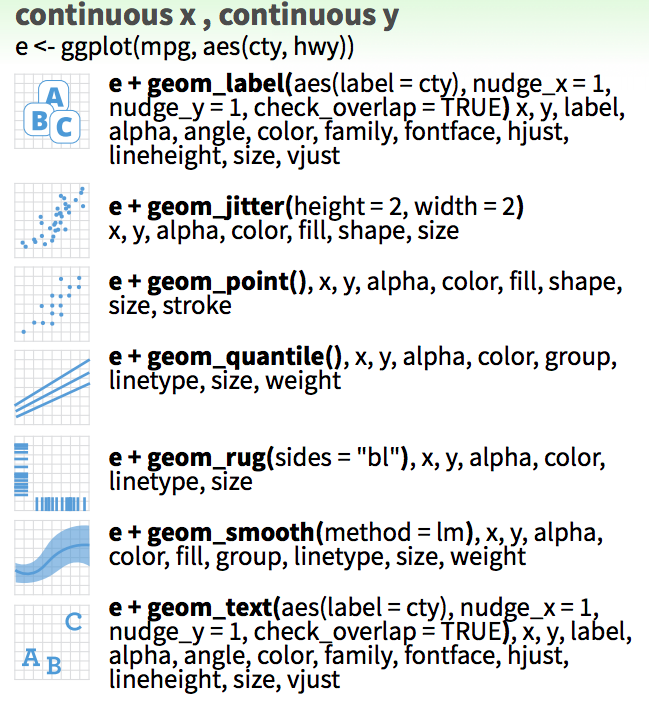
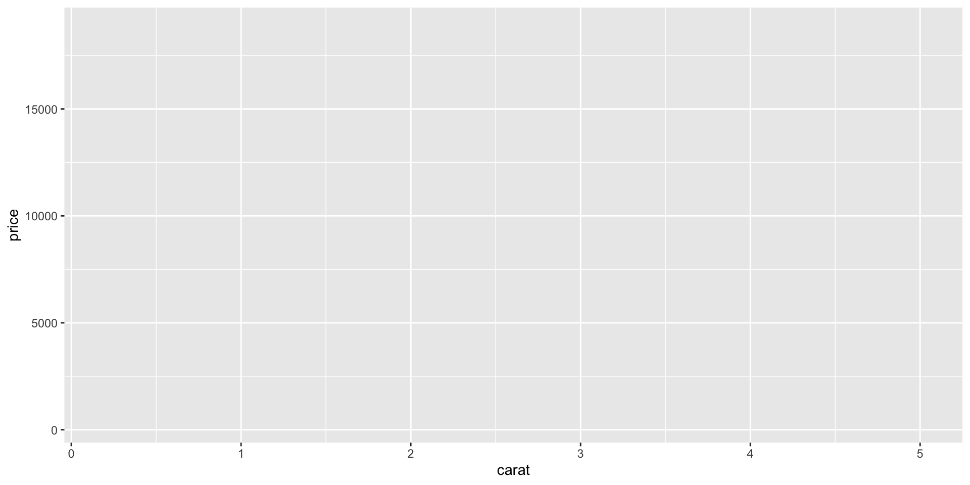
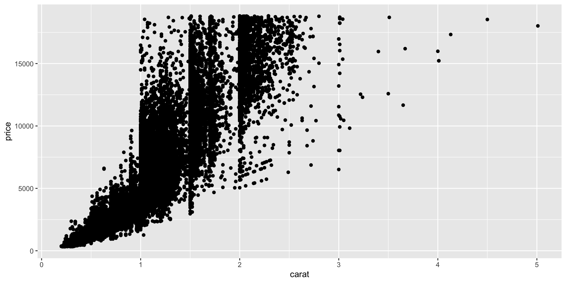
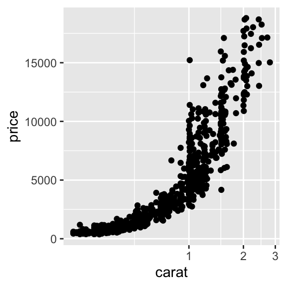
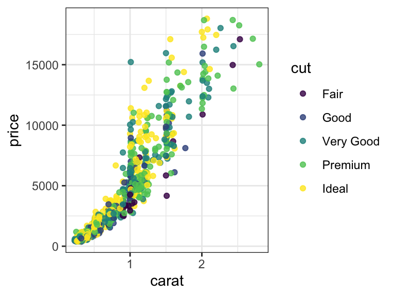
Make a scatter plot.
Now add a smoothing line.
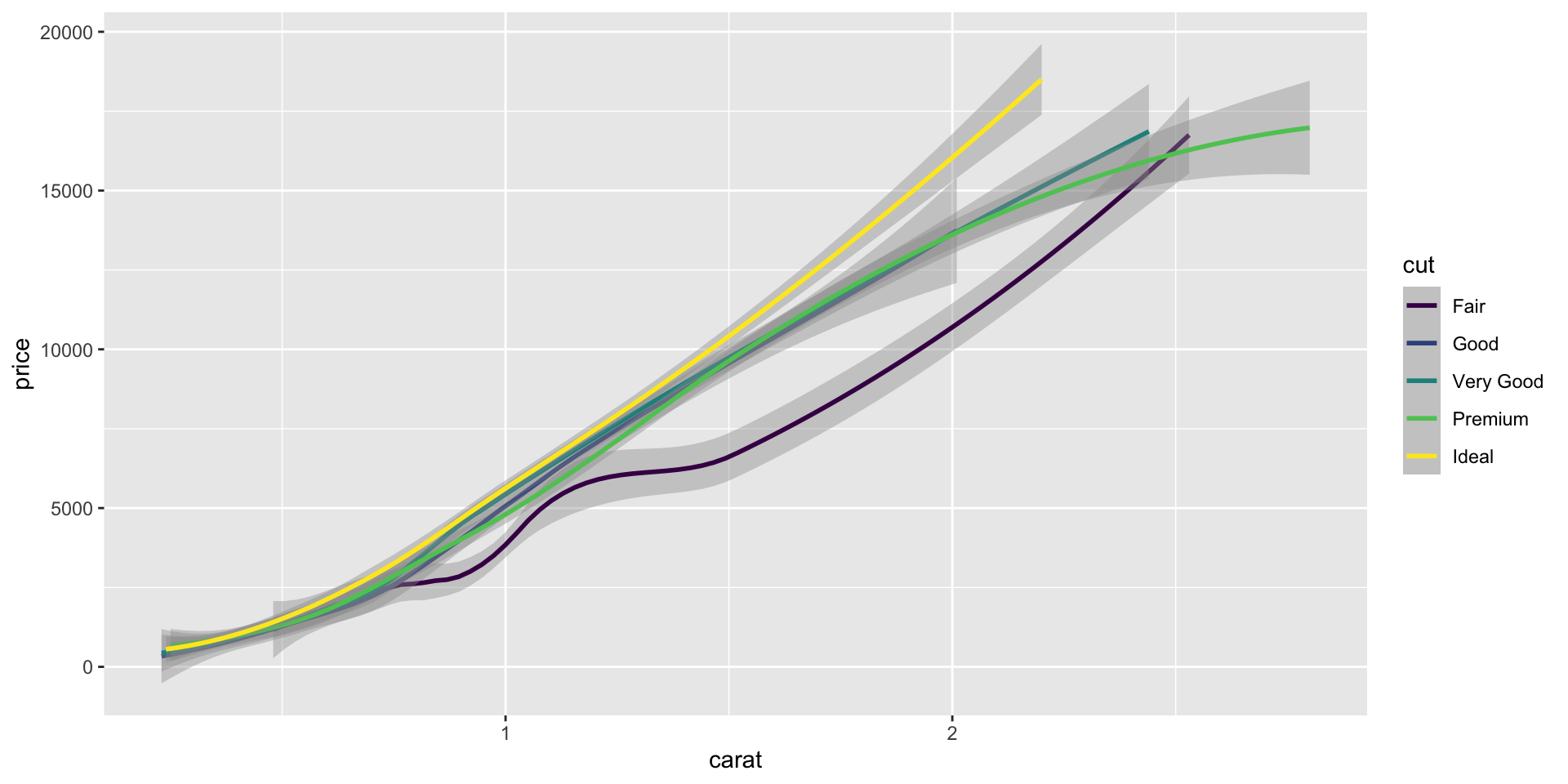
`geom_smooth()` using method = 'loess' and formula = 'y ~
x'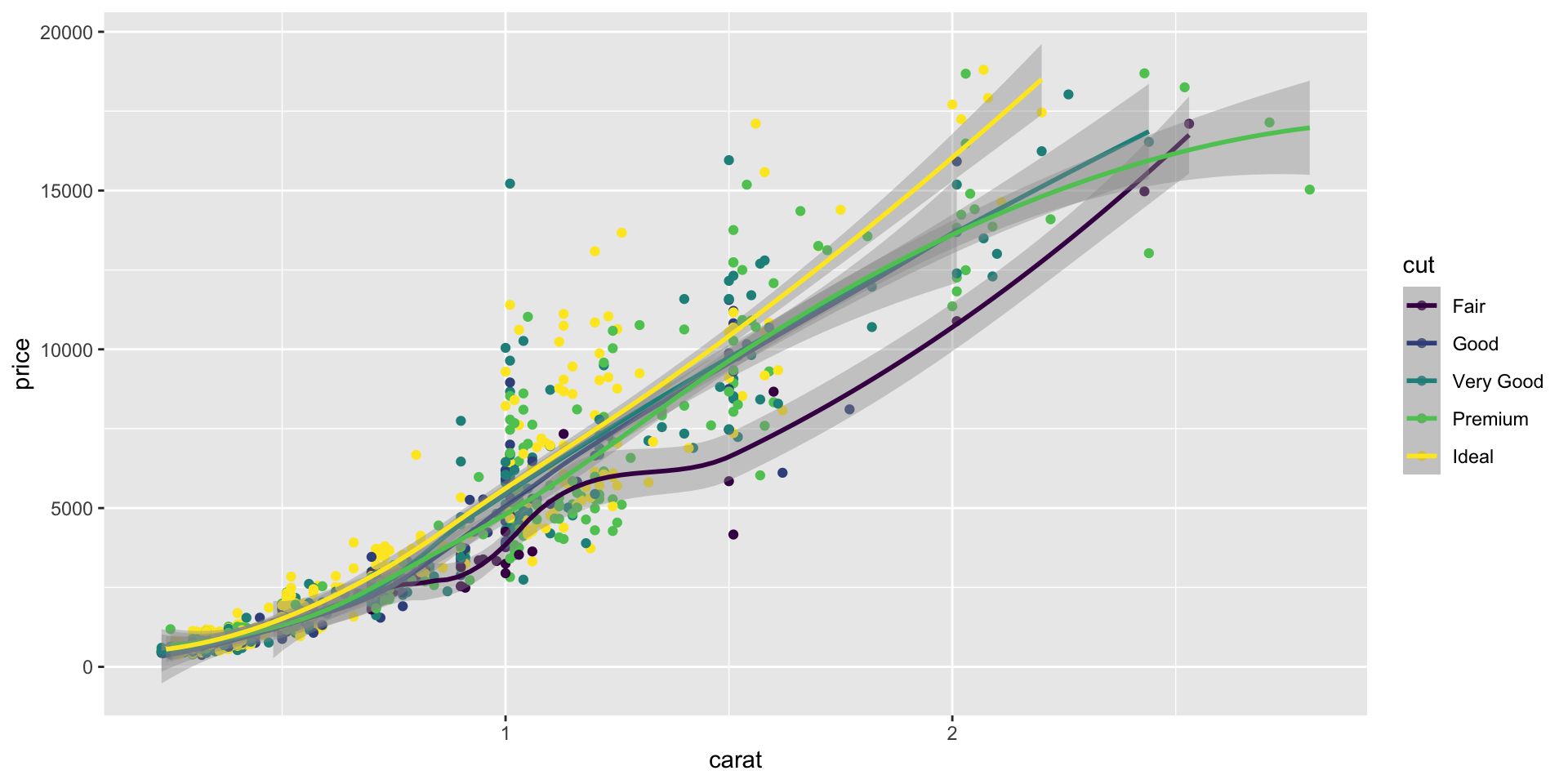
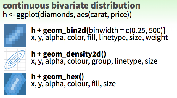
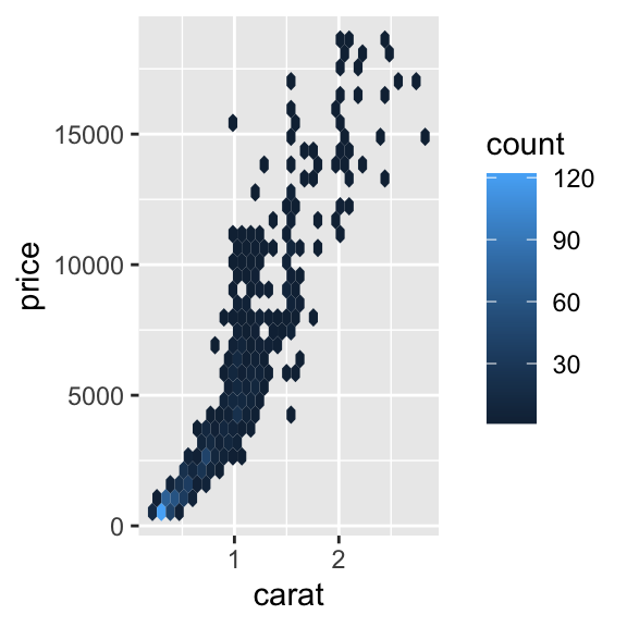
continuous bivariate - Exercise 7
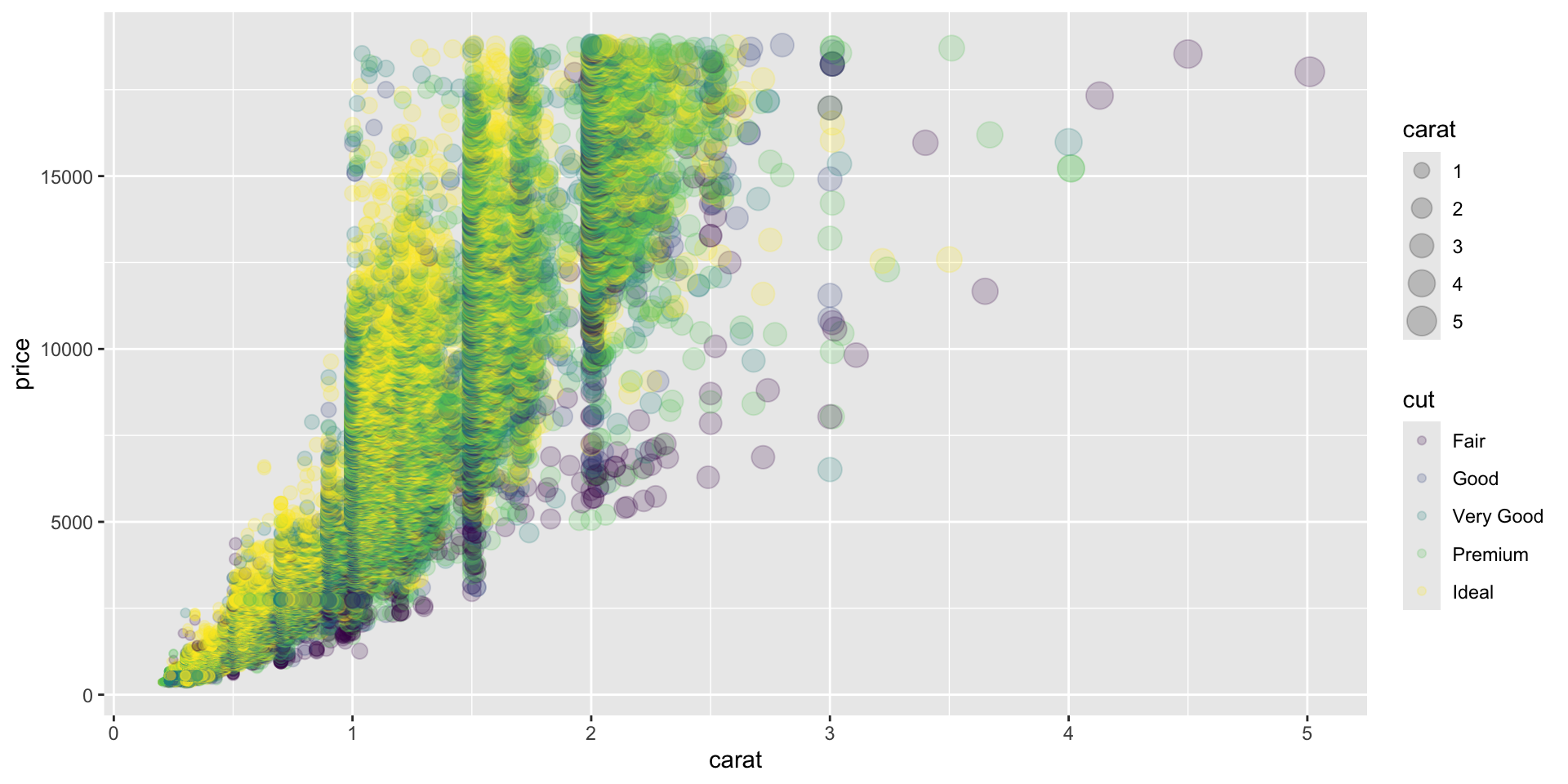
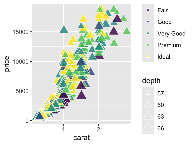
shape, size, fill, color, and transparency - Exercise 9
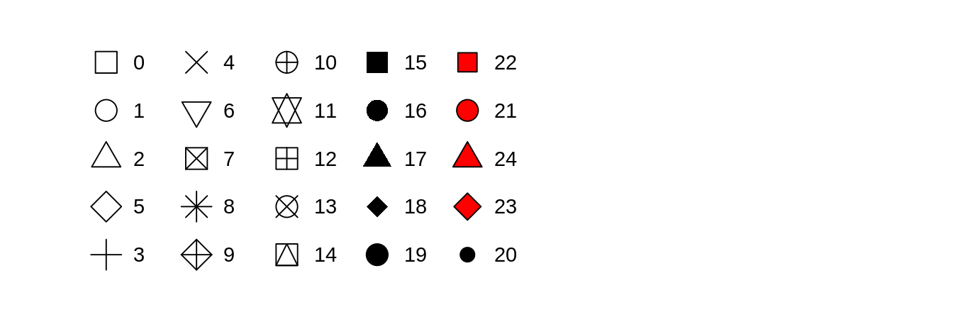
R has 25 built in shapes that are identified by numbers.
Some are similar: 0, 15, and 22 are all squares, but interact differently with color and fill aesthetics.
Hollow shapes have a border determined by color, solid shapes (15-18) are filled with color, an the filled shapes (21-24) have color border and fill inside.
Note that aesthetics can also be defined within a geoms.
This is useful if you use two different geoms that share an aesthetic.
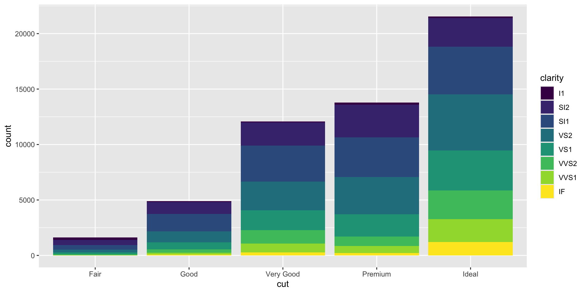
Position adjustments - Exercise 10
Position adjustments determine how to arrange geoms that would otherwise occupy the same space.
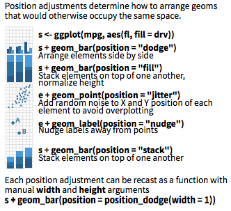
A stacked bar chart.
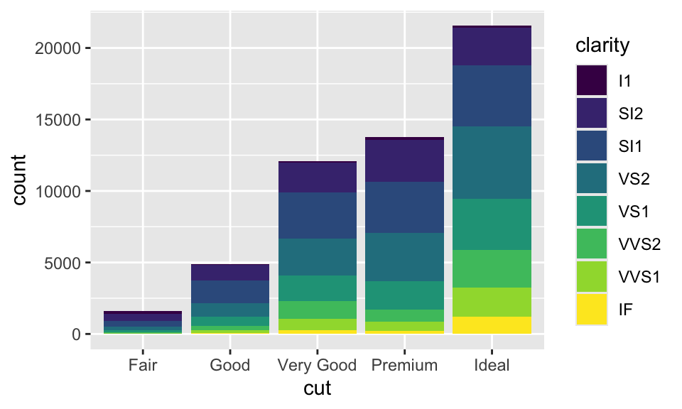
Dodged bars are easier to read (proportions are clearer)
Coordinate and Scale Functions - Exercise 11
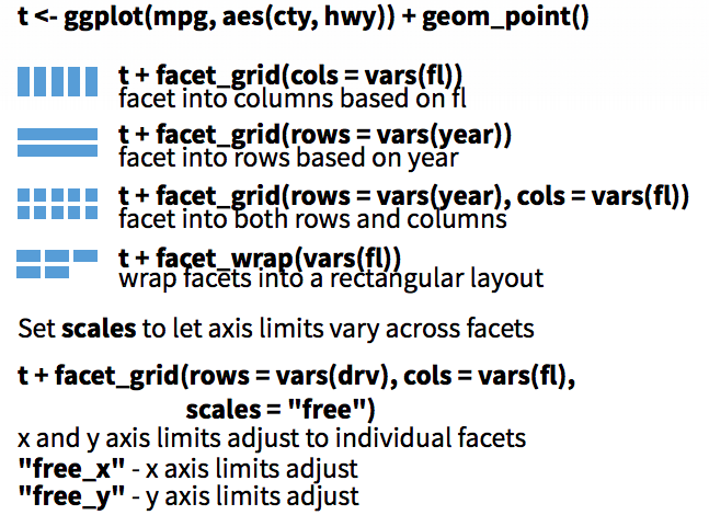
We won’t go into these functions too much today, but here is a brief overview:
The coordinate system determines how the x and y aesthetics combine to position elements in the plot. The default coordinate system is Cartesian ( coord_cartesian() ), which can be tweaked with coord_map() , coord_fixed() , coord_flip() , and coord_trans() , or completely replaced with coord_polar()
Scales control the details of how data values are translated to visual properties. There are 20+ scale functions. We will look at one; the ggplot2 cheatsheet is your friend for the rest.
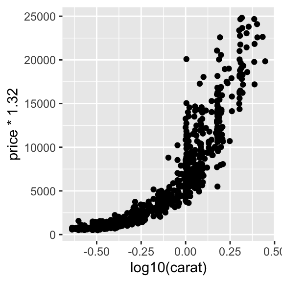
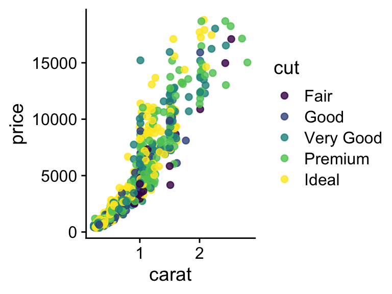
Logarithmic axes - 1
Note the difference between axis labels in these two examples.
Logarithmic axes - 2

Flipping coordinate system (swapping x and y)
Now flip the axis.
Brief aside: ggplot can handle on-the-fly data transformations.
Here we log-transform carat and convert USD to CAD.
We might want to change the limits of x or y axes to zoom in.
Warning: Removed 283 rows containing missing values or values
outside the scale range (`geom_point()`).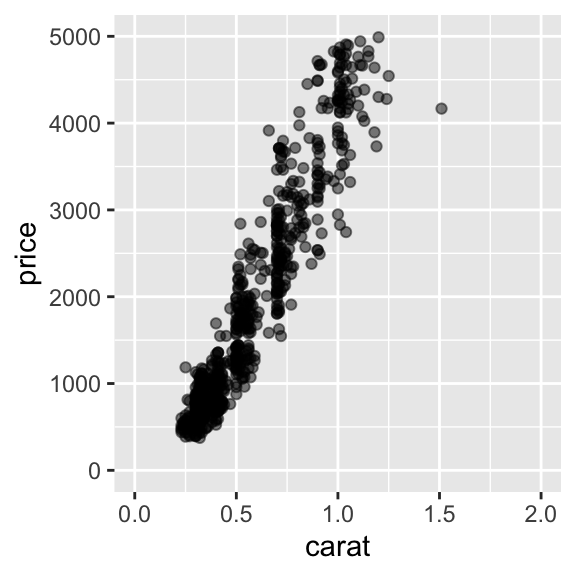
You can also use coord_cartesian(xlim, ylim)
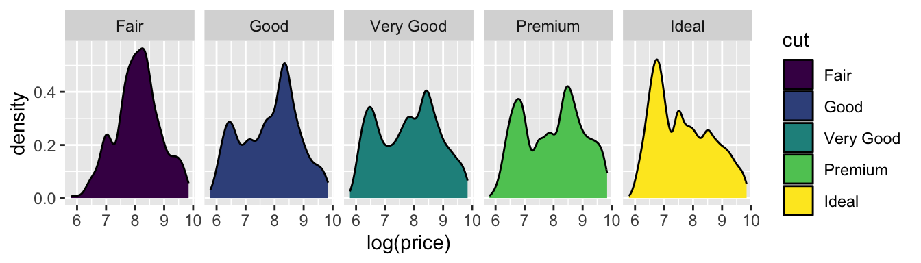
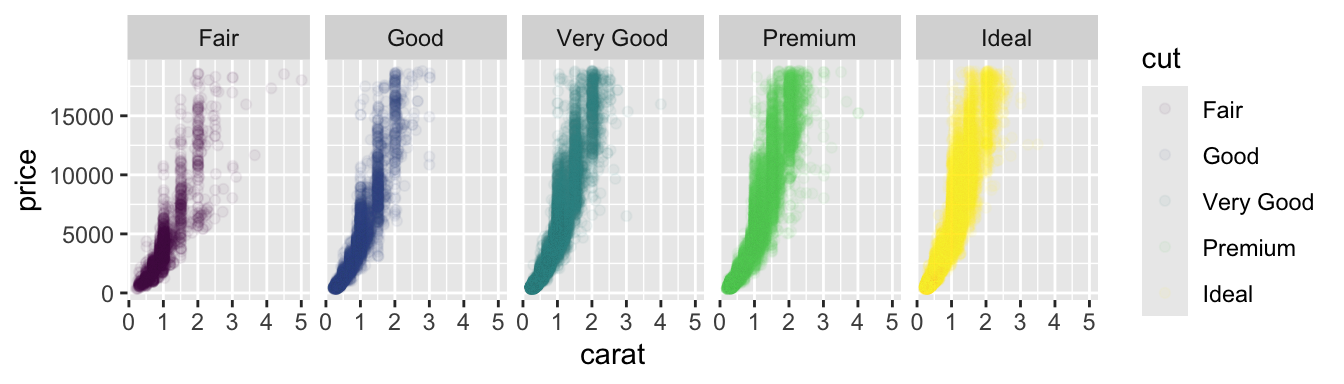
Faceting to plot subsets of data into separate panels - Exercise 13
“Facets” are a powerful tool to subdivide a plot based on the values of one or more discrete variables.
Density plot we’ve seen before. Which variables can we use to subdivide the data?
Faceted by cut
Scatter plot with facets.
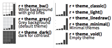
Themes - Exercise 14
Themes can significantly affect the appearance of your plot. Thanksfully, there are a lot to choose from.
Scatter plot with default theme.
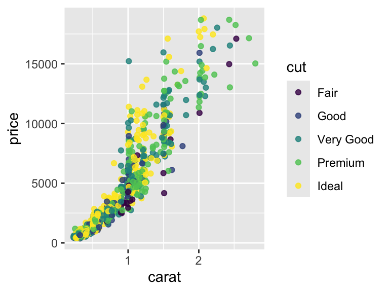
Change the theme with theme_bw().
My go-to is cowplot::theme_cowplot().
It implements much of the advice in the “Dataviz” book, e.g. YOUR LABELS ARE TOO SMALL.
We’re not going to cover it, but you can also customize pre-existing themes.
Labels & Legends - Exercise 15
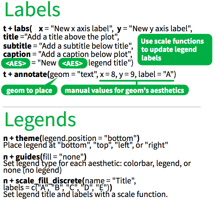
Use labs() to add / change plot labels.
ggplot(
  data = diamonds,
  mapping = aes(
    x = cut,
    y = log(price),
    fill = cut
  )
) +
  geom_boxplot() +
  labs(
    x = "Cut",
    y = "Price (log)",
    color = "Cut",
    title = "Distribution of diamond prices by cut",
    subtitle = "Data come from a random sample of 1000 diamonds",
    caption = "Source: diamonds dataset from ggplot2"
  ) +
  theme_cowplot()
Ignoring unknown labels:
• colour : "Cut"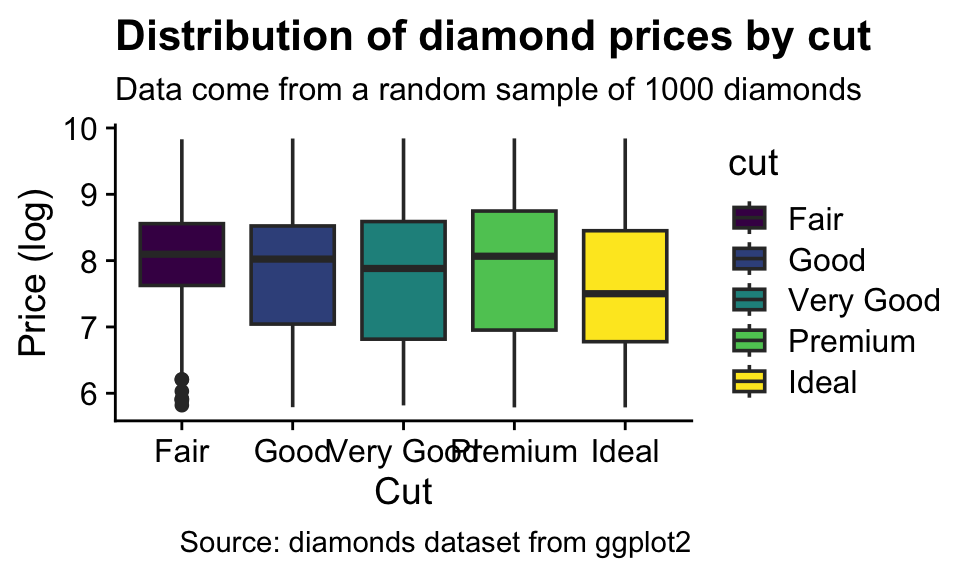
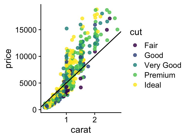
How to add a line to a plot? (Exercise 16)

`geom_smooth()` using formula = 'y ~ x'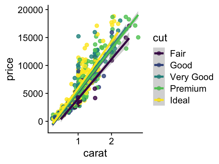
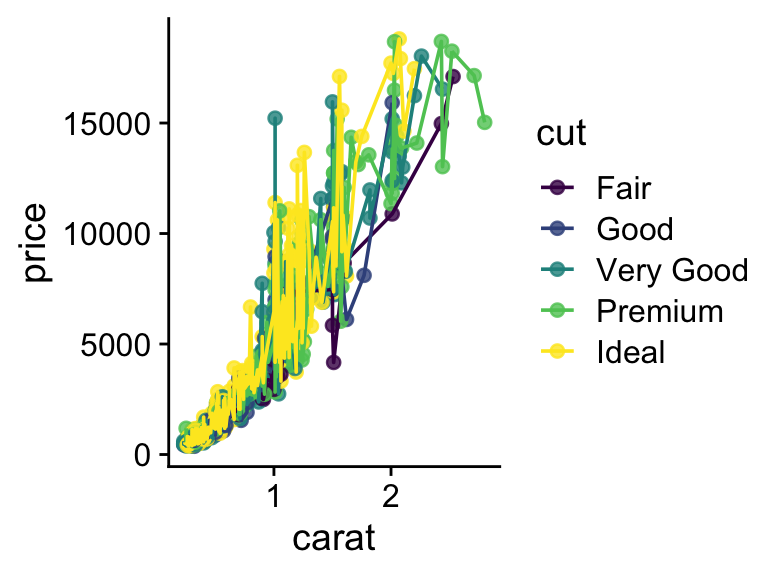
How to combine multiple plots into a figure? (Exercise 17)
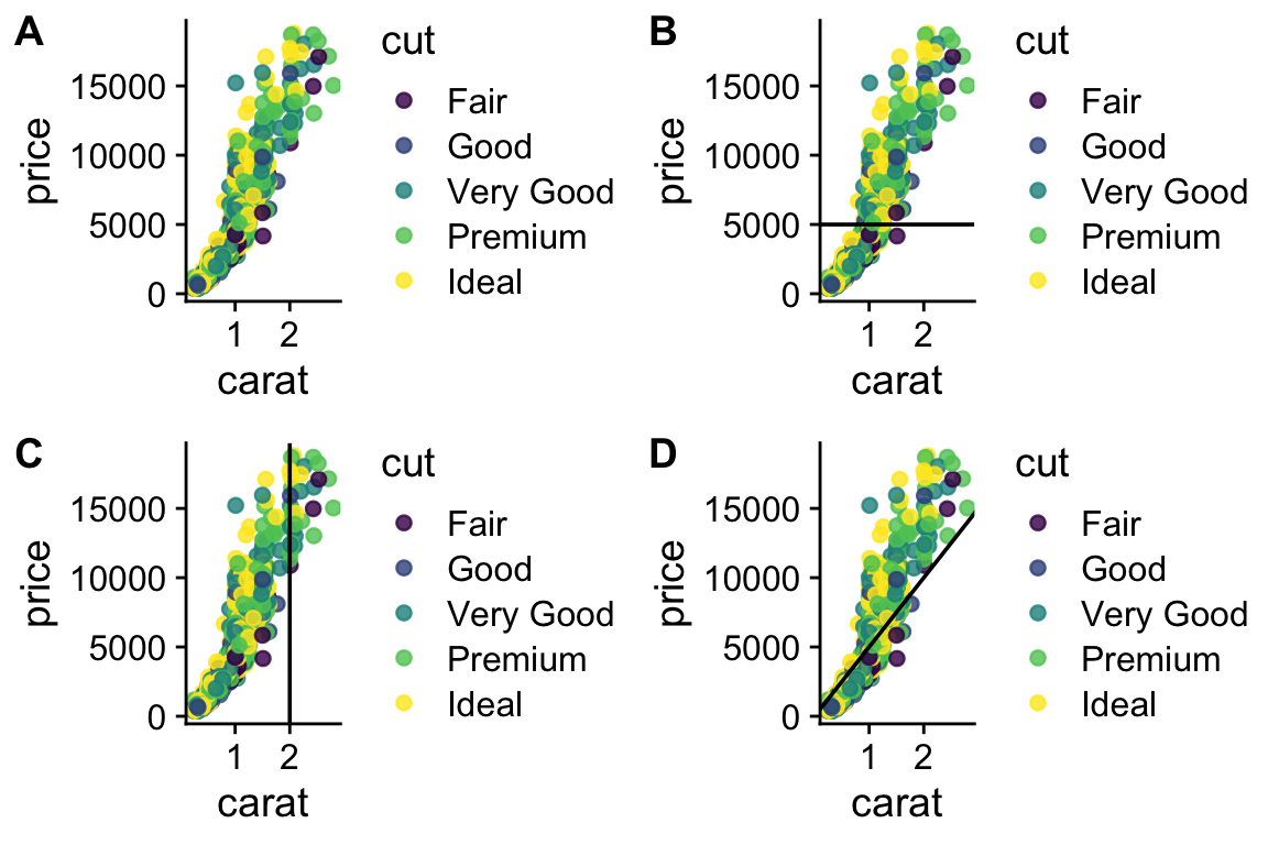
# we have 4 legends, which is too many - can they be removed?
# Yes, but it is not exactly straightforward
legend <- get_legend(plot1 + theme(legend.position = "bottom"))
plot1 <- p + theme(legend.position = "none")
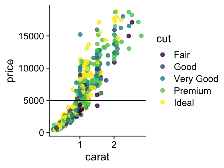
plot2 <- p +
geom_hline(aes(yintercept = 5000)) +
theme(legend.position = "none")
plot3 <- p + geom_vline(aes(xintercept = 2)) + theme(legend.position = "none")
plot4 <- p +
geom_abline(aes(intercept = 0.5, slope = 5000)) +
theme(legend.position = "none")
all_plots <- plot_grid(
plot1,
plot2,
plot3,
plot4,
labels = c("A", "B", "C", "D"),
nrow = 2
)
plot_final <- plot_grid(all_plots, legend, ncol = 1, rel_heights = c(1, .1))
plot_final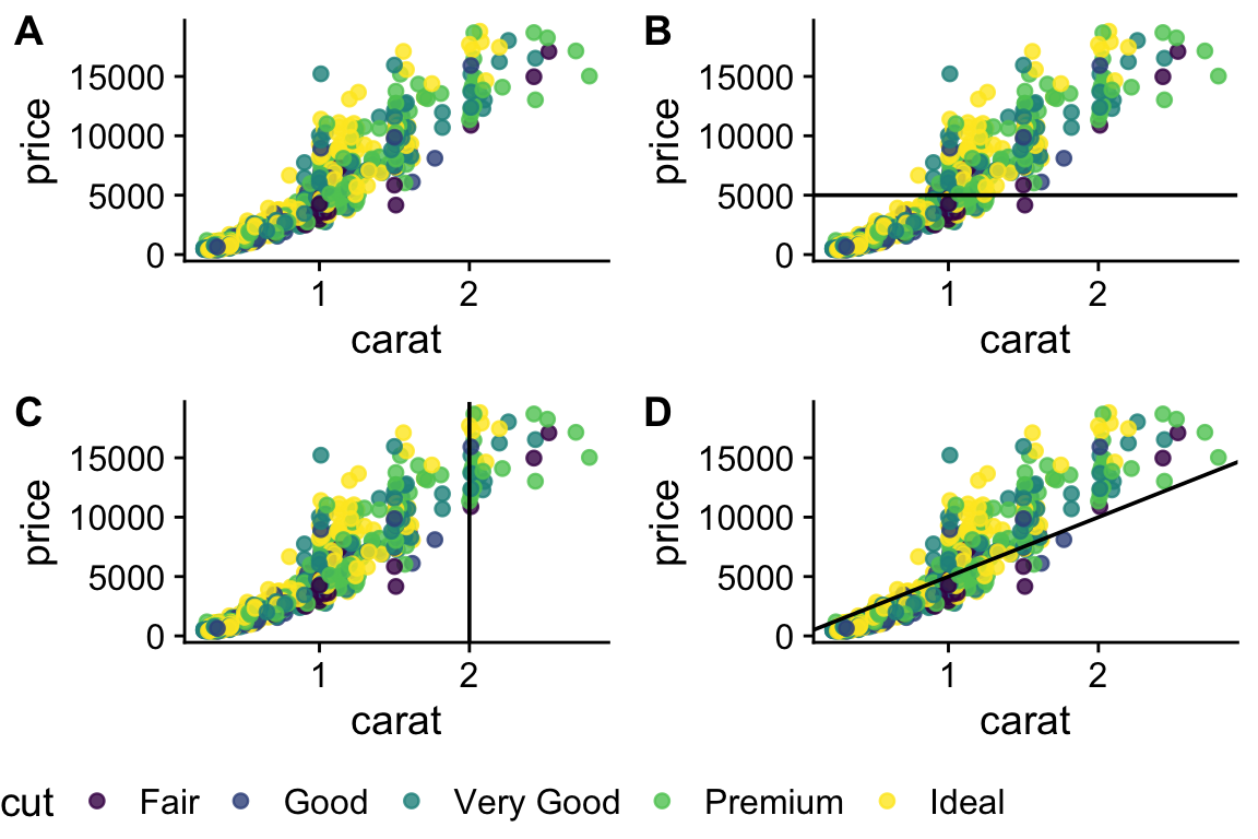
More information on using plot_grid (from package cowplot) is here