#There are some hints to help you get started

#Use biomaRt to get a table of transcript/gene relationships
mart <- biomaRt::useMart(
  "ENSEMBL_MART_ENSEMBL",
  dataset = "??",
  host = "https://www.ensembl.org"
)

t2g <- biomaRt::getBM(attributes = c("ensembl_transcript_id", "ensembl_gene_id", "external_gene_name"), mart = mart) |>
  dplyr::select(??, ??)


#Read in salmon quantification files

metadata <- data.frame(sample_id = list.files(here("??")),
                   salmon_dirs = list.files(here("??"),recursive = T,pattern = "quant.sf", full.names = T)

                   ) |>
  separate(col = ??,
           into = c("cell","loc","geno","rep"),
           sep = "??",
           remove = F)

metadata$rep <- gsub(pattern = "Rep", replacement = "", metadata$rep)

rownames(metadata) <- metadata$sample_id


#Get gene-level TPM values with tximport

salmdir <- metadata$??
names(salmdir) <- metadata$??


txi <- tximport(files = ??,
  type = "salmon",
  tx2gene = ??,
  dropInfReps = TRUE,
  countsFromAbundance = "lengthScaledTPM"
)

# Only keep genes that have a sum of TPMs across all samples > 1
tpms <- txi$?? |>
  as.data.frame() |>
  rownames_to_column(var = "ensembl_gene_id")


tpms.cutoff <-
  mutate(tpms, nSamples = rowSums(tpms[, 2:??] > 1)) |>
  filter(nSamples >= ??) |>

dplyr::select(-nSamples)RNA Block - Problem Set 23
Problem Set
Total points: 20. First problem is worth 10 points, second and third problems are worth 5 points.
Load libraries
Start by loading libraries you need analysis in the code chunk below.
We have an experiment where we can take neuronal cells and mechanically separate them into soma and neurite fractions. By sequencing RNA from both of these fractions and comparing the relative abundances of RNAs, we can get a sense of how neurite-localized every RNA is. We can also combine this approach with knockouts of specific RBPs. If we have an RBP that we think is involved in this process, we can do this subcellular fractionation in sequencing in both WT and RBP-knockout (KO) cells. Transcripts that depend upon the RBP for transcript to the neurite should be less neurite-enriched in the KO samples than the WT samples.
We recently completed this process in mouse cells that lack the RBP TDP-43. We have RNA sequence data for 4 conditions: WT soma, WT neurite, KO soma, and KO neurite with 3 replicates of each condition. These samples have been quantified with salmon.
Read in this data, collapse salmon’s transcript-level quantification to gene-level quantification with tximport. Then assess the quality of this data by performing hierarchical clustering of pairwise spearman correlation values and PCA analysis of TPM expression values.
The salmon data lives in data/block-rna/salmon_tdp43. In that directory, you will find one salmon output directory for each sample.
Q1: read in salmon data (10 pts)
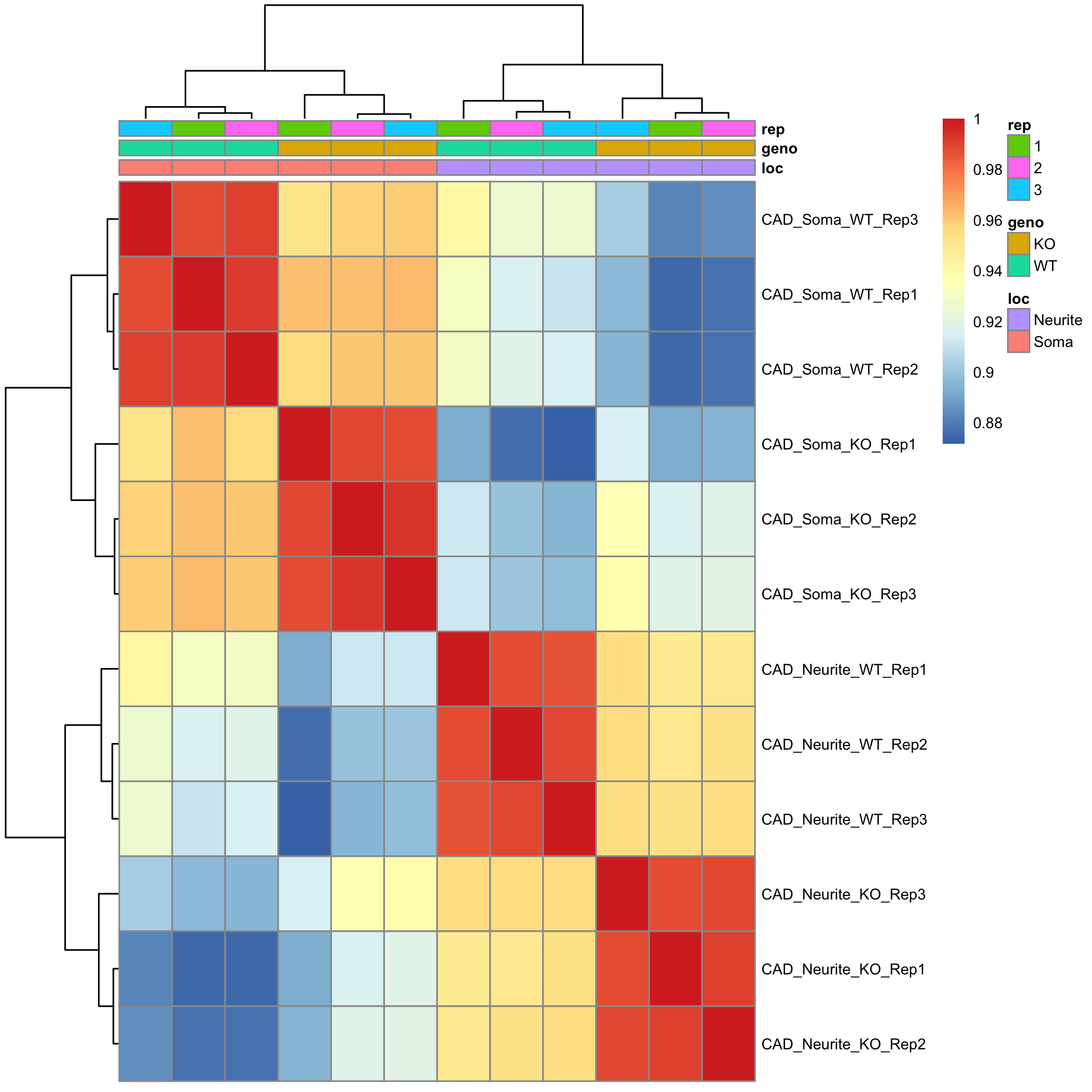
Q2: make correlation heatmap (5 pts)
#Use cor() to get a matrix of pairwise correlations between samples
tpms.cor <- cor(??, method = "??")

#Use pheatmap() to plot correlation matrix

pheatmap(
  ??,
  annotation_col = metadata[,??], # what would be interesting to add as colored categories
  fontsize = 7,
  show_colnames = FALSE
)
Provide 1-2 sentences of interpretation of the similarity of the samples based on the heatmap.
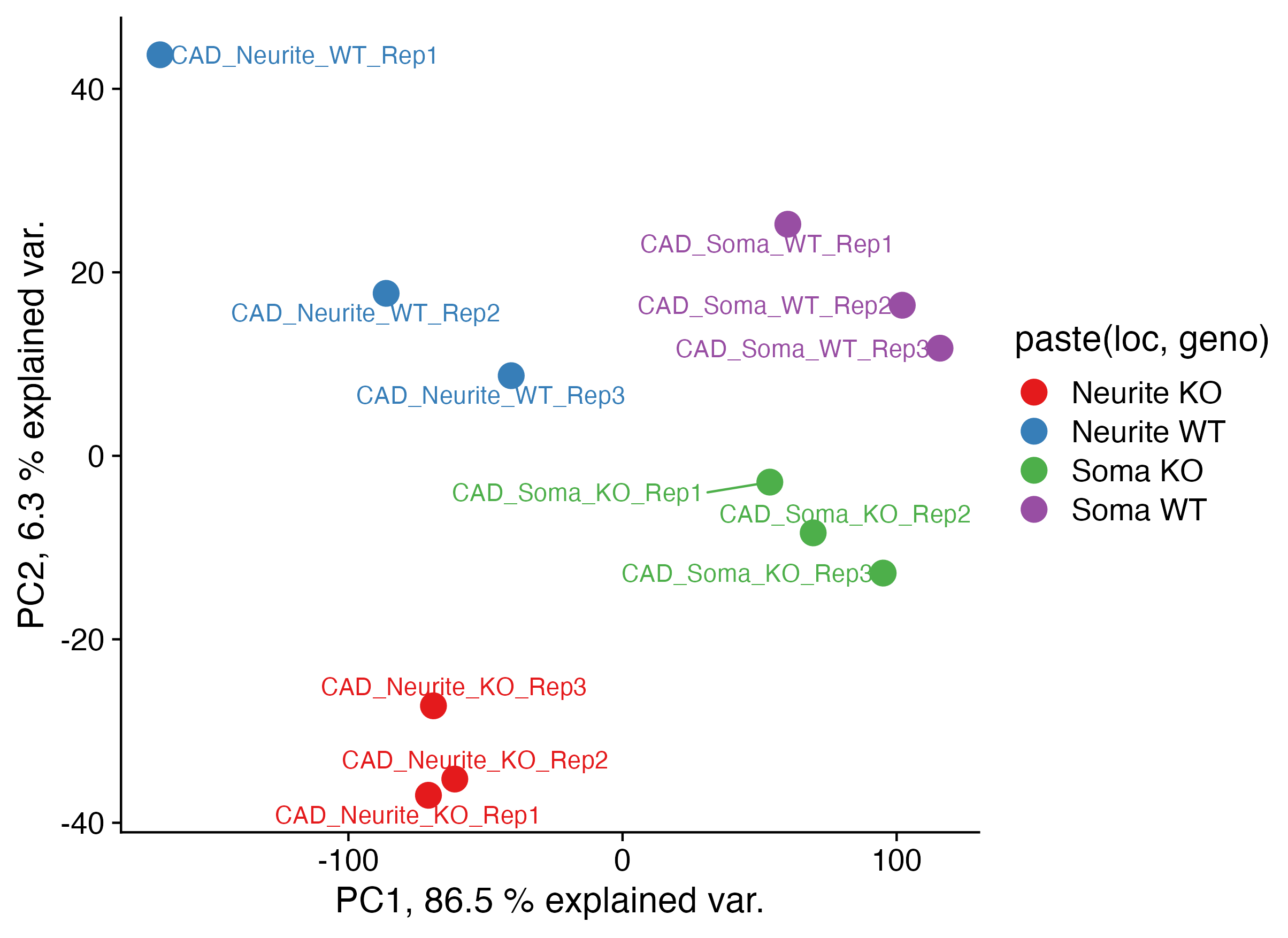
Q3: make PCA plot (5 pts)
#Start with the filtered TPM table from above
tpms.cutoff.matrix <- tpms.cutoff |>
  dplyr::select(-??) |>
  as.??()


#Use prcomp() to derive principle component coordinants of *LOGGED*  and *Scaled* TPM values
tpms.cutoff.matrix <- log??(tpms.cutoff.matrix + ??)

# scale
tpms.cutoff.matrix <- ??(scale(??(tpms.cutoff.matrix)))


# principle components
tpms.pca <- prcomp(t(tpms.cutoff.matrix))

#Add annotations of the cell compartment (soma / neurite) and TDP-43 status (WT / KO) of the samples
tpms.pca.pc <- tpms.pca$x %>%
  as.data.frame() %>%
  rownames_to_column(var = "sample_id") %>%
  left_join(., metadata[,c(1,??)], by = "??")

##

tpms.pca.summary <- summary(tpms.pca)$importance
pc1var <- round(tpms.pca.summary[2, 1] * 100, 1)
pc2var <- round(tpms.pca.summary[2, 2] * 100, 1)

#Plot PCA data

ggplot(data = tpms.pca.pc,
  aes(
    x = PC1, y = PC2,
    color = paste(??,??), label = sample_id
  )
) +
  geom_point(size = 5) +
  scale_color_brewer(palette = "Set1") +
  theme_cowplot(16) +
  labs(
    x = paste("PC1,", pc1var, "% explained var."),
    y = paste("PC2,", pc2var, "% explained var.")
  ) +
  geom_text_repel()
Provide 1-2 sentences of interpretation of the similarity of the samples based on the heatmap.
