Extreme aRt — Objective
Your objective is to create some new extreme art using R, something either ugly or sublime. What you cannot do is be boring; your goal is to stay on the fringe.
If you submit an entry, you get full credit on the problem set. Entries will be anonymized and winners will selected by popular vote.
Favorite Rtists
Here are some of my favorite generative artists who use R. Be inspired!
There are several resources for color palettes, an important component of any hideous or beautiful creation.
There are also several R packages that might help you build Rtistic plots.
gganimate provides tools to bring your plots to life.
ggforce provides interesting geoms that build on ggplot2.
patchwork provides layout functions for plots.
Ugly Plots
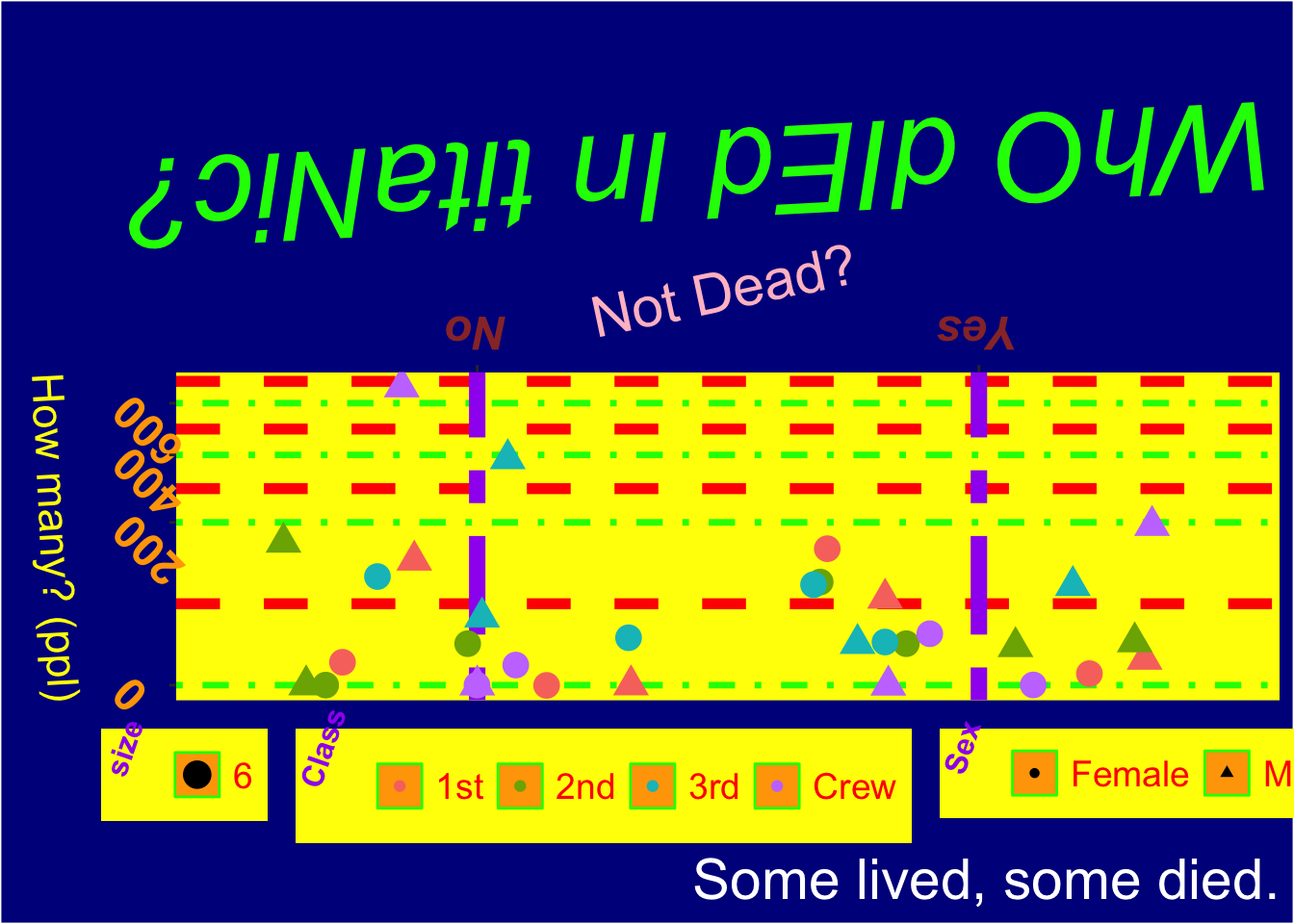
Yikes. We can thank Yunus Ozekin for this abomination.
Code library ( tidyverse ) titanic_tbl <- as_tibble ( Titanic ) ggplot ( titanic_tbl ,
aes (
x = Survived ,
y = n ,
color = Class ,
shape = Sex ,
size = 6
)
) + geom_jitter ( ) +
scale_y_sqrt ( ) +
labs (
x = "Not Dead?" ,
y = "How many? (ppl)" ,
title = "WhO dIEd In titaNic?" ,
caption = "Some lived, some died."
) +
scale_x_discrete ( position = "top" ) +
theme (
axis.text.x = element_text (
face = "bold.italic" ,
color = "#993333" ,
size = 18 ,
angle = 180
) ,
axis.text.y = element_text (
face = "bold" ,
color = "orange" ,
size = 18 ,
angle = 135
) ,
plot.background = element_rect ( fill = "darkblue" ) ,
plot.title = element_text (
face = "italic" ,
color = "green" ,
size = 48 ,
angle = 183
) ,
plot.caption = element_text ( color = "white" , size = 22 ) ,
axis.title.x = element_text ( size = 22 , color = "pink" , angle = 12 ) ,
axis.title.y = element_text ( color = "yellow" , angle = 273 , size = 17 ) ,
legend.background = element_rect ( fill = "yellow" ) ,
legend.title = element_text (
angle = 71 ,
face = "bold" ,
color = "purple" ,
size = 12
) ,
legend.key = element_rect ( color = "green" , fill = "orange" ) ,
legend.text = element_text ( color = "red" , size = 14 ) ,
panel.background = element_rect ( fill = "yellow" ) ,
panel.grid.major.y = element_line (
color = "green" ,
linetype = "dotdash" ,
linewidth = 1.2
) ,
panel.grid.major.x = element_line (
color = "purple" ,
linewidth = 3 ,
linetype = "twodash"
) ,
panel.grid.minor = element_line (
color = "red" ,
linewidth = 2 ,
linetype = "dashed"
) ,
legend.position = "bottom"
)
Beautiful Plots
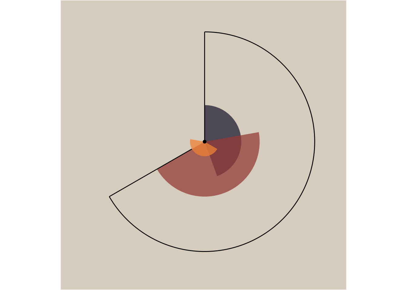
This is a piece from Ijeamaka Anyene’s ode to coord_polar()
Code library ( tidyverse ) apply_pattern_theme <- function ( bg_hex , caption_hex ) { theme (
plot.background = element_rect ( fill = bg_hex ) ,
panel.background = element_rect ( fill = bg_hex ) ,
panel.grid = element_blank ( ) ,
plot.caption = element_text (
family = "Open Sans" ,
size = 6 ,
color = caption_hex
) ,
legend.position = "none" ,
axis.title = element_blank ( ) ,
axis.text = element_blank ( ) ,
axis.ticks = element_blank ( )
)
} outline <- tibble ( x = 1 ,
xend = 7 ,
y = 15 ,
yend = 15
) segment_line <- tibble ( x = c ( 1 , 7 ) ,
xend = c ( 1 , 7 ) ,
y = c ( 0 , 2 ) ,
yend = 15
) area <- tibble ( x = c ( 3 , 5 , 6 ) ,
y = c ( 5 , 7.5 , 2 ) ,
type = LETTERS [ 1 : 3 ]
) palette_values <- c ( "#2a2640" , "#a64e46" , "#f29544" ) ggplot ( ) + geom_col (
data = area ,
aes ( x = x , y = y , fill = type ) ,
alpha = 0.75 ,
width = 4
) +
geom_segment (
data = outline ,
aes (
x = x ,
y = y ,
xend = xend ,
yend = yend
) ,
size = 0.5
) +
geom_segment (
data = segment_line ,
aes (
x = x ,
xend = xend ,
y = y ,
yend = yend
) ,
size = 0.5
) +
geom_point ( aes ( x = 5 , y = 0 ) ) +
scale_fill_manual ( values = palette_values ) +
scale_y_continuous ( limits = c ( 0 , 15 ) ) +
scale_x_continuous ( limits = c ( 1 , 10 ) ) +
coord_polar ( ) +
labs ( caption = "Ijeamaka Anyene | @ijeamaka_a" ) +
apply_pattern_theme (
bg_hex = "#ded5c9" ,
caption_hex = "black"
)
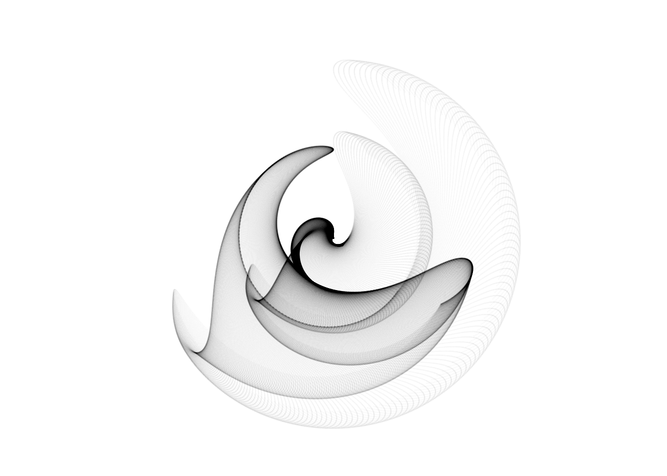
Here’s another more complex geometric creation, again using coord_polar()