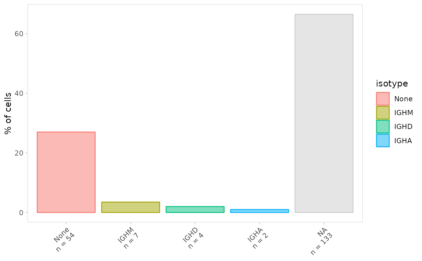
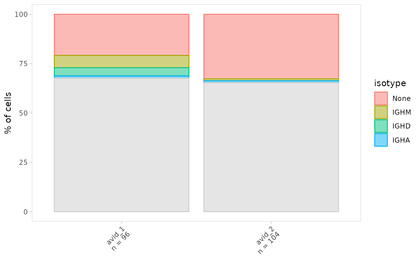
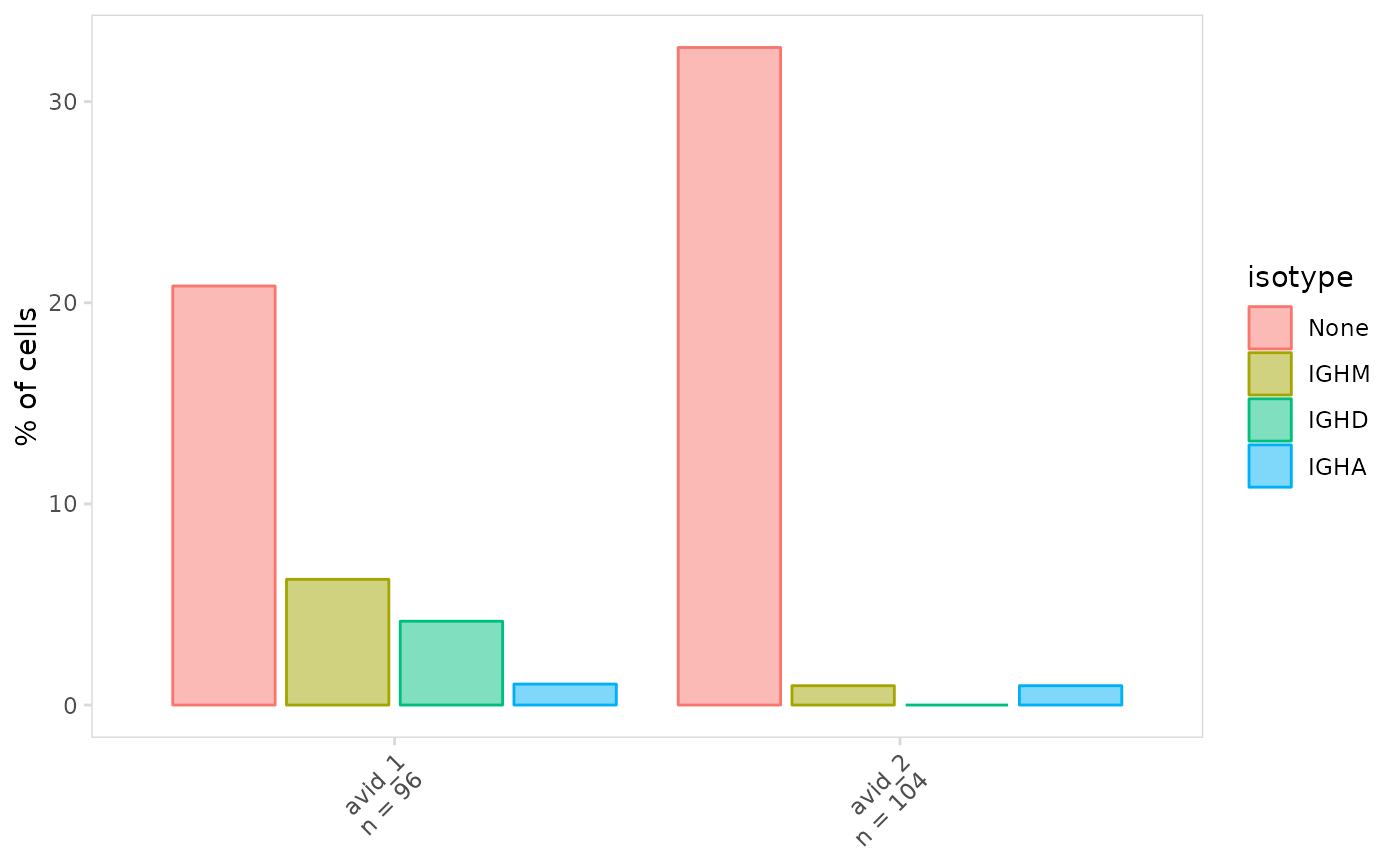
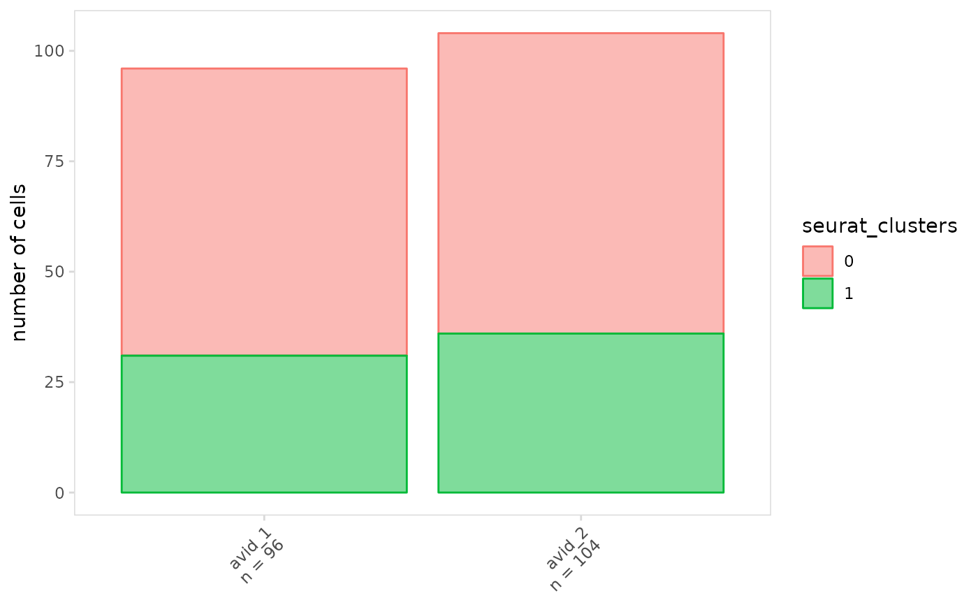
Plot the frequency of each cell label present in the provided meta.data column. This is useful for comparing the proportion of cells belonging to different samples, cell types, clonotypes, isotypes, etc.
Usage
plot_frequency(
  input,
  data_col,
  cluster_col = NULL,
  group_col = NULL,
  method = "bar",
  stack = NULL,
  units = "percent",
  top = NULL,
  other_label = "other",
  plot_colors = NULL,
  plot_lvls = NULL,
  na_color = "grey80",
  trans = "identity",
  show_points = TRUE,
  show_zeros = TRUE,
  n_label = NULL,
  p_label = c(value = 0.05),
  p_method = NULL,
  p_file = NULL,
  label_params = list(),
  ...,
  per_chain = FALSE,
  chain = NULL,
  chain_col = global$chain_col,
  sep = global$sep
)
Arguments
- input
Single cell object or data.frame containing V(D)J data. If a data.frame is provided, the cell barcodes should be stored as row names.
- data_col
meta.data column containing cell labels to use for calculating frequency, e.g. cell types, isotypes etc.
- cluster_col
meta.data column containing cluster IDs (or patients, treatment conditions, etc.) to use when calculating frequency. Calculations will be performed separately for each cluster.
- group_col
meta.data column to use for grouping cluster IDs present in cluster_col. This is useful when there are multiple replicates or patients for each treatment condition.
- method
Method to use for plotting when
group_colis provided, possible values are 'bar' or 'boxplot'- stack
If
TRUE, stacked bargraphs will be generated, otherwise grouped bargraphs will be generated- units
Units to plot on the y-axis, either 'frequency' or 'percent'
- top
To only show the top cell groups present in
data_col, provide one of the following, all other cells will be labeled using the value provided to theother_labelargument. IfNULLthis will be automatically set.Integer specifying the number of top groups to show
Vector specifying the names of cell groups to show
- other_label
Label to use for 'other' cells when
topis specified, ifNULLall cell groups present in data_col will be displayed on the plot.- plot_colors
Character vector containing colors for plotting
- plot_lvls
Levels to use for ordering clusters or groups
- na_color
Color to use for missing values
- trans
Transformation to use for plotting data, e.g. 'log10'. By default values are not transformed, refer to
ggplot2::continuous_scale()for more options. Values can only be transformed when stack isFALSE- show_points
If
TRUEdata points will be shown on boxplots, the point size can be adjusted using thepoint.sizeparameter- show_zeros
If
TRUEcell labels that are missing from a cluster will still be shown on the plot- n_label
Location on plot where n label should be added, this can be any combination of the following:
'corner', display the total number of cells plotted in the top right corner, the position of the label can be modified by passing
xandyspecifications with thelabel_paramsargument'axis', display the number of cells plotted for each group shown on the x-axis
'legend', display the number of cells plotted for each group shown in the plot legend
'none', do not display the number of cells plotted
- p_label
Specification indicating how p-values should be labeled on plot, this can one of the following:
'none', do not display p-values
'all', show p-values for all groups
A named vector providing p-value cutoffs and labels to display, e.g.
c('*' = 0.05, '**' = 0.01, '***' = 0.001). The keyword 'value' can be used to display the p-value for those less than a certain cutoff, e.g.c(value = 0.05, ns = 1.1)will show significant p-values, all others will be labeled 'ns'.
- p_method
Method to use for calculating p-values, by default when comparing two groups a t-test will be used. When comparing more than two groups the Kruskal-Wallis test will be used. With the exception of the edgeR method, p-values are adjusted for multiple testing using Bonferroni correction. Possible methods include:
't', two sample t-test performed with
stats::t.test()'wilcox', Wilcoxon rank sum test performed with
stats::wilcox.test()'kruskal', Kruskal-Wallis test performed with
stats::kruskal.test()'edgeR', differential abundance calculated with the edgeR package
- p_file
File path to save table containing p-values for each comparison.
- label_params
Named list providing additional parameters to modify n label aesthetics, e.g. list(size = 4, color = "red")
- ...
Additional arguments to pass to ggplot2, e.g. color, fill, size, linetype, etc.
- per_chain
If
TRUEthe frequency of each per-chain value will be calculated. IfFALSEper-chain data will not be parsed and the values present indata_colwill be used as is.- chain
Chain(s) to use for calculating frequency. Set to
NULLto include all chains.- chain_col
meta.data column(s) containing chains for each cell
- sep
Separator for storing per-chain data
Examples
# Plot frequency of different isotypes
plot_frequency(
  vdj_sce,
  data_col = "isotype"
)


# Plot frequency separately for cell clusters
plot_frequency(
  vdj_sce,
  data_col    = "isotype",
  cluster_col = "orig.ident"
)


# Create grouped bar graphs
plot_frequency(
  vdj_sce,
  data_col    = "isotype",
  cluster_col = "orig.ident",
  stack       = FALSE
)


# Plot number of cells on the y-axis
plot_frequency(
  vdj_sce,
  data_col    = "seurat_clusters",
  cluster_col = "orig.ident",
  units       = "frequency"
)

