Topics for this session:
- Normalization and dimensionality reduction methods
- Visualization strategies well-suited to single cell seq data
- Clustering methods commonly used for single cell data
- Differential gene expression discovery
- Cell identity assignment
Common analysis paradigm for scRNA-seq
- Normalize counts and log transform. Data used for differential gene expression
- Identify subset of informative genes to use for clustering (feature selection)
- Run PCA to reduce the dimensionality of the dataset
- Identify clusters using the PCA reduced data
- Project the data into 2-D using UMAP/tSNE or just PCA to visualize
- Find marker genes enriched in clusters
- Define cell types
- Repeat Steps 4-7 until satisfied
Seurat accomplishes these steps using a succinct set of functions provided by Seurat:
?Seurat::NormalizeData
?Seurat::ScaleData
?Seurat::RunPCA
?Seurat::RunUMAP
?Seurat::FindNeighbors
?Seurat::FindClusters
?Seurat::FindMarkers
Reloading saved objects
For this class, we load a basic QC filtered Seurat object, saved in RDS format, uploaded on Amazon S3.
An object of class Seurat
12572 features across 2686 samples within 1 assay
Active assay: RNA (12572 features, 0 variable features)
Normalization
Normalization of the UMI count data is necessary due to the large variability in total counts observed across cells. This variability is generally thought to be due to inefficiencies in library preparation and variable sequencing depths between cells. Without normalization the largest source of variability in the data would be due to technical differences rather than the biological differences of interest.
Global size factor approach
A commonly used approach for normalization of UMI data is a simple scaling normalization similar to the commonly used counts per million normalization methods. UMI counts per cell are scaled to the total # of UMIs per cell and multiplied by a constant for ease to prevent small numbers (10,000). The data are then log transformed (with a pseudocount) to stabilize the variance. e.g.
\(\log((10000 * \frac{x_{i}}{\sum_{x_i}}) + 1)\)
This approach makes the assumption that cells all have the same amount of RNA and that sequencing depth is the reason for the variability. These assumptions aren’t really valid, especially when comparing diverse cell types, however in practice this approach can still provide reasonable results and is the default normalization method used in Seurat.
so <- NormalizeData(so, normalization.method = "LogNormalize")
# data slot now contains log normalized values
GetAssayData(so, "data")[1:10, 1:10]
10 x 10 sparse Matrix of class "dgCMatrix"

AL627309.1    . . . . . .        . .        .        .
RP11-206L10.2 . . . . . .        . .        .        .
LINC00115     . . . . . .        . .        .        .
NOC2L         . . . . . .        . .        1.254193 .
KLHL17        . . . . . .        . .        .        .
PLEKHN1       . . . . . .        . .        .        .
HES4          . . . . . 1.766183 . .        .        .
ISG15         . . . . . 2.369960 . 1.679169 .        2.836986
AGRN          . . . . . .        . .        .        .
C1orf159      . . . . . .        . .        .        .
Normalization methods used in bulk RNA-seq data (e.g. DESeq2 size-factors ) are not appropriate due to the large numbers of zeros in the data. However, by pooling similar cells together, one can obtain enough data to estimate a normalization size factor. The Bioconductor package scran implements such a strategy.
Identifying highly variable genes (i.e. feature selection)
We will next select important features to use for dimensionality reduction, clustering and tSNE/uMAP projection. We can in theory use all ~20K genes in the dataset for these steps, however this is often computationally expensive and unnecessary. Most genes in a dataset are going to be expressed at relatively similar values across different cells, or are going to be so lowly expressed that they contribute more noise than signal to the analysis. For determining the relationships between cells in gene-expression space, we want to focus on gene expression differences that are driven primarily by biological variation rather than technical variation.
Seurat provides a function to help identify these genes, FindVariableGenes. Ranking genes by their variance alone will bias towards selecting highly expressed genes. To help mitigate this Seurat uses a vst method to identify genes. Briefly, a curve is fit to model the mean and variance for each gene in log space. Variances are then standardized against this model, and ranked. The top 2000 genes with the highest standardized variances are then called as highly variable, by default.
so <- FindVariableFeatures(so, selection.method = "vst")
VariableFeaturePlot(so)
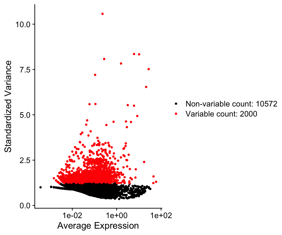
so@assays$RNA@var.features[1:10]
 [1] "PPBP"   "S100A9" "LYZ"    "IGLL5"  "GNLY"   "FTL"    "PF4"
[8] "FTH1" "FCER1A" "GNG11" VariableFeatures(so)[1:10]
 [1] "PPBP"   "S100A9" "LYZ"    "IGLL5"  "GNLY"   "FTL"    "PF4"
 [8] "FTH1"   "FCER1A" "GNG11"
An alternative approach uses the Bioconductor package M3Drop. This approach does not model the variance in the data, but rather uses the information about dropouts to identify genes that have high variance. Specifically, there is a clear relationship between the dropout rate and the abundance of a gene.
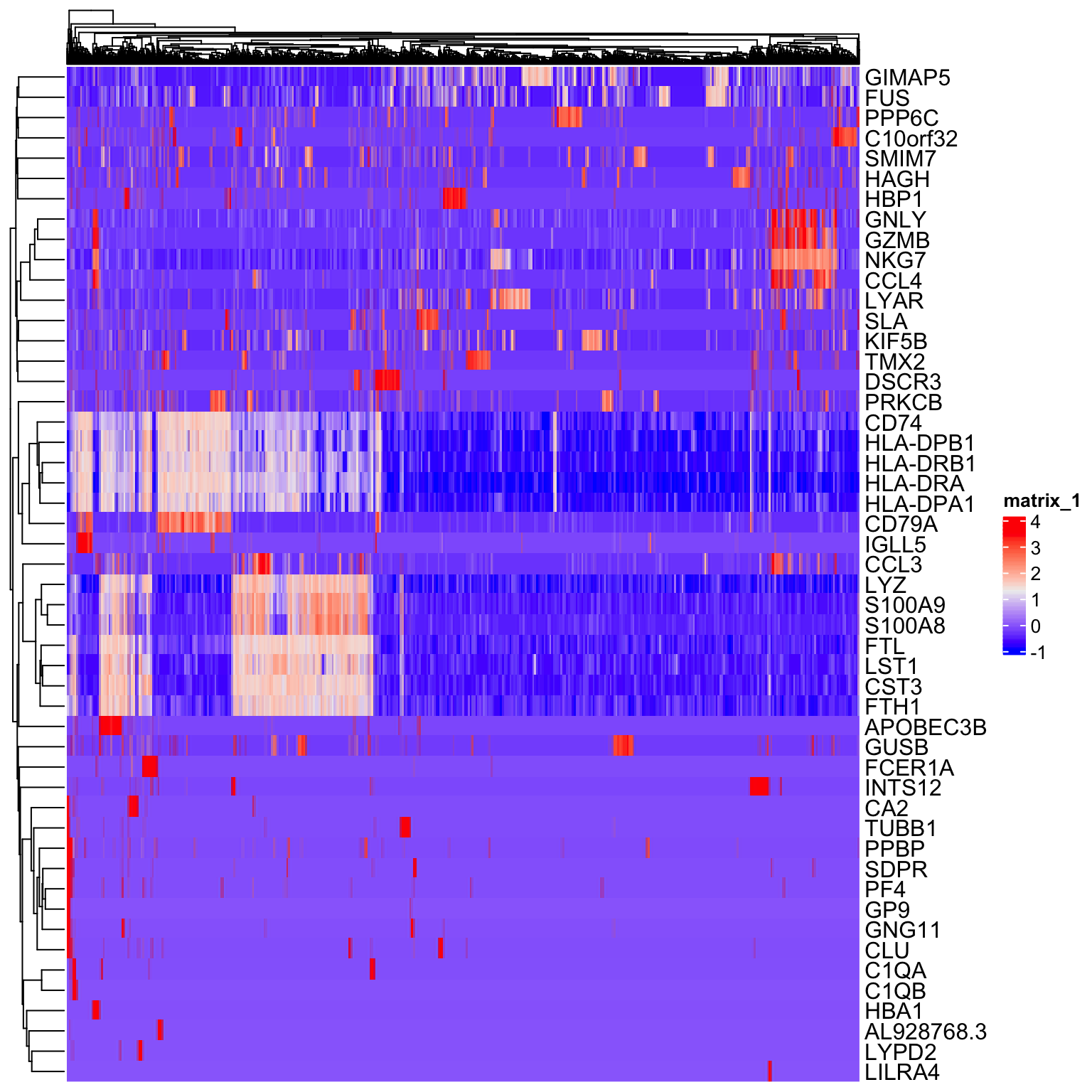
Scaling
Next, we will scale the normalized expression values. The scaled values will only be used for dimensionality reduction and clustering, and not differential expression. The purpose of scaling is to set the expression values for each gene onto a similar numeric scale. This avoid issues of have a gene that is highly expressed being given more weight in clustering simply because it has larger numbers. Scaling converts the normalized data into z-scores by default and the values are stored in the scale.data slot.
Single cell data sets often contain various types of ‘uninteresting’ variation. These can include technical noise, batch effects and confounding biological variation (such as cell cycle stage). We can use modeling to regress these signals out of the analysis using ScaleData. Variables present in the meta.data can be supplied as variables to regress. A linear model is fit between the the supplied variables (i.e nUMI, proportion.mito, etc.) and gene expression value. The residuals from this model are then scaled instead of the normalized gene expression.
In general, we recommend performing exploratory data analysis first without regressing any nuisance variables. Later, if you discover a nuisance variable (i.e. batch or cell cycle), then you can regress it out.
# get scaled values for top 50 variable genes
to_plot <- GetAssayData(so, slot = "scale.data")[VariableFeatures(so)[1:50], ]
Heatmap(as.matrix(to_plot),
        show_column_names = FALSE)
Performing dimensionality reduction and clustering
PCA
Heatmaps are useful for visualizing small numbers of genes (10s or 100s), but quickly become impractical for larger single cell datasets due to high dimensionality (1000s of cells X 20000 genes).
Dimensionality reduction techniques are used in single cell data analysis generally for two purposes:
Provide visualizations in 2 dimensions that convey information about relationships between cells.
Reduce the computational burden of working with 20K dimensions to a smaller set of dimensions that capture signal.
By identifying the highly variable genes we’ve already reduced the dimensions from 20K to ~1500. Next we will use Principal Component Analysis to identify a smaller subset of dimensions (10-100) that will be used for clustering and visualization.
so <- RunPCA(so,
             features = VariableFeatures(so),
             verbose = FALSE,
             ndims.print = 0)
DimPlot(so, reduction = "pca")
The RunPCA function will calculate the top 50 principal components using a modified form of PCA (see ?irlba) that doesn’t need to compute all of the PCs. By default it will also print the genes most highly associated with each principal component, we will visualize these later. Often these genes will be recognizable as markers of different cell populations and they are also often highly variable genes.
Note Some functions in Seurat (RunPCA, RunTSNE, RunUMAP, FindClusters), have a non-deterministic component that will give different results (usually slightly) each run due to a randomization step in the algorithm. However, you can set an integer seed to make the output reproducible. This is useful so that you get the same clustering results if you rerun your analysis code. In many functions seurat has done this for you with the seed.use parameter, set to 42. If you set this to NULL you will get a non-deterministic result.
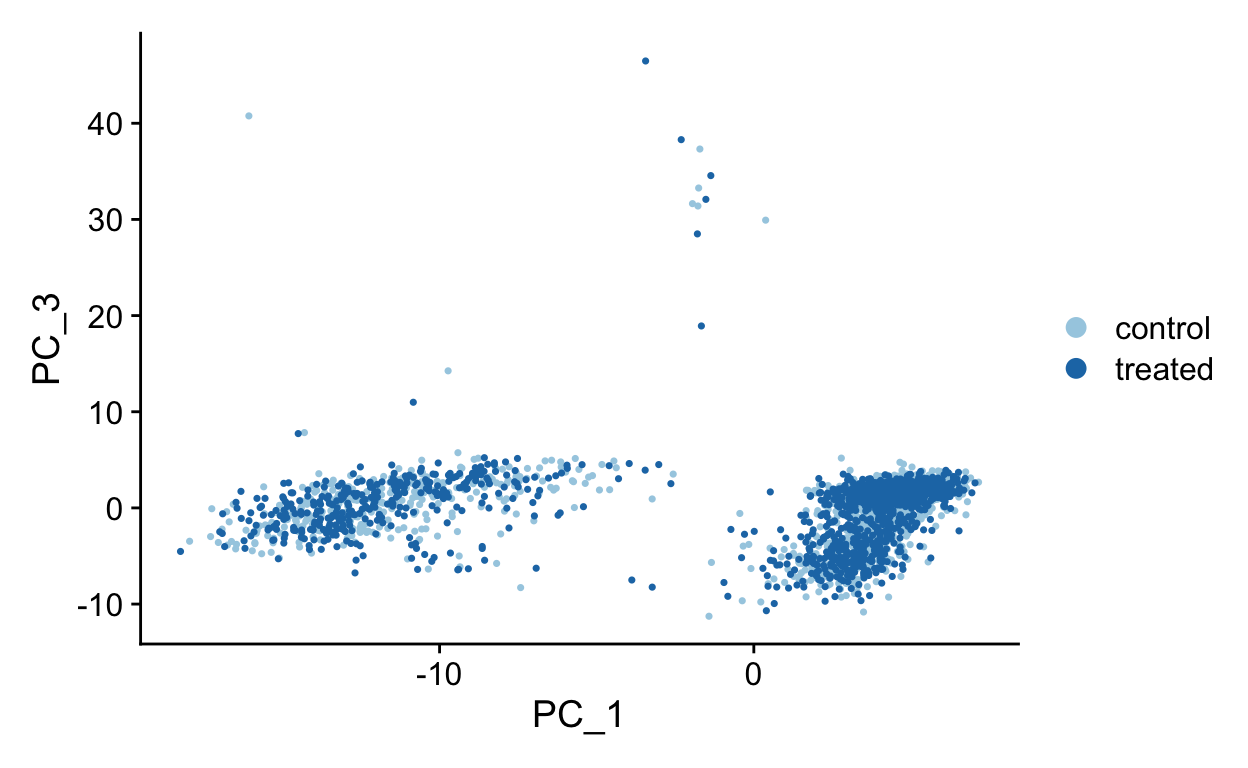
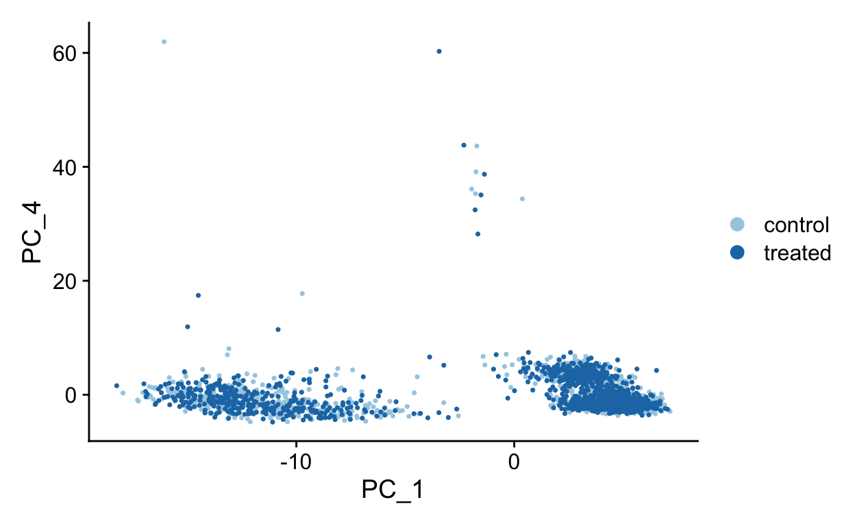
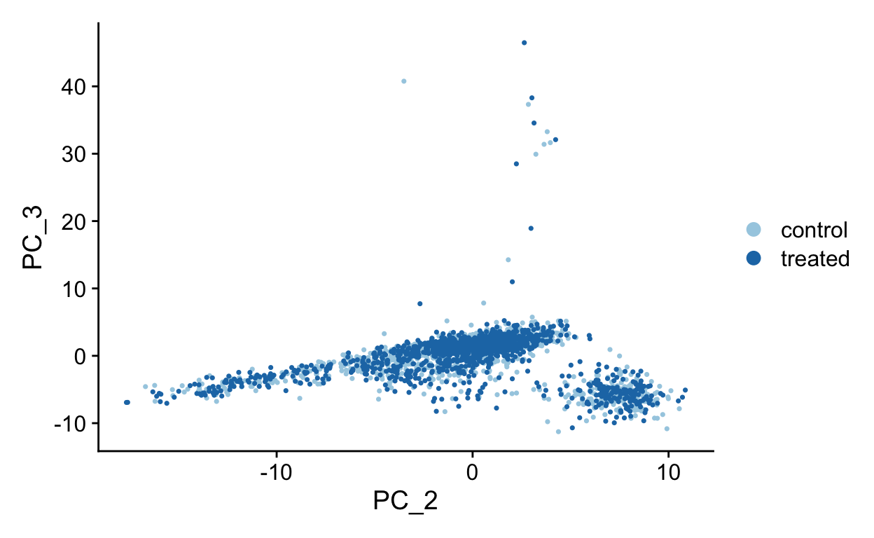
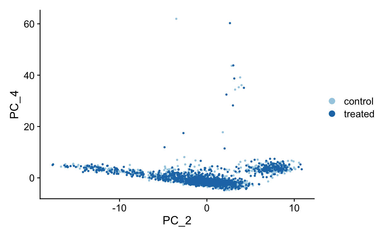
Shown in the tabs are 2 dimensional plots showing the principal component scores of cells.
pcs <- list(
  c(1, 2),
  c(1, 3),
  c(1, 4),
  c(2, 3),
  c(2, 4),
  c(3, 4)
)
for(i in seq_along(pcs)){
  cat('\n#### ', 'PC', pcs[[i]][1], ' vs PC', pcs[[i]][2], '\n', sep = "")
  p <- DimPlot(so,
          dims = pcs[[i]],
          reduction = "pca",
          cols = RColorBrewer::brewer.pal(10, "Paired"))
  print(p)
  cat('\n')
}
PC1 vs PC2
PC1 vs PC3
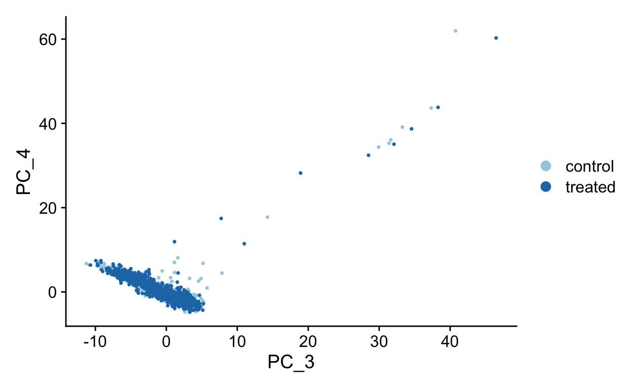
PC1 vs PC4
PC2 vs PC3
PC2 vs PC4
PC3 vs PC4
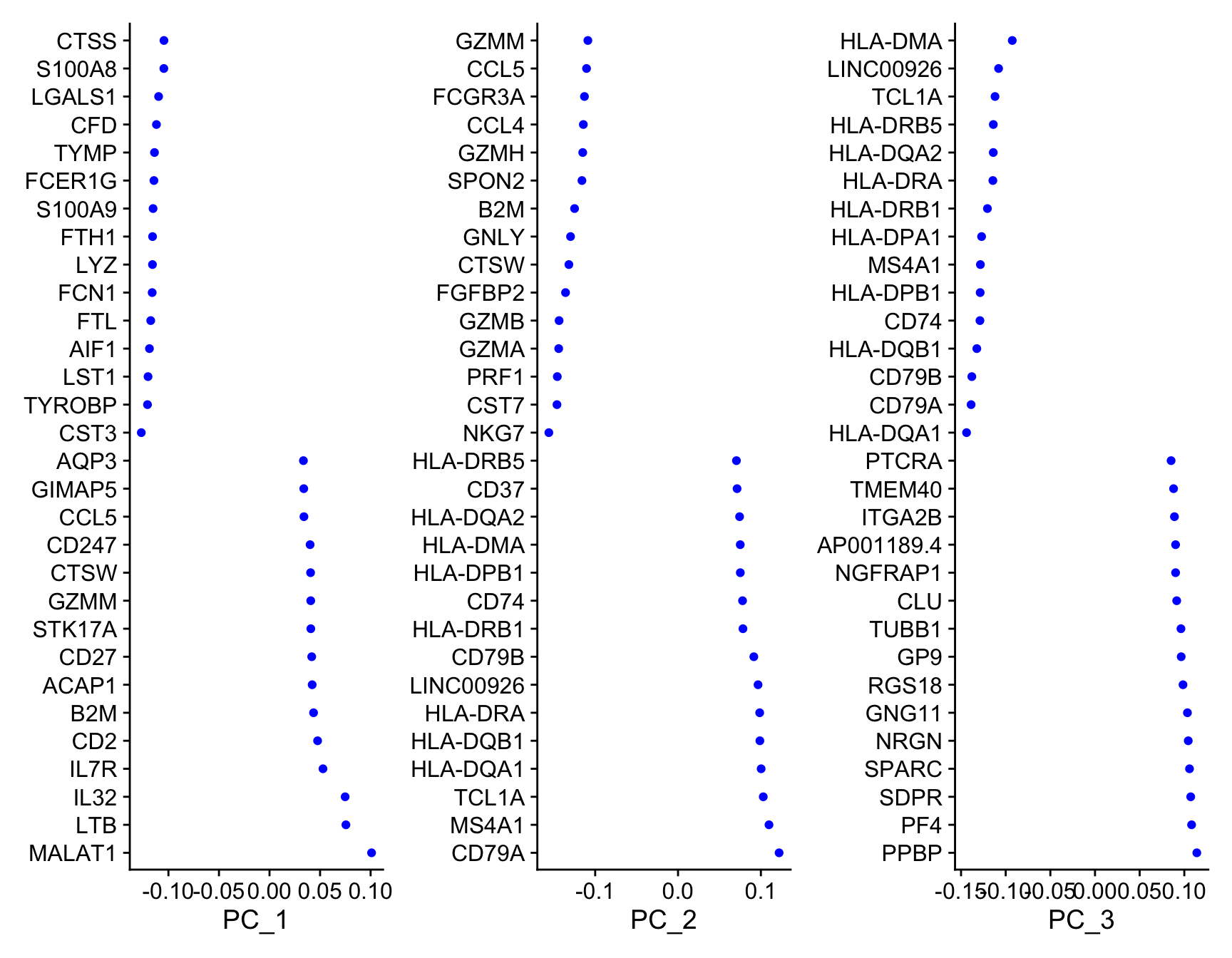
To see which genes are most strongly associated with the PCs you can use the VizDimLoadings function.
VizDimLoadings(object = so,
               dims = 1:3,
               balanced = TRUE,
               ncol = 3)
Finally, we can generate an ‘elbow plot’ of the standard deviation explained by each of the principle components.
ElbowPlot(so, ndims = 40)
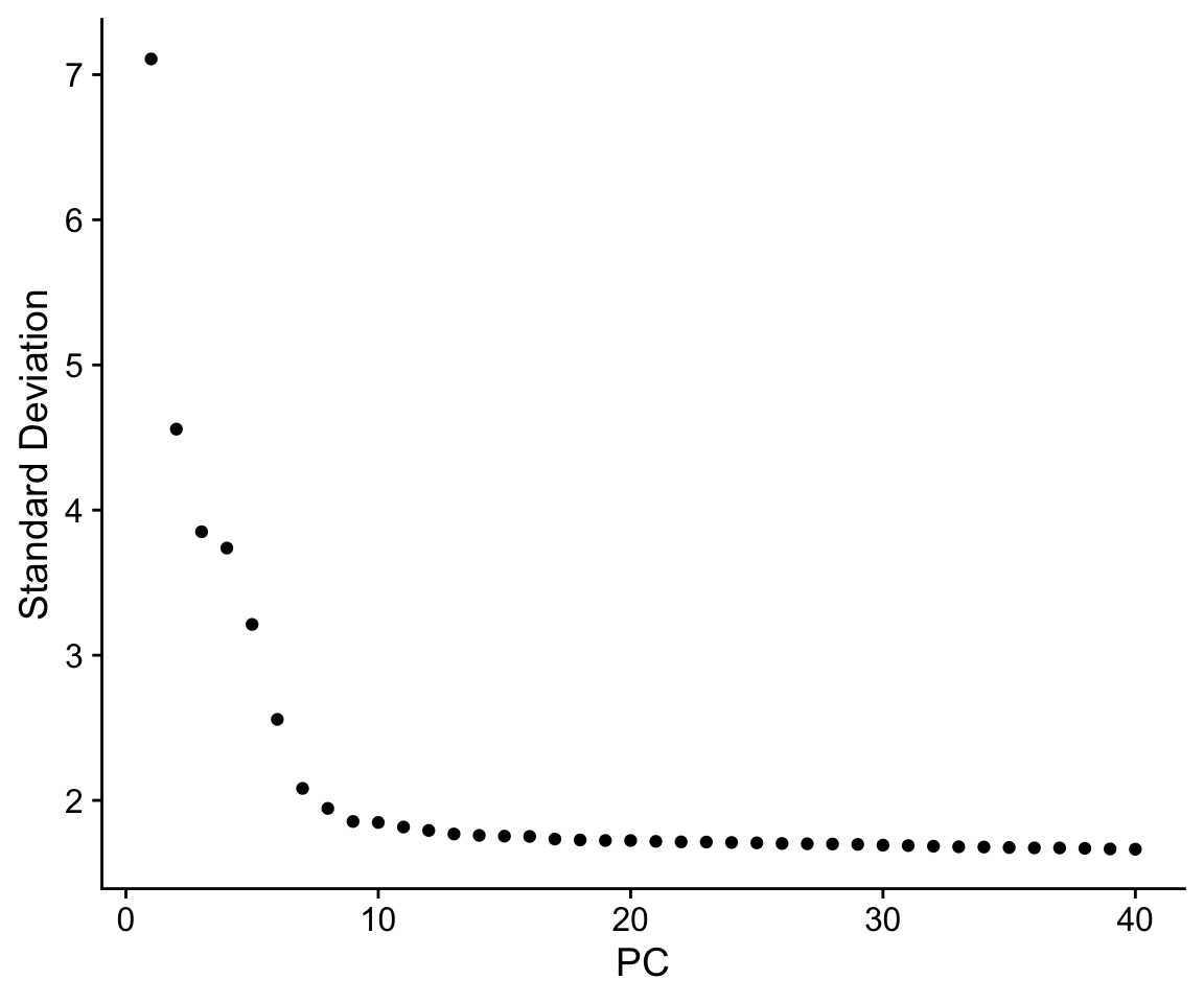
Note that most of the variation in the data is captured in a small number of PCs (< 20)
Early single cell studies simply used PCA to visualize single cell data, and by plotting the data in scatterplots reduced the dimensionality of the data to 2D. This is a fine approach for simple datasets, but often there is much more information present in higher principal components.
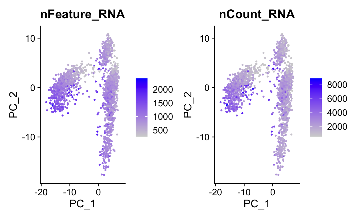
We can use PC1 and PC2 to begin to assess the structure of the dataset.
FeaturePlot(so,
            c("nFeature_RNA", "nCount_RNA"),
            reduction = "pca")
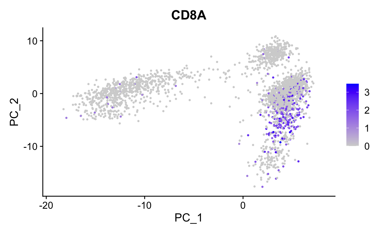
# Color by CD8, marker of CD8 t-cells
FeaturePlot(so,
            "CD8A",
            reduction = "pca")
Use wrapper functions for plotting to save some typing.
plot_pca <- function(sobj, features, ...){
FeaturePlot(sobj,
features,
reduction = "pca",
...)
}
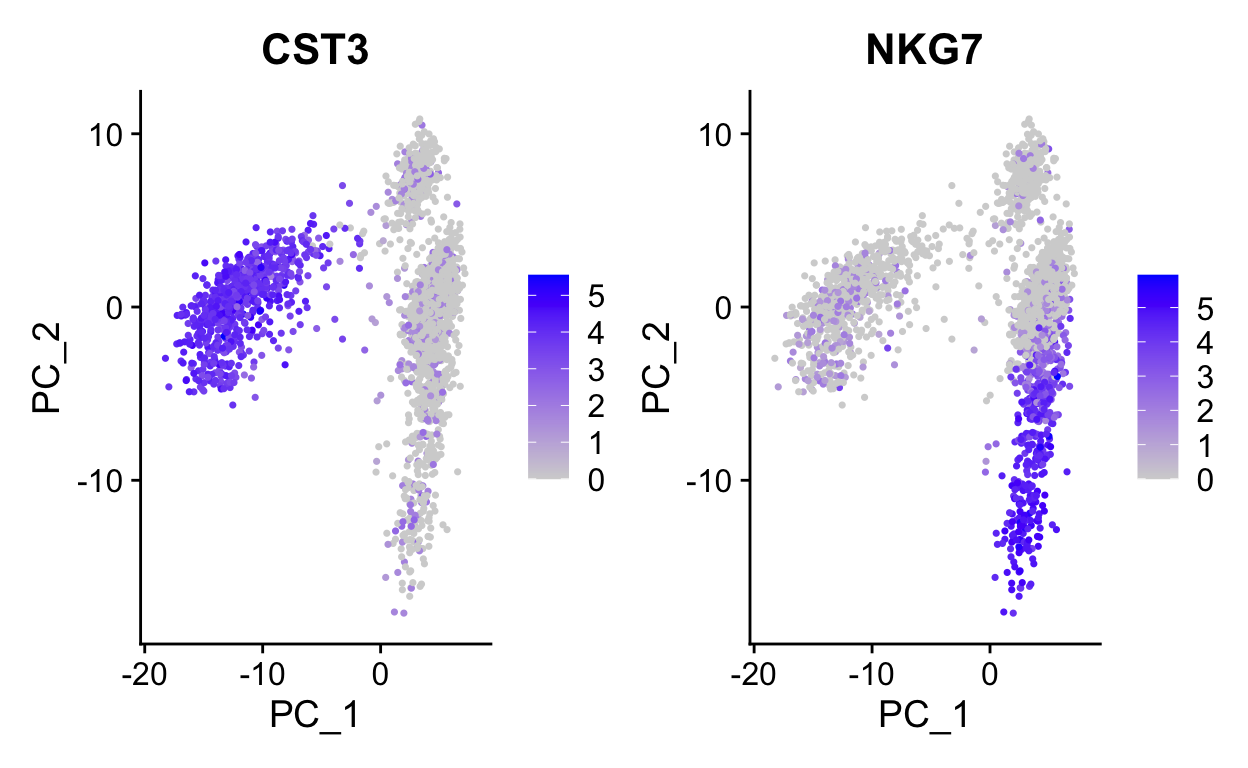
# Color by top genes associated with Pc1 and Pc2
plot_pca(so, c("CST3", "NKG7"))
# or use ggplot directly if need more custom viz
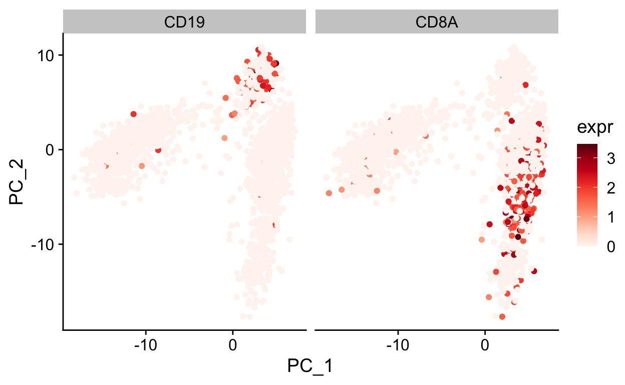
var_df <- FetchData(so, c("PC_1", "PC_2", "CD19", "CD8A")) %>%
gather(gene, expr, -PC_1, -PC_2)
ggplot(var_df, aes(PC_1, PC_2)) +
geom_point(aes(color = expr)) +
scale_color_gradientn(colours = RColorBrewer::brewer.pal(9, "Reds")) +
facet_grid(~gene) +
theme_cowplot()
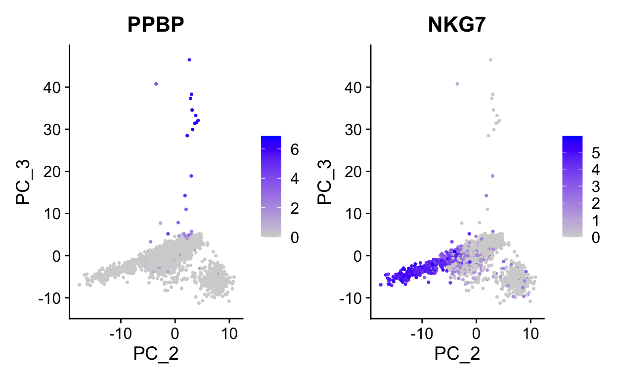
Note how other PCs separate different cell populations (PPBP is a marker of megakaryocytes).
UMAP
The first two dimensions of PCA are not sufficient to capture the variation in these data due to the complexity. However, PCA is useful in identifying a new set of dimensions (10-100) that capture most of the interesting variation in the data. This is useful because now with this reduced dataset we can use newer visualization technique to examine relationships between cells in 2 dimensions.
UMAP is a newer algorithm for projecting data in 2D (or higher) and has become very popular for single cell visualization. The UMAP algorithm derives from topological methods for data analysis, and is nicely described by the authors in the UMAP documentation.
Clustering single cell data
The PCA/UMAP/tSNE plots above indicate that there are likely different cell types present in the data as we can see clusters. Next we will formally cluster the dataset to assign cells to clusters. See this recent benchmarking paper for discussion of best clustering methods. Duo et al, 2018 A systematic performance evaluation of clustering methods for single-cell RNA-seq data
Graph based clustering methods are commonly used for single cell data, because they can scale to millions of cells, produce reasonable assignments, and have tunable parameters. The approach that is implemented in Seurat is performed as follows:
- construct a K-nearest (KNN) neighbor matrix.
- calculate shared nearest neighbors (SNN) using the jaccard index.
- use the Louvain community detection algorithm to assign clusters.
In Seurat the clustering is done using two functions:FindNeighbors which computes the KNN and SNN graphs, and FindClusters which finds clusters.
FindNeighbors calculates the KNN graph using the PCA matrix as input (or other dimensionality reductions).
so <- FindNeighbors(so,
reduction = "pca",
dims = 1:15,
k.param = 15)
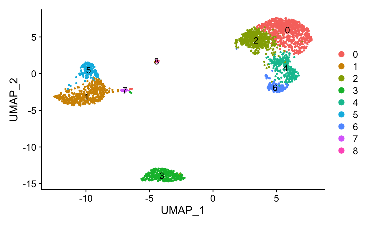
so <- FindClusters(so, resolution = 0.5, verbose = FALSE)
so$RNA_snn_res.0.5 %>% head()
AAACATACAACCAC-1 AAACATTGAGCTAC-1 AAACGCTGACCAGT-1 AAACGCTGGTTCTT-1
               0                3                4                4
AAAGTTTGATCACG-1 AAATCATGACCACA-1
               3                5
Levels: 0 1 2 3 4 5 6 7 8so$seurat_clusters %>% head()
AAACATACAACCAC-1 AAACATTGAGCTAC-1 AAACGCTGACCAGT-1 AAACGCTGGTTCTT-1
0 3 4 4
AAAGTTTGATCACG-1 AAATCATGACCACA-1
3 5
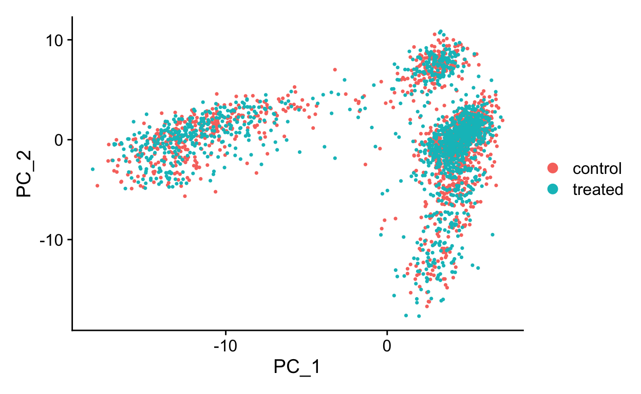
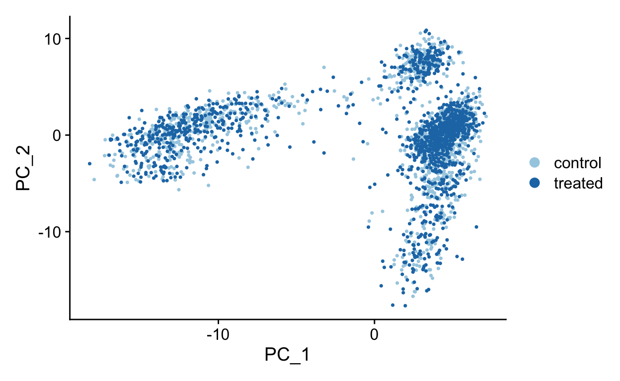
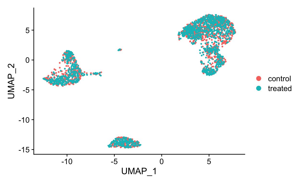
Levels: 0 1 2 3 4 5 6 7 8DimPlot(so, reduction = "umap", label = TRUE)
How many clusters?
Clustering algorithms produce clusters, even if there isn’t anything meaningfully different between cells. Determining the optimal number of clusters can be tricky and also dependent on the biological question.
Some guidelines:
Cluster the data into a small number of clusters to identify cell types, then recluster to generate additional clusters to define sub-populations of cell types.
To determine if the data is overclustered, examine differentially expressed genes between clusters. If the clusters have few or no differentially expressed genes then the data is overclustered. Similar clusters can be merged post-hoc if necessary as sometimes it is difficult to use one clustering approach for many diverse cell populations.
Assessing relationships between clusters
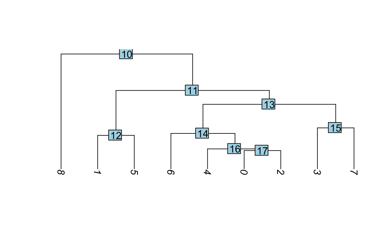
Hierarchical clustering can be used to visualize the relationships between clusters. The average expression of each cluster is computed then the distances between the clusters are used for hierarchical clustering.
Idents(so) <- "RNA_snn_res.0.5"
so <- BuildClusterTree(so)
PlotClusterTree(so)
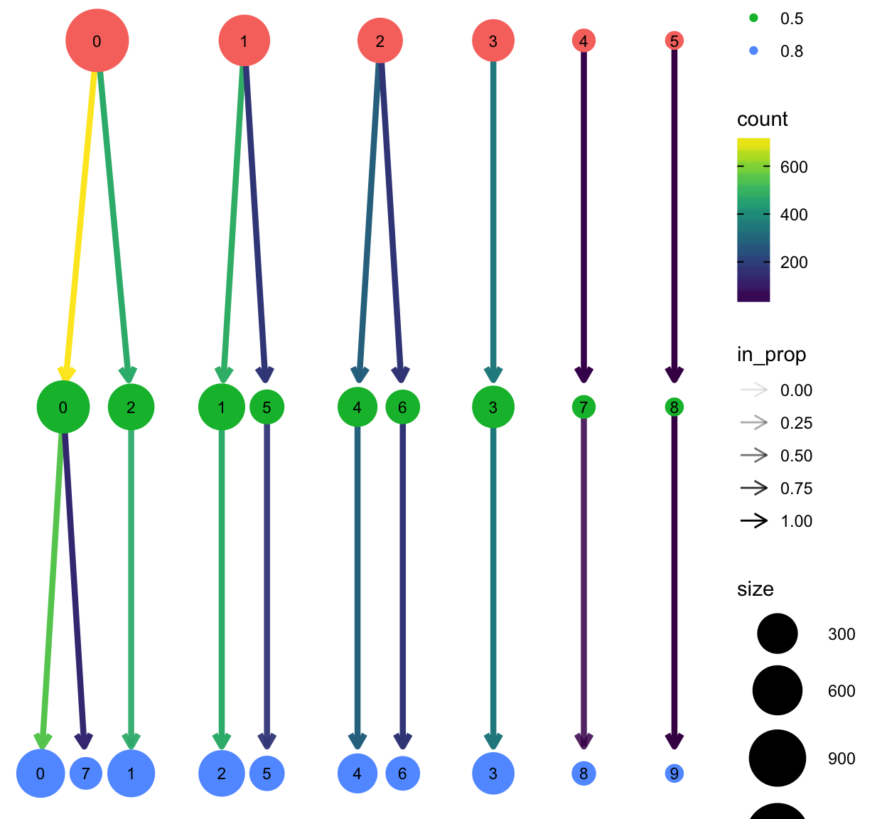
The clustree package provides a nice plotting utility to visualize the relationship of cells at different resolution settings.
library(clustree)
so <- FindClusters(so, resolution = 0.2, verbose = FALSE)
so <- FindClusters(so, resolution = 0.8, verbose = FALSE)
clustree(so)
Finally let’s define a meta data column as clusters as those generated with a resolution of 0.5 with 30 neighbors.
so$clusters <- so$RNA_snn_res.0.5
Save object and metadata
It’s always a good idea to store the cell metadata, particularly the clustering and projections, as these may change with reruns of the same data, for example if a package is updated or if the seed.use argument changes. Further down the road, when sequencing data is submitted to NCBI GEO, depositing metadata will help future bioinformaticians reproduce/reanalyze findings.
Finding markers and differential expression analysis
After clustering, differential expression testing (DE analysis, similar to bulk RNA-seq) finds gene signatures of each cluster/cell population, to give more insights into biology.
Many proposed methods
(In general, we recommend default “wilcox” or “t”, good balances between speed and accuracy)
In Seurat, we can use the FindAllMarkers() function, which will perform the wilcox.test() by default . Specifically, the function will iterate through each cluster, comparing the cells in one cluster to the cells in all of the other clusters. The test is run for every gene that is detectable above certain thresholds. The output is then filtered to identify significant genes with a positive fold-change (i.e. higher in abundance the cluster).
We recommend using the wilcoxauc() function from the presto package (installed from GitHub), which will do the same thing but in a (tiny) fraction of the time, due to implementation with C++ backend.
Important considerations
Keep things simple first and look at the results (try not integrating, not regressing), look at the output, and determine what variables need to be regressed out (batch, nCount_RNA, percent_mito, cell cycle, etc) during scaling (note this only affects dimension reduction and clustering).
Note that the p-values from these tests will be absurdly low (near or at 0). This is in part due to the large number of samples tested (e.g. each cell is considered a sample) but also due to the data being clustered based on the gene expression. Testing for differential expression between clusters will always result in some differentially expressed genes… because that’s what makes them different clusters in the first place, hence the logical is somewhat circular and result in inflated p-values. Nevertheless, we can use the p-values to rank the genes, but you shouldn’t just blindly trust that a p-value < 0.05 is something meaningful in single cell data.
Use normalized data for DE (slot is dependent on normalization method, also don’t use integrated assay)
Note that marker genes found is very dependent on clustering and the compared populations.
Find all markers for each cluster
FindAllMarkers compares cells in each cluster to all other cells in the dataset. Typically, focus is given to genes upregulated in each cluster, i.e. markers.
# Load clustered object if needed
# so <- readRDS(url("https://scrnaseq-workshop.s3.us-west-2.amazonaws.com/clustered_sobj.rds"))
# Also check/set ident to the desired comparison
Idents(so) %>% head()
AAACATACAACCAC-1 AAACATTGAGCTAC-1 AAACGCTGACCAGT-1 AAACGCTGGTTCTT-1
               0                3                4                4
AAAGTTTGATCACG-1 AAATCATGACCACA-1
               3                5
Levels: 0 1 2 3 4 5 6 7 8 9Idents(so) <- "clusters"
markers_df <- FindAllMarkers(so,
assay = "RNA", # be careful with sobj_sc and intergrated objects
slot = "data",
only.pos = TRUE)
markers_df %>% head()
              p_val avg_log2FC pct.1 pct.2     p_val_adj cluster
RPS12 1.687445e-141  0.7223366 1.000 0.991 2.121455e-137       0
RPL32 6.448401e-140  0.6191260 0.999 0.995 8.106930e-136       0
RPS27 1.489397e-137  0.7075273 0.999 0.992 1.872469e-133       0
RPS6  2.128866e-137  0.6546818 0.997 0.995 2.676410e-133       0
RPS25 2.281824e-132  0.7760917 0.999 0.974 2.868710e-128       0
RPS14 1.962082e-127  0.5966430 0.999 0.995 2.466730e-123       0
       gene
RPS12 RPS12
RPL32 RPL32
RPS27 RPS27
RPS6   RPS6
RPS25 RPS25
RPS14 RPS14
pct.1: fraction detected in the cluster in question, pct.2: fraction detected in the rest of the cells avg_logFC: expression comparison of the cluster in question (natural log, so exp(x) to reverse) vs rest of the cells
And save tables to disk with write_csv.
write_csv(markers_df, "data/allmarkers.csv")
markers_df <- read_csv("data/allmarkers.csv")
markers_df %>% head()
Consider the equivalent but faster way, using presto::wilcoxauc.
library(presto)
markers_presto <- wilcoxauc(so, "clusters") # give metadata column name
markers_presto %>% head() # also contains negative markers, how would you keep only the positive?
        feature group     avgExpr         logFC statistic       auc
1    AL627309.1     0 0.002306096 -0.0041467779    706481 0.4986579
2 RP11-206L10.2     0 0.002530023  0.0001246319    707925 0.4996771
3     LINC00115     0 0.005074268 -0.0077729488    704592 0.4973245
4         NOC2L     0 0.148937014 -0.0133363124    697980 0.4926576
5        KLHL17     0 0.002593014 -0.0026994222    706844 0.4989141
6       PLEKHN1     0 0.002349838 -0.0029621530    707202 0.4991668
       pval      padj    pct_in   pct_out
1 0.2862773 0.4893801 0.1386963 0.4071247
2 0.7310980 0.8510458 0.1386963 0.2035623
3 0.1321250 0.3025638 0.2773925 0.8142494
4 0.2516458 0.4484960 8.3217753 9.9745547
5 0.3602607 0.5645237 0.1386963 0.3562341
6 0.4531110 0.6544015 0.1386963 0.3053435
Find DE genes for specific cell groups
For more control in the comparisons, use FindMarkers.
# DE analysis for cluster 1 vs 2
markers_df2 <- FindMarkers(so,
                           assay = "RNA",
                           slot = "data",
                           ident.1 = "1",
                           ident.2 = "2",
                           test.use = "t")
markers_df2 %>% head()
p_val avg_log2FC pct.1 pct.2 p_val_adj
S100A9 0.000000e+00 6.277399 0.994 0.186 0.000000e+00
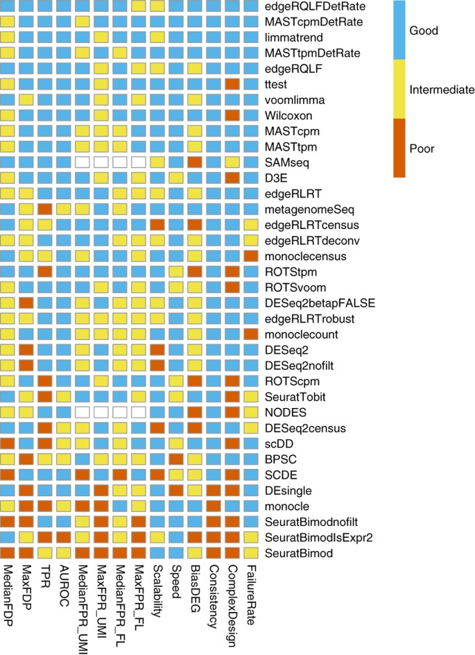
LYZ 0.000000e+00 5.498958 0.998 0.540 0.000000e+00
CST3 0.000000e+00 4.881313 0.992 0.220 0.000000e+00
TYROBP 0.000000e+00 5.076521 0.994 0.136 0.000000e+00
FTL 0.000000e+00 3.711881 1.000 0.992 0.000000e+00
FTH1 2.978166e-317 2.835164 1.000 0.994 3.744151e-313pct.1: fraction detected in the cells of ident.1, pct.2: fraction detected in the cells of ident.2 avg_logFC: expression comparison (natural log fold change) of ident.1 vs ident.2 (> 0 means higher in ident.1)
FindMarkers defaults to the current active ident. To use other value groups, set idents to the intended column, or use the group.by argument.
# Compare control vs treated in only cluster 1
markers_df3 <- FindMarkers(so,
                           assay = "RNA",
                           slot = "data",
                           subset.ident = "1", # <- if needed, subset on current ident first, then switch idents
                           group.by = "orig.ident", # <- grouping cells by this metadata column
                           ident.1 = "control",
                           ident.2 = "treated")
# More complicated example
# Compare cluster 1 control vs cluster 2 treated
# Make new metadata column for this need
so@meta.data$newid <- so@meta.data %>%
  mutate(newid = str_c(orig.ident, clusters, sep = "_")) %>%
  pull(newid)
markers_df4 <- FindMarkers(so,
                           assay = "RNA",
                           slot = "data",
                           group.by = "newid",
                           ident.1 = "control_1",
                           ident.2 = "treated_2")
Genes of interest can then be visualized as violin plots or feature plots.
# Violin plots
VlnPlot(so, "LYZ")
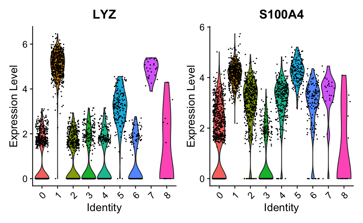
VlnPlot(so, "LYZ", split.by = "orig.ident", split.plot = TRUE)
# Project on UMAP
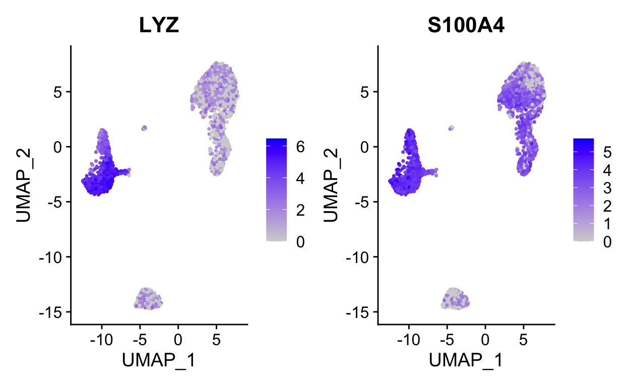
FeaturePlot(so, "LYZ")

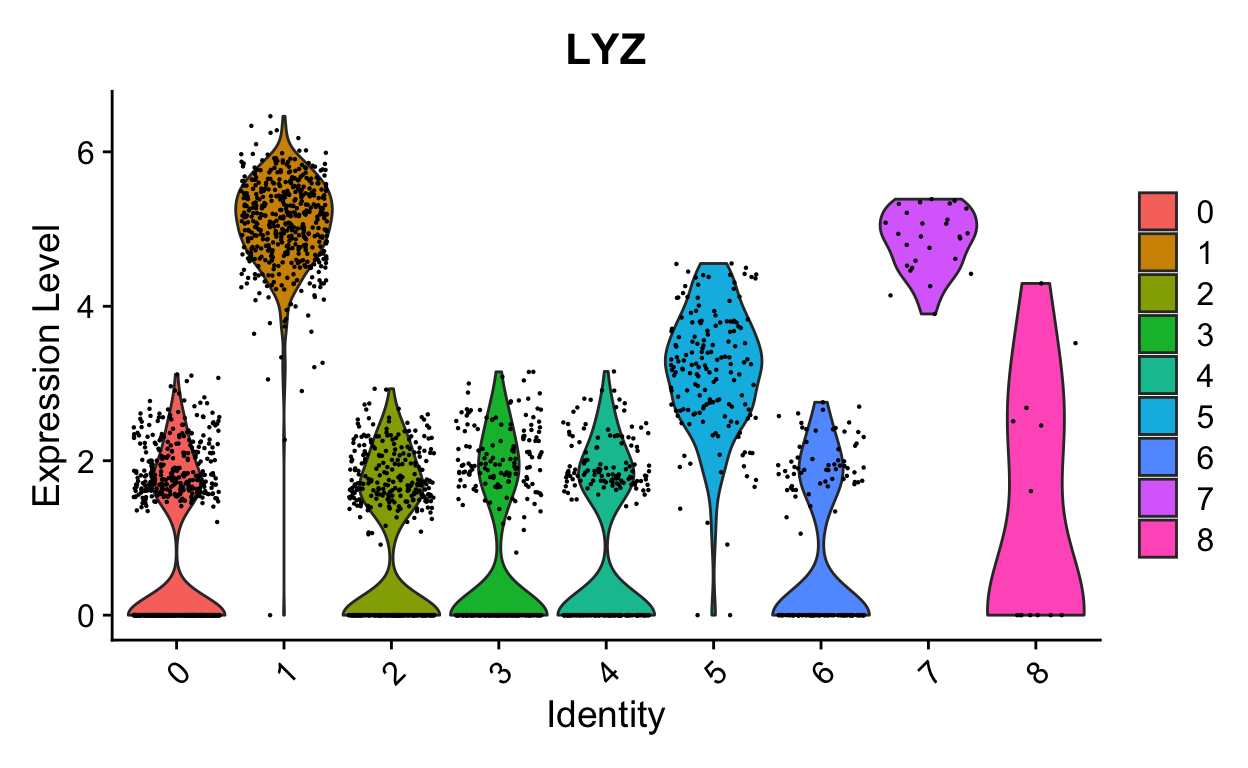
FeaturePlot(so, c("LYZ", "S100A4")) # can be a vector of gene names
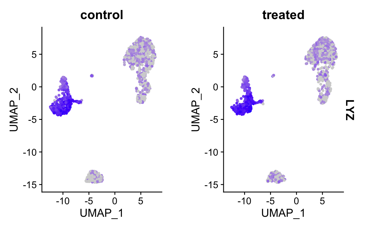
FeaturePlot(so, "LYZ", split.by = "orig.ident") # <- split into panels based on metadata column
Cluster identities
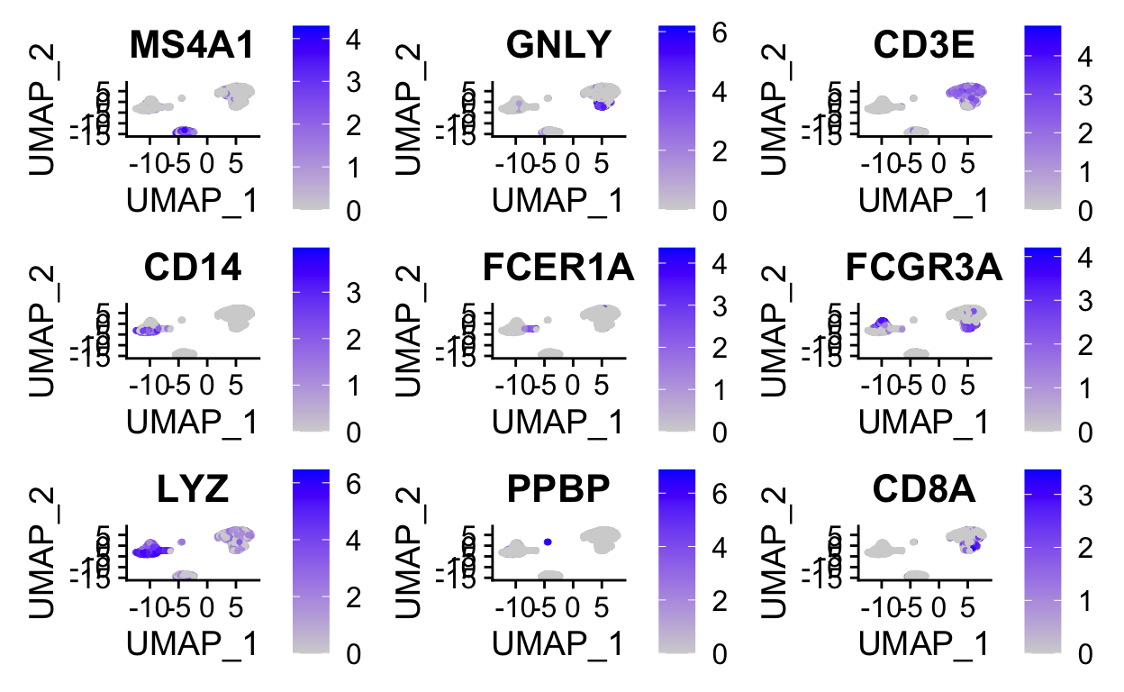
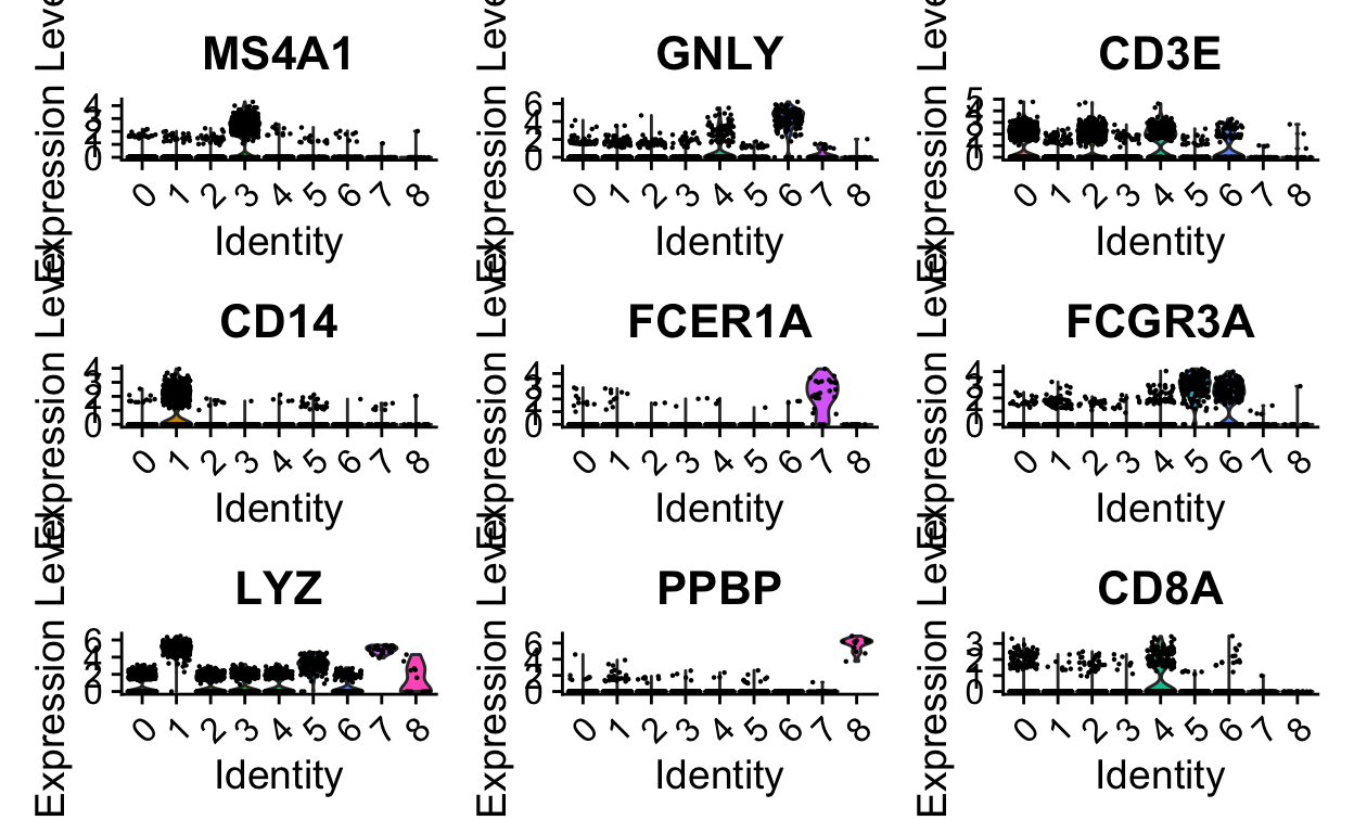
Without venturing into the realm of philosophical debates on what a “cell type” constitutes, standard practice is to use certain gene expression features to classify cells. This is often done manually, by visual inspection of key genes. Automated/less-biased approaches that utilize a broader range of features are currently being developed.
Manual inspection of key genes using expertise in the lab
FeaturePlot(so,
            features = c("MS4A1", "GNLY", "CD3E", "CD14", "FCER1A", "FCGR3A", "LYZ", "PPBP", "CD8A"),
            ncol = 3)
VlnPlot(so,
        features = c("MS4A1", "GNLY", "CD3E", "CD14", "FCER1A", "FCGR3A", "LYZ", "PPBP", "CD8A"),
        ncol = 3)
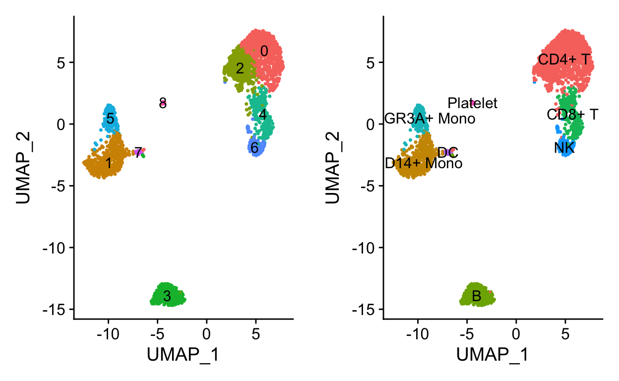
a <- DimPlot(so, label = TRUE) + NoLegend()
# Use RenameIdents to remap the idents from the current IDs to the new IDs
so <- RenameIdents(so,
                   "0" = "CD4+ T",
                   "1" = "CD14+ Mono",
                   "2" = "CD4+ T",
                   "3" = "B",
                   "4" = "CD8+ T",
                   "5" = "FCGR3A+ Mono",
                   "6" = "NK",
                   "7" = "DC",
                   "8" = "Platelet")
# Plot UMAP with new cluster IDs
b <- DimPlot(object = so,
             label = TRUE) +
  NoLegend()
cowplot::plot_grid(a,b)
# Remember to save the new idents into meta.data
so <- StashIdent(object = so, save.name = "cluster_name")
Towards a (or 20) more automated approach of identity assignment
Using
Seurat, inference from previous Seurat object (requires very similar Seurat object), see Seurat Integration Vignette for more details.Using other classification packages such as
clustifyr(disclosure: developed by the RBI).
clustifyr works by comparing the average gene expression in each cluster to a reference matrix that contains average gene signatures of reference cell types. The reference can be built from other single cell data, bulk rna-seq, microarray data, or other sources. Ranked Spearman correlation is used to compare the reference to the clusters. Only the highly variable genes are used for the correlation.
cell type composition
Insight into different samples can be gained from the proportion of cells that fall into each cell type.
tab1 <- so@meta.data %>%
  group_by(orig.ident, cluster_name) %>%
  tally() # counting up all combinations
tab1
# A tibble: 16 x 3
# Groups:   orig.ident [2]
   orig.ident cluster_name     n
   <fct>      <fct>        <int>
 1 control    CD4+ T         586
 2 control    CD14+ Mono     241
 3 control    B              176
 4 control    CD8+ T         155
 5 control    FCGR3A+ Mono    83
 6 control    NK              74
 7 control    DC              12
 8 control    Platelet         7
 9 treated    CD4+ T         613
10 treated    CD14+ Mono     247
11 treated    B              174
12 treated    CD8+ T         125
13 treated    FCGR3A+ Mono    84
14 treated    NK              88
15 treated    DC              15
16 treated    Platelet         6
tab2 <- tab1 %>% pivot_wider(names_from = cluster_name, values_from = n) # spread out "long" into "wide" form
tab2
# A tibble: 2 x 9
# Groups:   orig.ident [2]
  orig.ident `CD4+ T` `CD14+ Mono`     B `CD8+ T` `FCGR3A+ Mono`    NK
  <fct>         <int>        <int> <int>    <int>          <int> <int>
1 control         586          241   176      155             83    74
2 treated         613          247   174      125             84    88
# … with 2 more variables: DC <int>, Platelet <int>
tab3 <- tab1 %>% group_by(orig.ident) %>%
mutate(n = n/sum(n)) %>% # convert counts to proportions first
pivot_wider(names_from = cluster_name, values_from = n)
tab3
# A tibble: 2 x 9
# Groups:   orig.ident [2]
  orig.ident `CD4+ T` `CD14+ Mono`     B `CD8+ T` `FCGR3A+ Mono`
  <fct>         <dbl>        <dbl> <dbl>    <dbl>          <dbl>
1 control       0.439        0.181 0.132   0.116          0.0622
2 treated       0.453        0.183 0.129   0.0925         0.0621
# … with 3 more variables: NK <dbl>, DC <dbl>, Platelet <dbl>
Other things to do with marker genes
Gene list to pathway activity score, via
Seurat::AddModuleScoreorAUCellIf TF expression is too low for detection, consider
SCENICfor TF activity inferenceStandard GO term enrichment tools
gProfiler2,enrichR,fgsea, etc