This script walks though the steps to correct batch effects and find pseudotemporal relationships between single cells.
Please download the raw Rmarkdown from github
show
# Load packages
library(Seurat)
library(cowplot)
library(knitr)
library(tidyverse)
library(LaCroixColoR)
library(viridis)
library(RColorBrewer)
library(harmony)
library(slingshot)
library(ggridges)
library(tradeSeq)
library(pheatmap)
library(here)

# Set theme
ggplot2::theme_set(ggplot2::theme_classic(base_size = 10))

base_dir <- here()
Description of data
We will use two datasets today. The first is associated with the publication “Single-cell RNA sequencing of murine islets shows high cellular complexity at all stages of autoimmune diabetes”. In this publication, the authors were trying to characterize the immune cell response during onset of diabetes in nonobese diabetic (NOD) mice. NOD mice are an autoimmune model for Type 1 diabetes where T cells lead the destruction of insulin producing Beta cells. To characterize the development of diabetes, they performed a timecourse experiment looking at immune cells in the pancreatic islet at 4 weeks, 8 weeks, and 15 weeks of age.
4 wk is about the first time that the first infiltrating T cells can be identified; 8 wk represents a time when leukocyte infiltration is prominent in most islets, still with no evidence of dysglycemia; and 15 wk is just before the time when clinical diabetes becomes evident.
To further complicate their design, samples were processed in two batches, the first batch contained one 4 week, one 8 week, and one 15 week sample. The second batch contained one 4 week and one 8 week sample.
We will start with just one of the 4 week samples from this dataset. The others we will include when we look at pseudotime.
The second dataset is from the paper “Single-cell transcriptome analysis defines heterogeneity of the murine pancreatic ductal tree”. They isolated all islet and ductal cells, so some of the cells overlap with the first dataset and some do not. We will use all cells for this analysis.
Download the files (Just an example, don’t run today)
All of the timecourse samples were downloaded here. This group uploaded all of the filtered csv files from cellranger for each sample. These will be downloaded if you download the GSE141784_RAW.tar file. I have alread downloaded these files for you and ran basic filtering and aligning with the provided metadata using the code below. You do not need to run anything in this section, it is just provided so you can see all of the steps to process this data.
show
################################## DO NOT RUN ##################################
# This function will create a seurat object, filter to the cells used in the
# publication and add in the provided meta data.
make_seurat <- function(sample_list){
  print(sample_list[["sample_full"]])
  sample_counts <- Read10X(file.path(data_dir, "raw_data",
                               sample_list["sample_full"]))

  sample_object <- CreateSeuratObject(counts = sample_counts,
                                      project = sample_list["sample_full"],
                                      min.cells = 5)

  # Subset meta data to only the current sample
  meta_data_short <- meta_data %>%
    filter(Sample == sample_list["sample"] & Batch == sample_list["batch"])

  # Change the barcode to match each sample pre-merging
  meta_data_short$Barcode <- sub(pattern = "-[0-9]", replacement = "-1",
                                 meta_data_short$Barcode)

  # Subset to only cells in meta data
  sample_object <- subset(sample_object, cells = meta_data_short$Barcode)

  # Check if identical
  print(identical(meta_data_short$Barcode, colnames(sample_object)))

  rownames(meta_data_short) <- meta_data_short$Barcode

  sample_object <- AddMetaData(sample_object, metadata = meta_data_short)

  # Add mitochondrial percent
  sample_object[["percent.mt"]] <- PercentageFeatureSet(sample_object,
                                                    pattern = "^mt-")

  sample_object <- CellCycleScoring(sample_object,
                                  s.features = s.genes,
                                  g2m.features = g2m.genes,
                                  set.ident = FALSE)


  # Normalize
  sample_object <- NormalizeData(sample_object) %>%
    FindVariableFeatures() %>%
    ScaleData()
  return(sample_object)
}

# Set directories
base_dir <- here()

data_dir <- file.path(base_dir, "data")

# Read in meta data
meta_data <- read.table(file.path(data_dir,
                                  "GSE141784_Annotation_meta_data.txt"),
                        header = T)
# Set sample information
sample_list <- list(
  c(sample_full = "NOD_15w_2734", sample = "NOD_15w", batch = 2734),
  c(sample_full = "NOD_4w_2734", sample = "NOD_4w", batch = 2734),
  c(sample_full = "NOD_4w_2849", sample = "NOD_4w", batch = 2849),
  c(sample_full = "NOD_8w_2734", sample = "NOD_8w", batch = 2734),
  c(sample_full = "NOD_8w_2849", sample = "NOD_8w", batch = 2849))

# Cell cycle genes (taken from seurat cc.genes and translated to mouse genes)
s.genes <- c("Exo1", "Mcm4", "Msh2", "Gmnn", "Chaf1b", "Mcm2", "Rrm2",
             "Rad51ap1", "Gins2", "Hells", "Cdc6", "Ubr7", "Cdc45", "Fen1",
             "Rpa2", "Slbp", "Uhrf1", "Ung", "Mcm5", "Dtl", "Casp8ap2",
             "Wdr76", "Nasp", "Prim1", "Cdca7", "Clspn", "Pola1", "Mcm6",
             "Blm", "Dscc1", "Usp1", "Tipin", "Rfc2", "Brip1", "Rrm1",
             "Rad51", "Tyms", "Ccne2", "E2f8", "Pcna")
g2m.genes <- c("Ctcf", "Smc4", "Dlgap5", "Cdc25c", "Gtse1", "Kif20b", "Ncapd2",
               "Ttk", "G2e3", "Lbr",  "Cks1brt", "Cdca2", "Tacc3", "Anp32e",
               "Cdca3", "Ckap2", "Cks2", "Hmgb2", "Top2a", "Tpx2", "Kif23",
               "Rangap1", "Psrc1", "Cks1b", "Aurkb", "Hmmr", "Cenpf", "Birc5",
               "Cdca8", "Ckap5", "Kif2c", "Kif11", "Hjurp", "Cenpe", "Nuf2",
               "Ndc80", "Nek2", "Cdc20", "Ect2", "Anln", "Tubb4b", "Bub1",
               "Aurka", "Ckap2l", "Ccnb2", "Nusap1", "Mki67", "Ube2c", "Cenpa")

# Make a list of seurat objects
seurat_list <- lapply(sample_list, make_seurat)
The files associated with the second can be downloaded here. This group only uploaded their output files from 10x genomics, so I remade the object, performed the initial steps of analysis and identified celltypes by looking for clusters that shared the most marker genes with each of their identified cell types.
Download the files
I have already created processed Seurat objects that we will use today. This processing included finding mitochondrial percents, creating a cell cycle score, normalizing the data, finding variable genes, and scaling the data. We will skip this today, but all steps are shown in the code segment above. We can use the code below to create a “data” directory (folder) and download the files into it.
show
## Make a data directory only if it doesn't already exist
ifelse(!dir.exists(file.path(base_dir, "data")),
       dir.create(file.path(base_dir, "data")), FALSE)
[1] FALSEshow
## DOWNLOAD FILES if they haven't already been downloaded

ifelse(!file.exists(file.path(base_dir, "data", "NOD_4w_2734.rda")),
       download.file(
  url = "http://amc-sandbox.ucdenver.edu/User60/single_cell_workshop/NOD_4w_2734.rda",
              destfile = file.path(base_dir, "data", "NOD_4w_2734.rda")),
  FALSE)
[1] FALSEshow
ifelse(!file.exists(file.path(base_dir, "data", "hendley_seurat.rda")),
       download.file(
  url = "http://amc-sandbox.ucdenver.edu/User60/single_cell_workshop/hendley_seurat.rda",
              destfile = file.path(base_dir, "data", "hendley_seurat.rda")),
  FALSE)
[1] FALSERead in the files
Integration of samples
Before we integrate samples, we first need to decide if there is a batch effect that we need to worry about. To do this, I first merge all of the samples together and use a few quick plots.
Merge the files
We can take this list and pass it to the merge function from Seurat. This function takes one seurat object as x and a list of Seurat objects for y. This function automatically merges the data slots, so we won’t need to repeat normalization. We can see other options by typing ?merge
show
# merge objects
seurat_merge <- merge(x = seurat_object,
                      y = seurat_two)
Let’s now look at this new object
show
print(seurat_merge)
An object of class Seurat
18788 features across 16846 samples within 1 assay
Active assay: RNA (18788 features, 0 variable features)
You can see that we no longer have variable features, so we will need to find new variable features and rescale the data
show
# Remeber if you want to regress out any variables, you can do that using ScaleData
seurat_merge <- FindVariableFeatures(seurat_merge) %>%
  ScaleData()
We also will need to repeat PCA and UMAP
show
# It's best to set a seed before running UMAP
set.seed(0)
seurat_merge <- RunPCA(seurat_merge) %>%
  FindNeighbors(dims = 1:30) %>%
  FindClusters(resolution = 0.8) %>%
  RunUMAP(dims = 1:30, assay = "RNA")
Modularity Optimizer version 1.3.0 by Ludo Waltman and Nees Jan van Eck

Number of nodes: 16846
Number of edges: 662672

Running Louvain algorithm...
Maximum modularity in 10 random starts: 0.9215
Number of communities: 31
Elapsed time: 2 seconds
Check for batch
Now we should check if any sort of batch correction is necessary. Let’s check by dataset. The dataset is stored as orig.ident in the object
orig.ident nCount_RNA nFeature_RNA
AAACGGGAGGAGTTTA-1_1 NOD_4w_2734 755 424
AACCGCGAGGAGTAGA-1_1 NOD_4w_2734 1044 559
ACATACGGTCGCATCG-1_1 NOD_4w_2734 686 465
AGGCCACTCAAGGCTT-1_1 NOD_4w_2734 2019 994
AGTGGGAAGGGAACGG-1_1 NOD_4w_2734 1168 607
ATCATCTCAATCGGTT-1_1 NOD_4w_2734 779 393
Barcode Cells Sample Batch Library
AAACGGGAGGAGTTTA-1_1 AAACGGGAGGAGTTTA-1 Bcell NOD_4w 2734 6
AACCGCGAGGAGTAGA-1_1 AACCGCGAGGAGTAGA-1 Bcell NOD_4w 2734 6
ACATACGGTCGCATCG-1_1 ACATACGGTCGCATCG-1 Bcell NOD_4w 2734 6
AGGCCACTCAAGGCTT-1_1 AGGCCACTCAAGGCTT-1 Bcell NOD_4w 2734 6
AGTGGGAAGGGAACGG-1_1 AGTGGGAAGGGAACGG-1 Bcell NOD_4w 2734 6
ATCATCTCAATCGGTT-1_1 ATCATCTCAATCGGTT-1 Bcell NOD_4w 2734 6
percent.mt S.Score G2M.Score Phase
AAACGGGAGGAGTTTA-1_1 2.913907 -0.009980040 -0.015109121 G1
AACCGCGAGGAGTAGA-1_1 3.065134 0.034031936 0.030183982 S
ACATACGGTCGCATCG-1_1 3.498542 0.065019960 0.148715782 G2M
AGGCCACTCAAGGCTT-1_1 3.268945 0.129091816 0.235910145 G2M
AGTGGGAAGGGAACGG-1_1 3.595890 0.003709248 -0.001416123 S
ATCATCTCAATCGGTT-1_1 1.412067 0.015019960 0.013133401 S
RNA_snn_res.0.8 seurat_clusters RNA_cluster
AAACGGGAGGAGTTTA-1_1 2 2 <NA>
AACCGCGAGGAGTAGA-1_1 9 9 <NA>
ACATACGGTCGCATCG-1_1 12 12 <NA>
AGGCCACTCAAGGCTT-1_1 12 12 <NA>
AGTGGGAAGGGAACGG-1_1 9 9 <NA>
ATCATCTCAATCGGTT-1_1 2 2 <NA>
pANN_0.25_0.05_478
AAACGGGAGGAGTTTA-1_1 NA
AACCGCGAGGAGTAGA-1_1 NA
ACATACGGTCGCATCG-1_1 NA
AGGCCACTCAAGGCTT-1_1 NA
AGTGGGAAGGGAACGG-1_1 NA
ATCATCTCAATCGGTT-1_1 NA
DF.classifications_0.25_0.05_478 Doublet_finder
AAACGGGAGGAGTTTA-1_1 <NA> <NA>
AACCGCGAGGAGTAGA-1_1 <NA> <NA>
ACATACGGTCGCATCG-1_1 <NA> <NA>
AGGCCACTCAAGGCTT-1_1 <NA> <NA>
AGTGGGAAGGGAACGG-1_1 <NA> <NA>
ATCATCTCAATCGGTT-1_1 <NA> <NA>
RNA_snn_res.0.4
AAACGGGAGGAGTTTA-1_1 <NA>
AACCGCGAGGAGTAGA-1_1 <NA>
ACATACGGTCGCATCG-1_1 <NA>
AGGCCACTCAAGGCTT-1_1 <NA>
AGTGGGAAGGGAACGG-1_1 <NA>
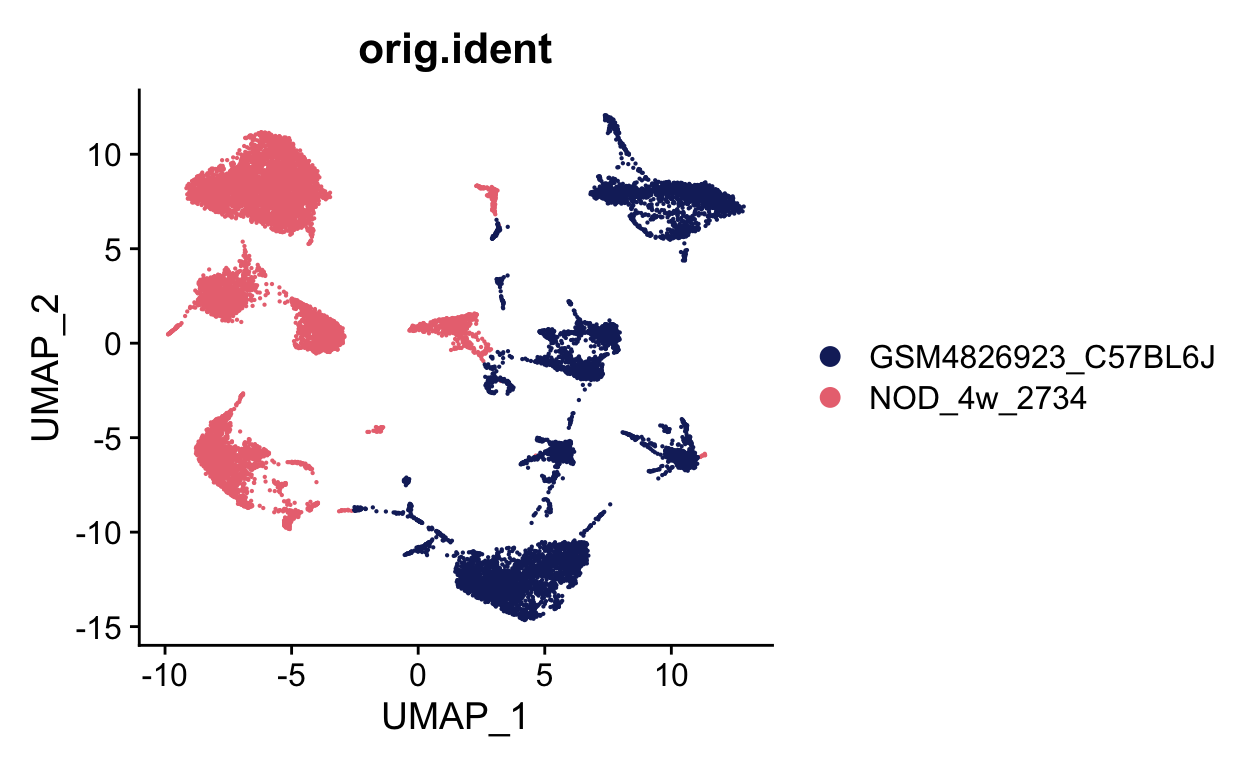
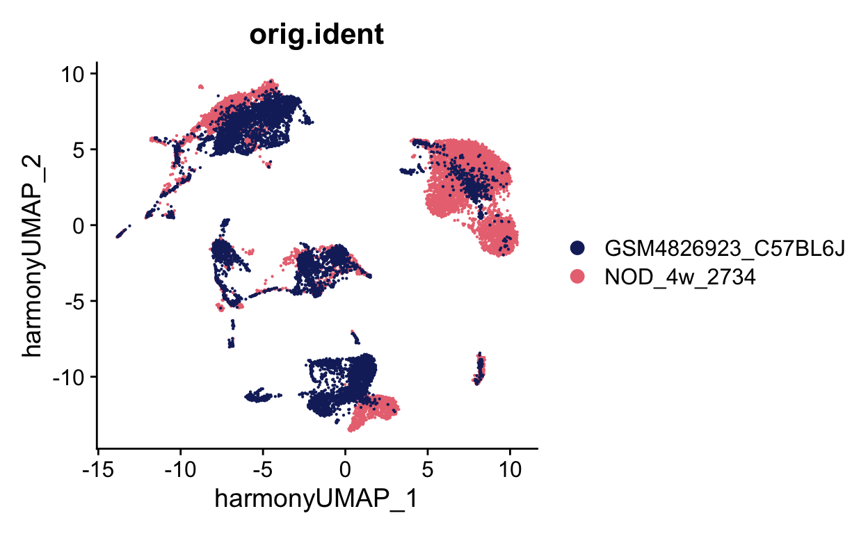
ATCATCTCAATCGGTT-1_1 <NA>We can now plot to see if these look different, which they do. In samples with bad batch effects, like these two samples, no cells will overlap. You can see that the samples almost are a mirror image of each other.
show
batch_colors <- LaCroixColoR::lacroix_palette("Pamplemousse", 2)
names(batch_colors) <- unique(seurat_merge$orig.ident)

DimPlot(seurat_merge, group.by = "orig.ident", cols = batch_colors)
These two datasets are interesting because they contain some, but not all, of the same celltypes
                       Bcell                          CD4
                          25                          283
                         CD8                          cDC
                         148                          200
     Contamination_Endocrine          Contamination_Neutr
                          31                            1
Contamination_Red_blood_cell                           EC
                           8                         5206
                         gdT                         ILC2
                          10                            7
                         Mac                  Mesenchymal
                        1711                         1193
                          NK                          NKT
                          26                           58
                         pDC             Undefined_Stroma
                          84                           28
                  Bcell                     CD4
                    624                     681
                    CD8                     cDC
                    566                     305
           Ductal_cells                      EC
                   2073                     611
            Fibroblasts Germinal_center_B_cells
                     73                     232
                    Mac                     pDC
                   2533                      21
            Plasma_cell                 unknown
                     86                      22
show
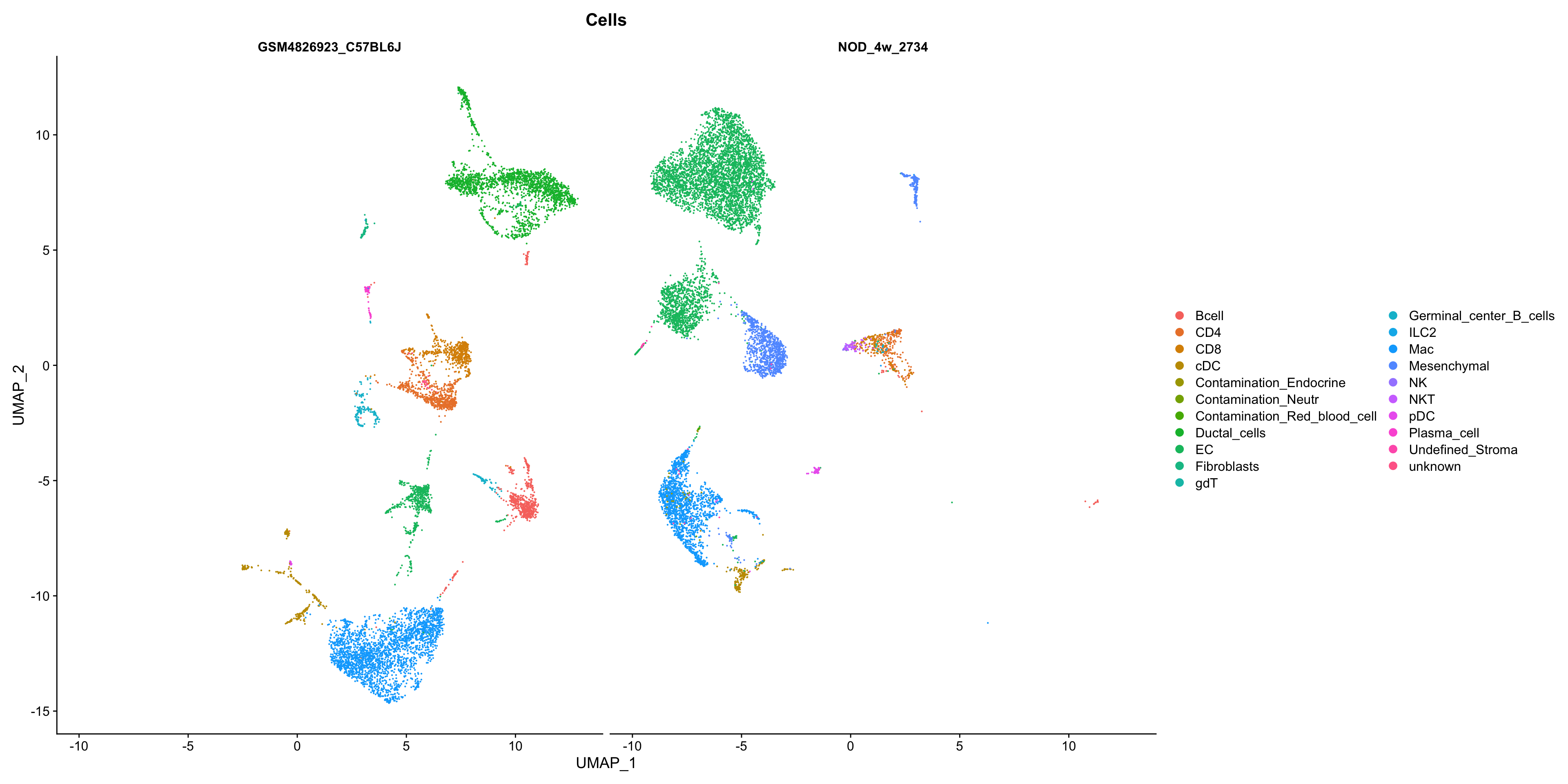
DimPlot(seurat_merge, group.by = "Cells", split.by = "orig.ident",
        reduction = "umap")
Correct the batch
I personally first use harmony as my batch correction tool. There are some really nice benchmarking papers for batch correction that can give you more information on the best tool to use.
Harmony works by weakly clustering cells and then calculating - and iteratively refining - a dataset correction factor for each cluster. Note that Harmony only computes a new corrected dimensionality reduction - it does not calculate corrected expression values (the raw.data, data and scale.data slots are unmodified). This works well for most datasets, but can be be insufficient for downstream differential expression analyses in extremely divergent samples.
Actually running harmony with a seurat object is quite simple, you just use a function called RunHarmony. We can see the inputs to this function by using ?RunHarmony
We will use plot_convergence = TRUE so that we can ensure each iteration improves
show
# Here we use "orig.ident", but we can use anything from the meta data
seurat_merge <- RunHarmony(object = seurat_merge,
                           group.by.vars = "orig.ident",
                           plot_convergence = TRUE)
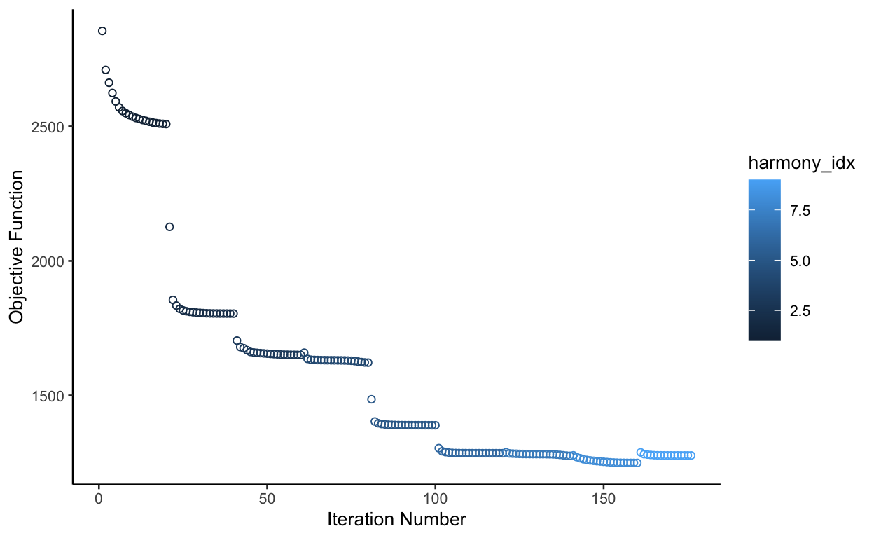
The objective function should be continuously improving. In this case, it’s not perfect, but probably good enough. I recomend changing the theta parameter if the function gets severely worse in later itearation.
The returned object now has a new dimensional reduction called harmony.
show
print(seurat_merge)
An object of class Seurat
18788 features across 16846 samples within 1 assay
Active assay: RNA (18788 features, 2000 variable features)
 3 dimensional reductions calculated: pca, umap, harmony
We can use this to rerun our UMAP. I like to use a reduction key for my umap so I remember that it was made with harmony
show
set.seed(0)
seurat_merge <- FindNeighbors(seurat_merge,
                              dims = 1:30, reduction = "harmony") %>%
  FindClusters(resolution = 0.8) %>%
  RunUMAP(dims = 1:30, assay = "RNA", reduction = "harmony",
          reduction.key = "harmony.UMAP_", reduction.name = "harmony.umap")
Modularity Optimizer version 1.3.0 by Ludo Waltman and Nees Jan van Eck
Number of nodes: 16846
Number of edges: 662316
Running Louvain algorithm...
Maximum modularity in 10 random starts: 0.9062
Number of communities: 31
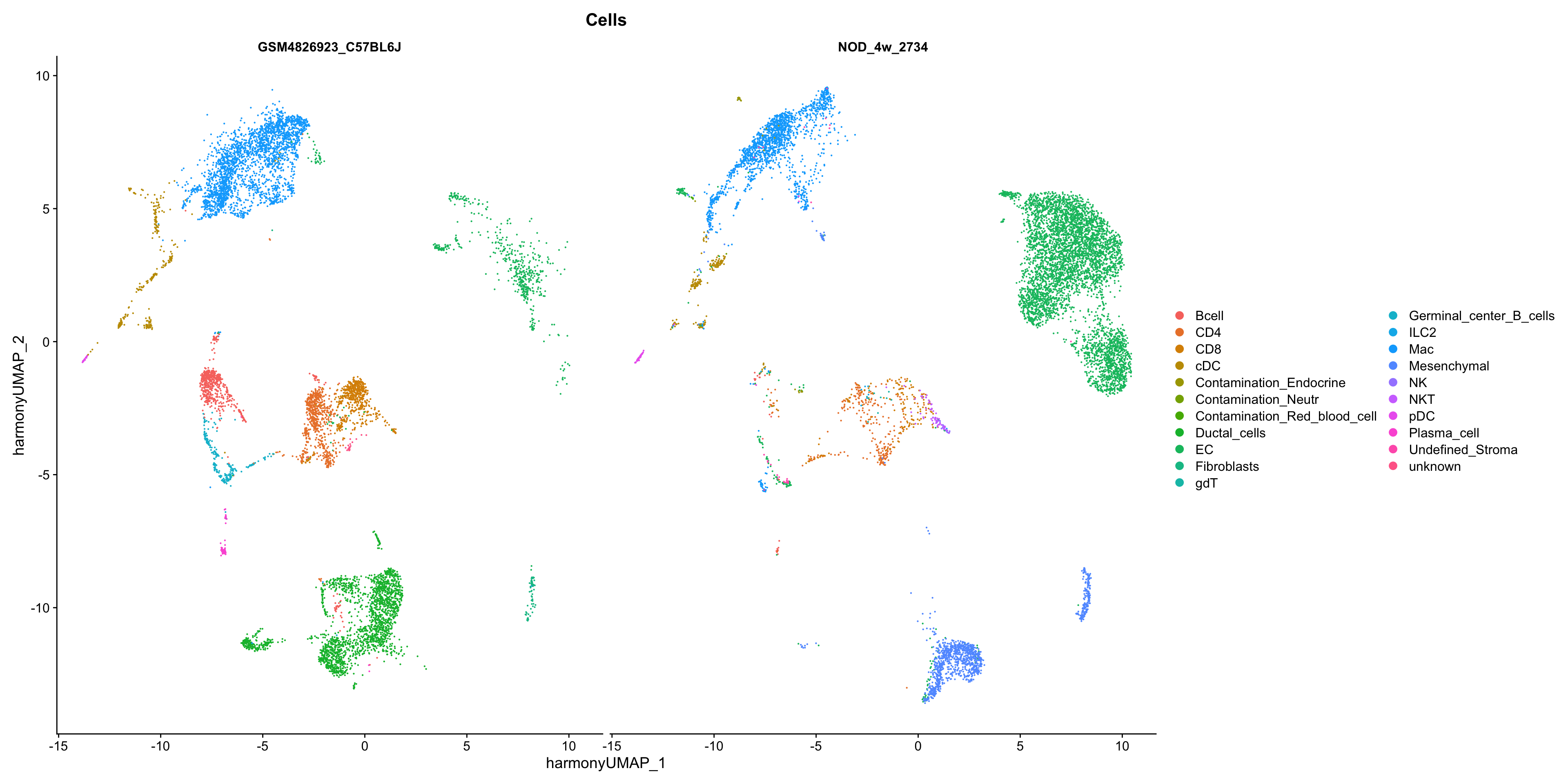
Elapsed time: 2 secondsWe can check with some plots. Now we need to specify the reduction. Below we can see that in many places cells overlap and in some places they don’t. If harmony worked, the common cell types should overlap while the unique celltypes should not
show
print(seurat_merge)
An object of class Seurat
18788 features across 16846 samples within 1 assay
Active assay: RNA (18788 features, 2000 variable features)
 4 dimensional reductions calculated: pca, umap, harmony, harmony.umap
show
DimPlot(seurat_merge, group.by = "orig.ident", cols = batch_colors,
        reduction = "harmony.umap")
Now we can check celltypes
show
DimPlot(seurat_merge, group.by = "Cells",
        reduction = "harmony.umap")
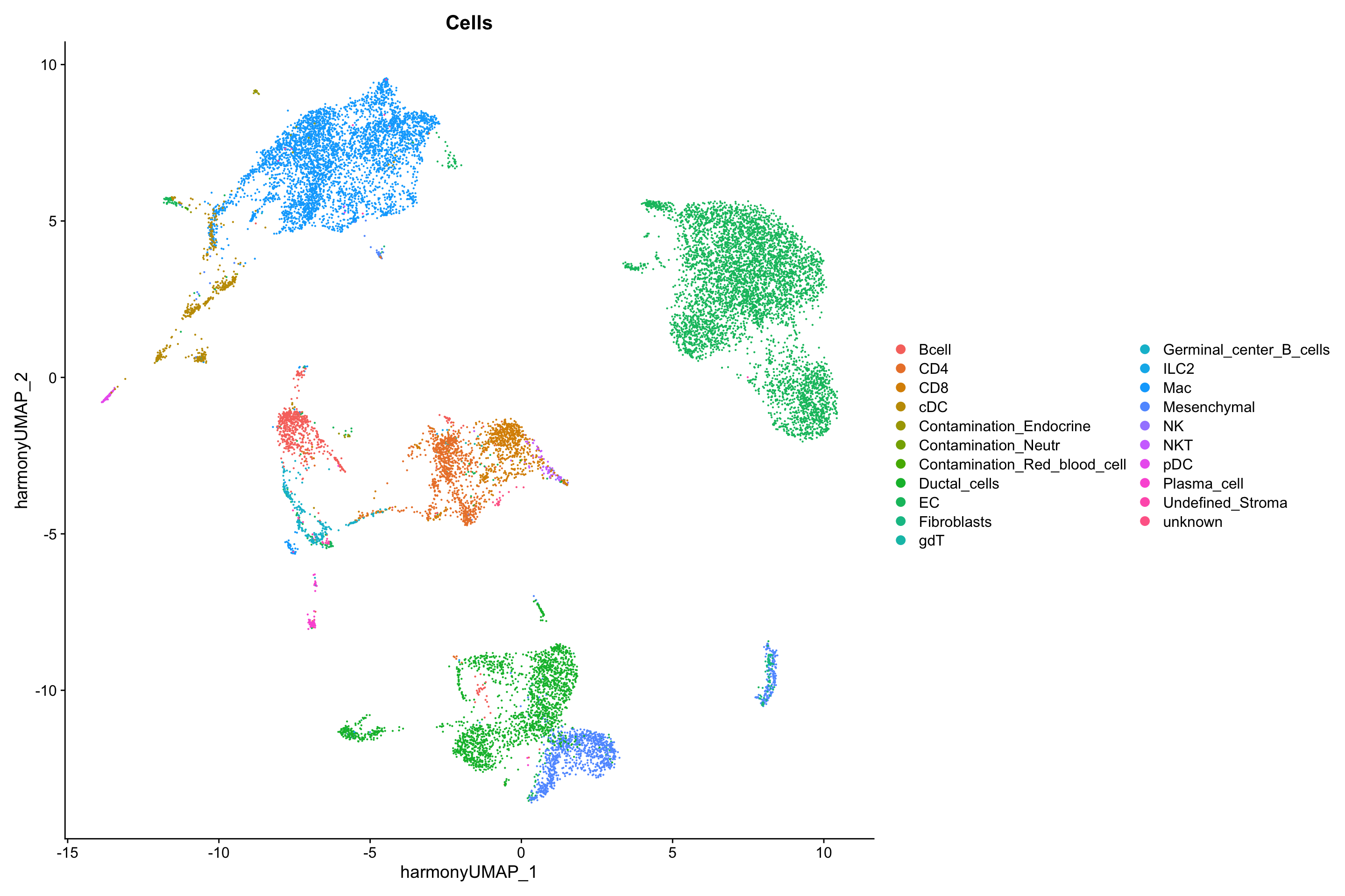
Overall, this looks great. The ductal cells should only be in one dataset which is true, same with the Mesenchymal cells. The other cell types mix nicely.
show
DimPlot(seurat_merge, group.by = "Cells", split.by = "orig.ident",
        reduction = "harmony.umap")
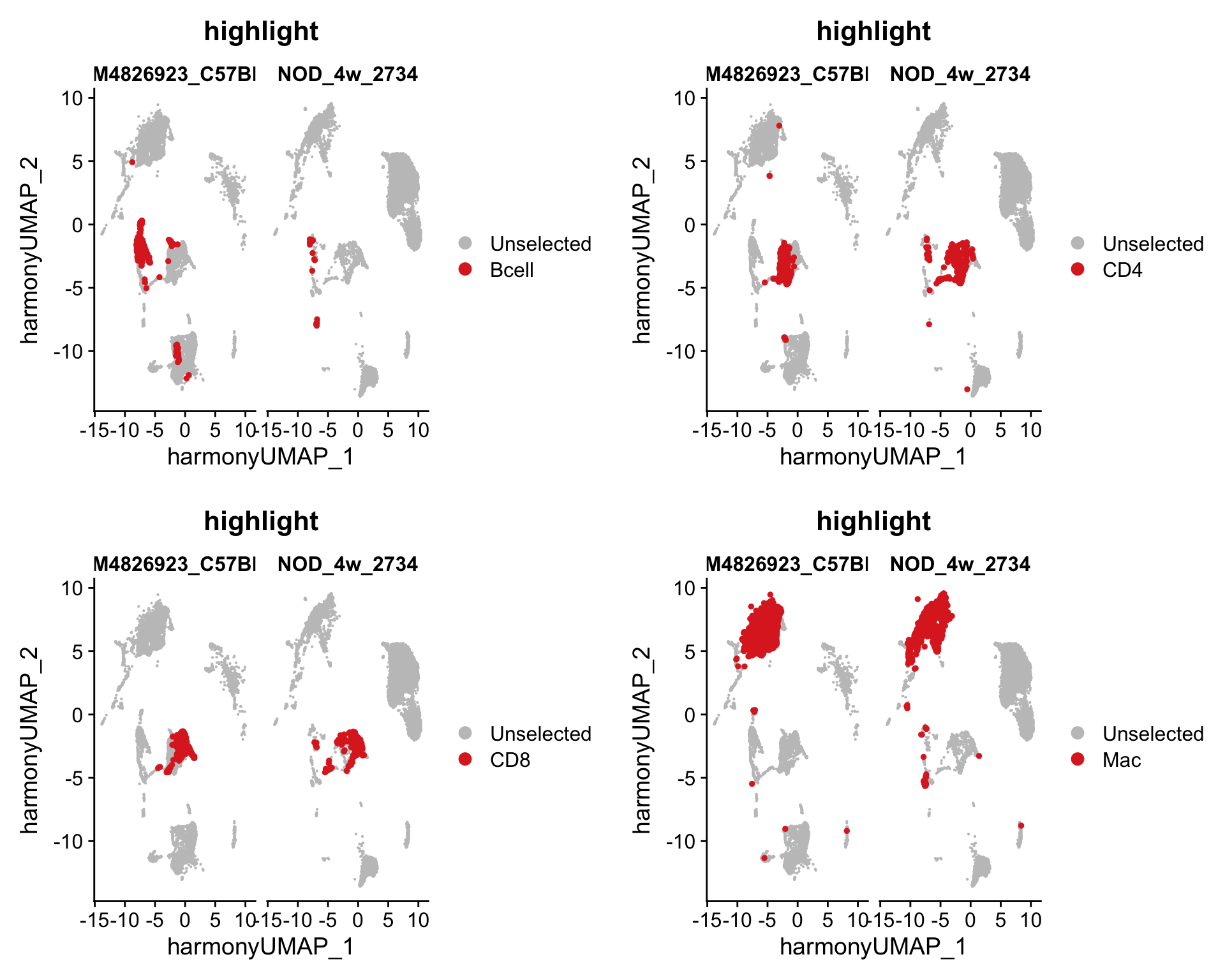
Just to visualize more clearly, we can visualize specific celltypes in each dataset.
show
Idents(seurat_merge) <- "Cells"
plots <- lapply(c("Bcell", "CD4", "CD8", "Mac"), function(x){
  return(DimPlot(seurat_merge, group.by = "Cells", split.by = "orig.ident",
                 cells.highlight = CellsByIdentities(object = seurat_merge,
                                                     idents = x),
                 reduction = "harmony.umap"))
})

plot_grid(plotlist = plots,
          nrow = 2, ncol = 2)
Marker identification
We can now identify markers based on this integrated dataset. We can identify markers of celltypes that are conserved in both datasets using the funciton FindConservedMarkers. First, we can set the identity of the cells to the celltypes. The below function takes several minutes to run, so we will skip it here. It also requires a couple of additional packages
show
################################## DO NOT RUN ##################################
BiocManager::install('multtest')
install.packages('metap')
Idents(seurat_merge) <- "Cells"

macrophage_markers <- FindConservedMarkers(seurat_merge,
                                           ident.1 = "Mac",
                                           grouping.var = "orig.ident")

print(macrophage_markers[1:20,])
We can also identify any differences between the macrophage populations in the two samples. This would be more interesting if one was a treatment and one was a control.
First, we need to create a new column in the metadata that contains both sample information and cell type information
show
seurat_merge$sample_celltype <- paste0(seurat_merge$orig.ident, "_",
                                       seurat_merge$Cells)
Now we can find markers between two populations
show
Idents(seurat_merge) <- "sample_celltype"
mac_sample_markers <- FindMarkers(seurat_merge, ident.1 = "NOD_4w_2734_Mac",
                                  ident.2 = "GSM4826923_C57BL6J_Mac")

print(mac_sample_markers[1:20,])
          p_val avg_log2FC pct.1 pct.2 p_val_adj
Pid1          0  -1.937315 0.137 0.810         0
Cfh           0  -2.892699 0.122 0.904         0
Rgs1          0   3.430878 0.871 0.158         0
Gas5          0   2.893606 0.805 0.000         0
Mrc1          0  -4.001585 0.037 0.968         0
Rpl35         0   1.324887 0.992 0.990         0
Zeb2          0  -1.669259 0.428 0.930         0
Gatm          0   2.738485 0.950 0.492         0
Pltp          0  -1.937587 0.188 0.785         0
Ctsz          0   1.720703 0.944 0.764         0
Rpl22l1       0   1.551200 0.937 0.794         0
Mbnl1         0  -2.005029 0.276 0.908         0
Fcrls         0  -2.771061 0.016 0.855         0
Txnip         0  -2.085770 0.205 0.873         0
Rpsa-ps10     0   1.522140 0.469 0.000         0
Wwp1          0  -2.726688 0.032 0.840         0
Cd72          0   2.332359 0.756 0.196         0
Prdx1         0   1.868586 0.969 0.884         0
Ccdc23        0   1.602846 0.492 0.000         0
Cela3b        0  -2.566615 0.002 0.734         0
One thing to remember while looking for differences between samples is that we had to perform a batch correction. Batch correction with harmony only corrects the dimensional reduction, not the gene counts so here we are likely also picking up on batch differences.
To save memory, we can remove the seurat objects from our enverionment
            used   (Mb) gc trigger   (Mb) limit (Mb)  max used   (Mb)
Ncells   7451174  398.0   13508754  721.5         NA  13508754  721.5
Vcells 132954848 1014.4  420601427 3209.0      65536 420600975 3209.0
Batch correction conclusion
While I personally prefer harmony as my batch correction, it only helps identify shared celltypes or clusters while not actually correcting the sequencing counts. This is fine if you want to find differences between shared celltypes within each sample, but it may not be correct if you want to compare expression differences between samples. There are other batch correction tools that do allow you to also correct the expression values. One that has received high marks recently is scVI, which is implemented in python so we won’t go into it here. Unfortunately, the creators of scVI don’t seem comfortable with these corrected values being used to perform differential expression analysis between samples. Seurat also performs an integration that corrects expression values, but those creators also suggest using the uncorrected RNA matrix for differential expression testing.
An alternative option if you have replicates is to use muscat which creates pseudobulk profiles for each cell type in each sample and then runs traditional differential expression tests that can account for variation within replicates when running differential expression.
Pseudotime
We can also perform puseoditme analysis on integrated samples.
Download provided files
I have already created processed Seurat objects that we will use today. This processing included finding mitochondrial percents, creating a cell cycle score, normalizing the data, finding variable genes, and scaling the data. We will skip this today, but all steps are shown in the code segment above.
show
## DOWNLOAD FILES if they haven't already been downloaded

ifelse(!file.exists(file.path(base_dir, "data", "NOD_4w_2849.rda")),
       download.file(
  url = "http://amc-sandbox.ucdenver.edu/User60/single_cell_workshop/NOD_4w_2849.rda",
              destfile = file.path(base_dir, "data", "NOD_4w_2849.rda")),
  FALSE)
[1] FALSEshow
ifelse(!file.exists(file.path(base_dir, "data", "NOD_8w_2734.rda")),
       download.file(
  url = "http://amc-sandbox.ucdenver.edu/User60/single_cell_workshop/NOD_8w_2734.rda",
              destfile = file.path(base_dir, "data", "NOD_8w_2734.rda")),
  FALSE)
[1] FALSEshow
ifelse(!file.exists(file.path(base_dir, "data", "NOD_8w_2849.rda")),
       download.file(
  url = "http://amc-sandbox.ucdenver.edu/User60/single_cell_workshop/NOD_8w_2849.rda",
              destfile = file.path(base_dir, "data", "NOD_8w_2849.rda")),
  FALSE)
[1] FALSEshow
ifelse(!file.exists(file.path(base_dir, "data", "NOD_15w_2734.rda")),
       download.file(
  url = "http://amc-sandbox.ucdenver.edu/User60/single_cell_workshop/NOD_15w_2734.rda",
              destfile = file.path(base_dir, "data", "NOD_15w_2734.rda")),
  FALSE)
[1] FALSEshow
ifelse(!file.exists(file.path(base_dir, "data", "meta_data.rda")),
       download.file(
  url = "http://amc-sandbox.ucdenver.edu/User60/single_cell_workshop/meta_data.rda",
              destfile = file.path(base_dir, "data", "meta_data.rda")),
  FALSE)
[1] FALSEshow
ifelse(!file.exists(file.path(base_dir, "data", "mac_sce.rda")),
       download.file(
  url = "http://amc-sandbox.ucdenver.edu/User60/single_cell_workshop/mac_sce.rda",
              destfile = file.path(base_dir, "data", "mac_sce.rda")),
  FALSE)
[1] FALSERead in provided files
First, we need to read in all of the files associated with the first dataset. Seurat wants files as a list to merge, so let’s read them in that way using lapply
show
sample_names <- c("NOD_4w_2734", "NOD_4w_2849",
                  "NOD_8w_2734", "NOD_8w_2849",
                  "NOD_15w_2734")

# I hate the default R colors, so I will also make my own
colors <- RColorBrewer::brewer.pal(5, "Set1")
names(colors) <- sample_names

seurat_list <- lapply(sample_names, function(x){
  seurat_object <- readRDS(file.path(base_dir, "data", paste0(x, ".rda")))
})
Merge the files
We can take this list and pass it to the merge function from Seurat.
Clean up memory
            used   (Mb) gc trigger   (Mb) limit (Mb)  max used   (Mb)
Ncells   7531188  402.3   13508754  721.5         NA  13508754  721.5
Vcells 301128109 2297.5  903723896 6894.9      65536 739787185 5644.2
Prepare data
One important thing to remember about running pseudotime is that connections will be found between cells that are related or not. Because we know that the macrophages should not become B cells, we should first subset to only the macrophage population.
            used   (Mb) gc trigger   (Mb) limit (Mb)  max used   (Mb)
Ncells   7481396  399.6   13508754  721.5         NA  13508754  721.5
Vcells 160809205 1226.9  722979117 5515.9      65536 739787185 5644.2
After subestting, we need to repeat some of the processing steps. We need to find variable genes, scale the data, run pca, and run umap
show
set.seed(0)
seurat_mac <- FindVariableFeatures(seurat_mac) %>%
  ScaleData() %>%
  RunPCA(npcs = 30) %>%
  FindNeighbors(dims = 1:15, reduction = "pca") %>%
  FindClusters(resolution = 0.4) %>%
  RunUMAP(dims = 1:15, assay = "RNA", reduction = "pca")
Modularity Optimizer version 1.3.0 by Ludo Waltman and Nees Jan van Eck

Number of nodes: 5975
Number of edges: 198660

Running Louvain algorithm...
Maximum modularity in 10 random starts: 0.8329
Number of communities: 8
Elapsed time: 0 seconds
Check for batch
Now we should check if any sort of batch correction is necessary. This data was processed in two batches. The cells within these two batches should only differ because of technical effects. To view these potential effects, we can first plot by batch.
show
head(seurat_mac[[]])
                      orig.ident nCount_RNA nFeature_RNA
TGTGGTACAATGAAAC-1_1 NOD_4w_2734       5504         2104
TTAGGCAGTTGTTTGG-1_1 NOD_4w_2734       7174         2452
TTAGGCATCATCACCC-1_1 NOD_4w_2734       6893         2398
AAACGGGAGCTGAACG-1_1 NOD_4w_2734       1306          639
AAACGGGAGGACGAAA-1_1 NOD_4w_2734       1074          523
AAACGGGCAAGCTGAG-1_1 NOD_4w_2734       6761         2073
                                Barcode Cells Sample Batch Library
TGTGGTACAATGAAAC-1_1 TGTGGTACAATGAAAC-1   Mac NOD_4w  2734       6
TTAGGCAGTTGTTTGG-1_1 TTAGGCAGTTGTTTGG-1   Mac NOD_4w  2734       6
TTAGGCATCATCACCC-1_1 TTAGGCATCATCACCC-1   Mac NOD_4w  2734       6
AAACGGGAGCTGAACG-1_1 AAACGGGAGCTGAACG-1   Mac NOD_4w  2734       6
AAACGGGAGGACGAAA-1_1 AAACGGGAGGACGAAA-1   Mac NOD_4w  2734       6
AAACGGGCAAGCTGAG-1_1 AAACGGGCAAGCTGAG-1   Mac NOD_4w  2734       6
                     percent.mt     S.Score    G2M.Score Phase
TGTGGTACAATGAAAC-1_1   3.143169 -0.03649368 -0.004545299    G1
TTAGGCAGTTGTTTGG-1_1   2.815723 -0.11072854  0.019745783   G2M
TTAGGCATCATCACCC-1_1   3.003047 -0.01443779 -0.040919110    G1
AAACGGGAGCTGAACG-1_1   6.125574  0.08270126  0.001381862     S
AAACGGGAGGACGAAA-1_1   3.351955 -0.01197605  0.005858639   G2M
AAACGGGCAAGCTGAG-1_1   3.283538 -0.03344977 -0.067185912    G1
                     RNA_snn_res.0.4 seurat_clusters
TGTGGTACAATGAAAC-1_1               1               1
TTAGGCAGTTGTTTGG-1_1               1               1
TTAGGCATCATCACCC-1_1               0               0
AAACGGGAGCTGAACG-1_1               3               3
AAACGGGAGGACGAAA-1_1               3               3
AAACGGGCAAGCTGAG-1_1               1               1
show
DimPlot(seurat_mac, group.by = "Batch", cols = "Set1")
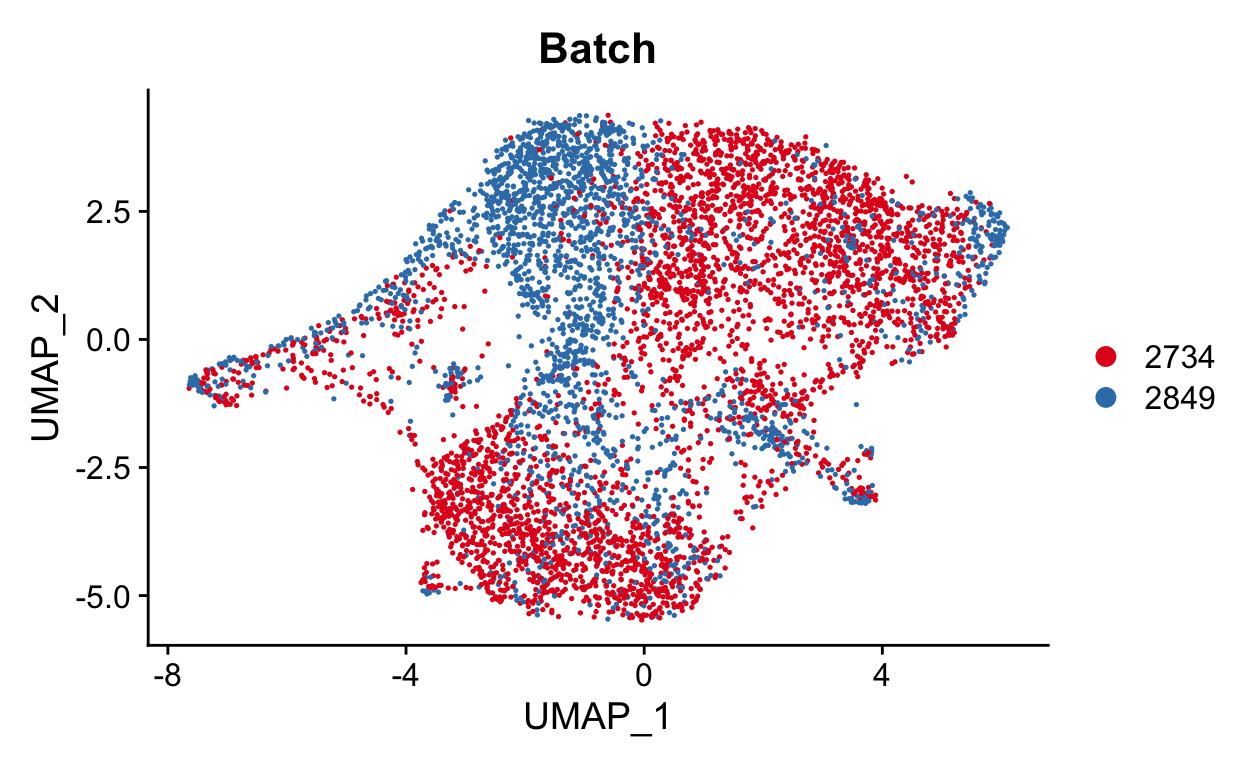
While this isn’t as bad as our previous example, we should still try to remove the batch effect. Here we can include both the batch information as variable.
Note we can also include the original identity in our batch correction. We can include as many correction factors as we want here, but I hesitate to correct beyond batch because I don’t want to remove our biological effect. In a real analysis, I would try removing just with batch and with batch and orig.ident
show
seurat_mac <- RunHarmony(seurat_mac, group.by.vars = c("Batch"))
We can now repeat clustering and performing UMAP dimensional reduction on this new batch corrected data.
show
seurat_mac <- FindNeighbors(seurat_mac, dims = 1:15, reduction = "harmony") %>%
  FindClusters(resolution = 0.4) %>%
  RunUMAP(dims = 1:15, assay = "RNA", reduction = "harmony")
Modularity Optimizer version 1.3.0 by Ludo Waltman and Nees Jan van Eck

Number of nodes: 5975
Number of edges: 196762

Running Louvain algorithm...
Maximum modularity in 10 random starts: 0.8356
Number of communities: 6
Elapsed time: 0 seconds
show
DimPlot(seurat_mac, group.by = "Batch", cols = "Set1")
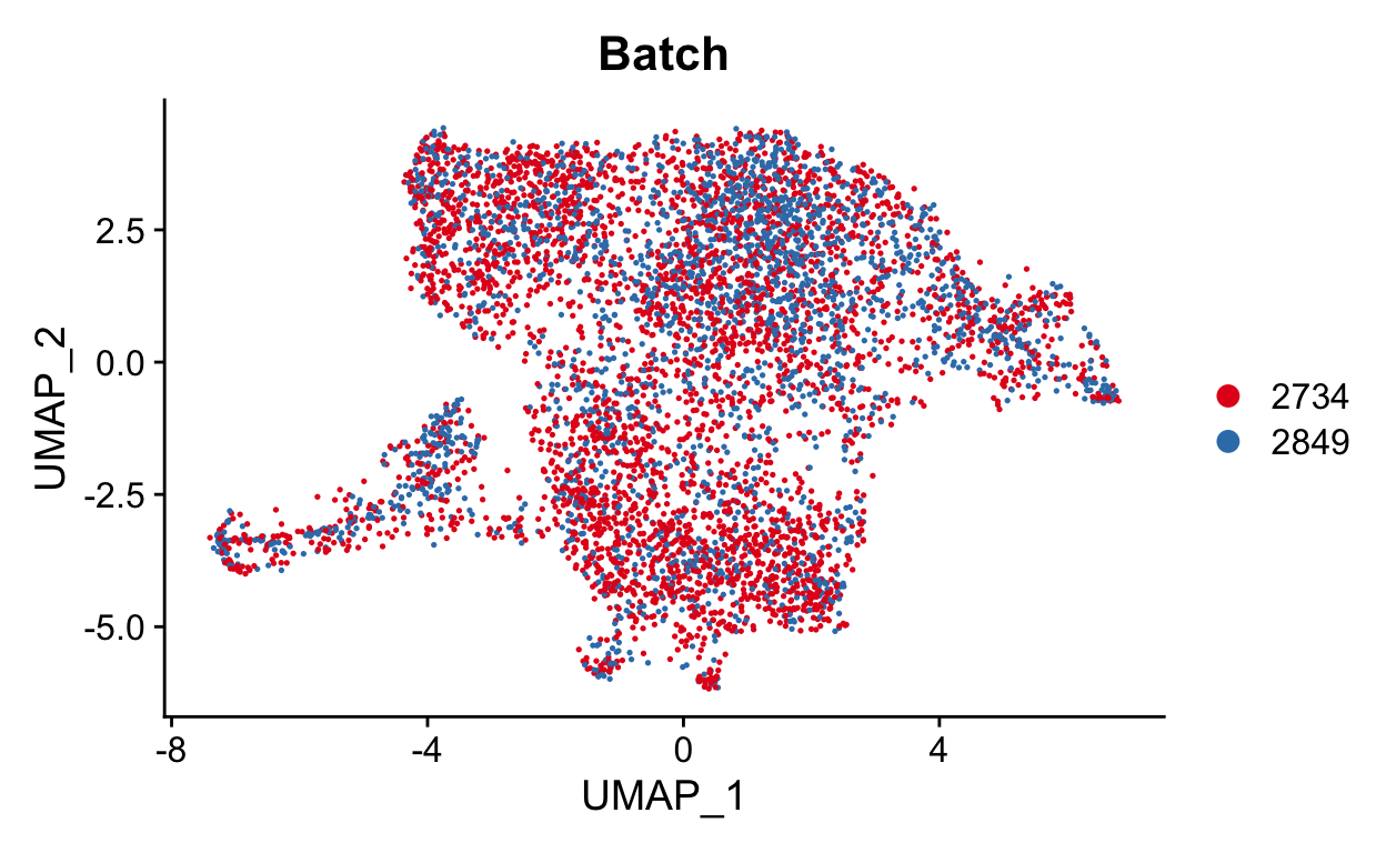
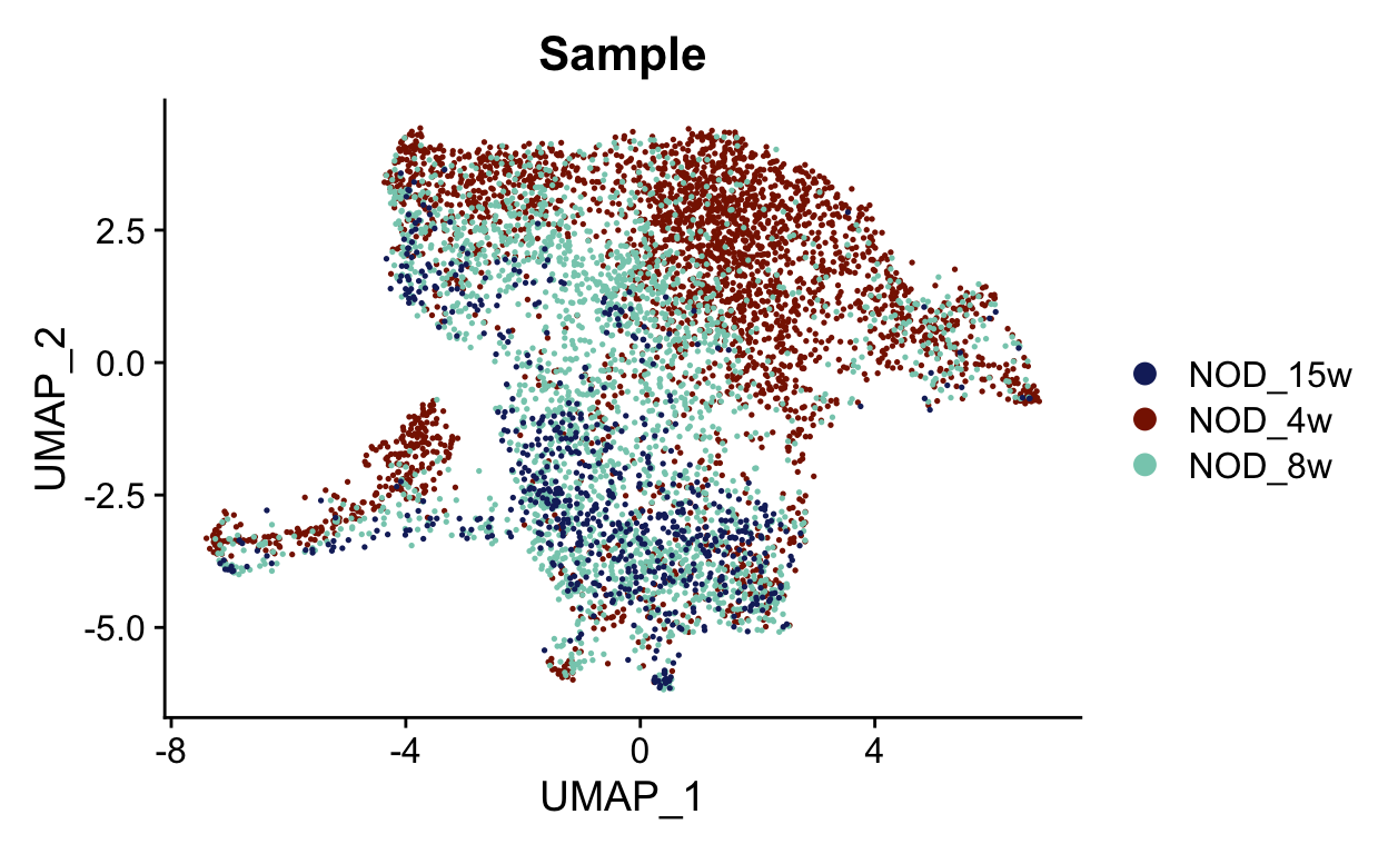
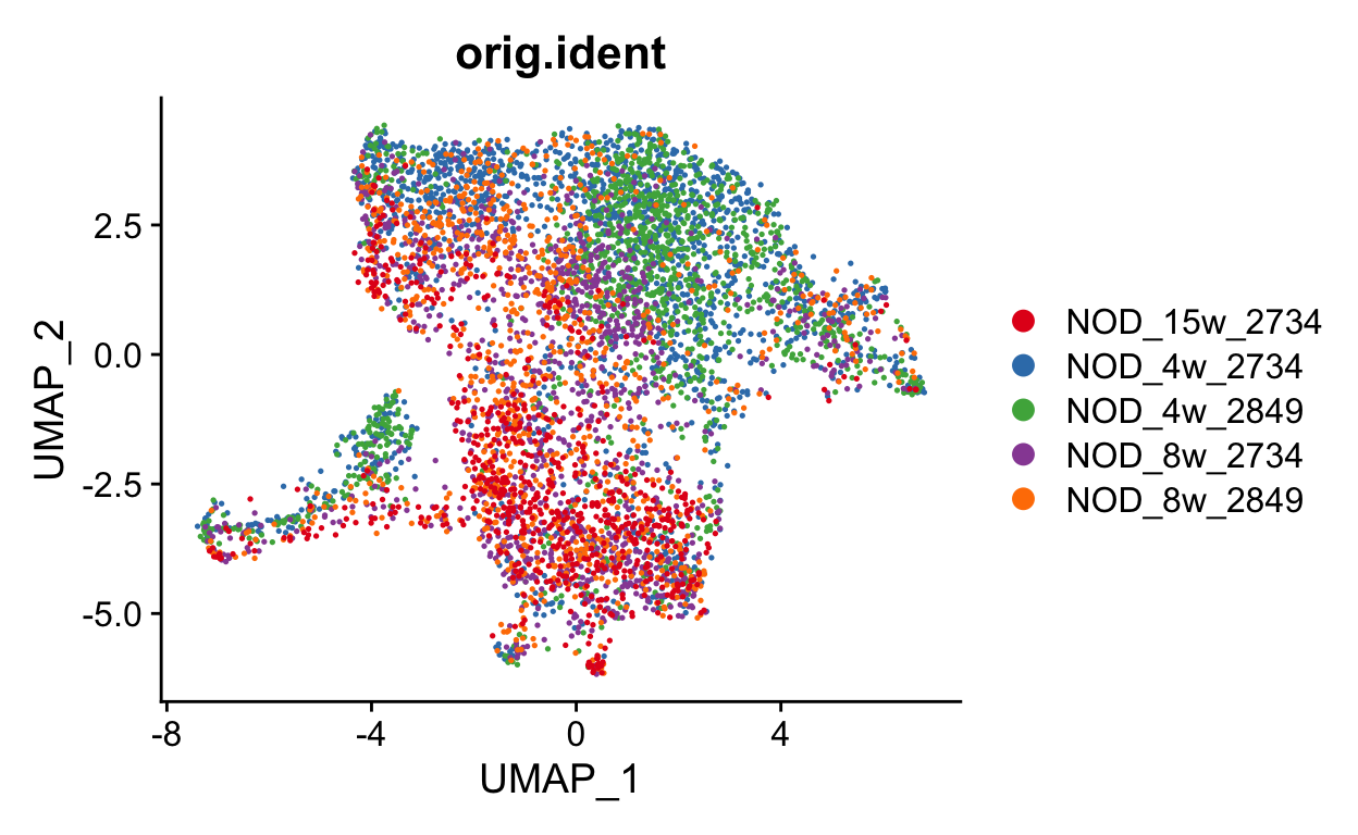
This looks much better. We can also check the sample and original identity. If we had also used orig.ident in the correction, we may be concerned that we over-corrected the timecourse. It is always good to keep what you corrected in mind as you continue your analysis.
show
samples <- unique(seurat_mac$Sample)
sample_colors <- LaCroixColoR::lacroix_palette("Coconut", 3)
names(sample_colors) <- samples
DimPlot(seurat_mac, group.by = "Sample", cols = sample_colors)
show
DimPlot(seurat_mac, group.by = "orig.ident", cols = "Set1")
show
DimPlot(seurat_mac, group.by = "seurat_clusters", cols = "Set1")
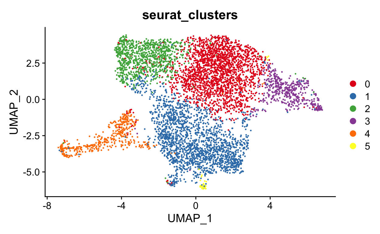
Note your UMAP and clusters may look slightly different than mine. That is okay. There are random seeds used to generate UMAPs and to run other functions that are influenced by that packages and versions of packages on your system. For now, we can just run it and acknowledge that all of our output may be a bit different
Run pseudotime
As with batch correction, there are many tools for pseudotime. RNA velocity or velocyto are interesting methods that rely on intron retention to predict future cell state. Other options just use transcriptome similarity to identify cells that are likely related. With this second type, we cannot use the tool to identify the direction of cell development, but we can use known biology to infer this relationship. There are also good benchmarking papers that compare pseudotime methods.
slingshot tends to do well in these benchmarking studies, so I generally start with that. But I find it is a good idea to compare a couple of methods to make sure your conclusions are robust.
Now we can run slingshot. Slingshot runs on your dimensionality reduction. Some tutorials show this being run on the UMAP dimensions, but it is best to run this either on the PCA (or harmony) reduction. The UMAP is generally generated based on the PCA (or harmony) dimensional reduction and is only 2 dimensions. PCA or harmony can be many dimensions (ex. 50) and is a better representation of your data.
First we need to pull the new harmony coordinates and cluster information from the seurat object. Make sure we use the same number of coordiantes we’ve used for other analysis
show
pca_coords <- Embeddings(object = seurat_mac, reduction = "harmony")[ , 1:15]
clusters <- seurat_mac$seurat_clusters
We can then input these into slingshot
show
mac_slingshot <- slingshot(data = pca_coords, clusterLabels = clusters)
Looking at this object, we can see that 4 lineages were found.
show
mac_slingshot
class: SlingshotDataSet
Samples Dimensions
5975 15
lineages: 3
Lineage1: 5 1 0 2
Lineage2: 5 1 0 3
Lineage3: 5 1 0 4
curves: 3
Curve1: Length: 43.684 Samples: 5020.65
Curve2: Length: 62.279 Samples: 4675.3
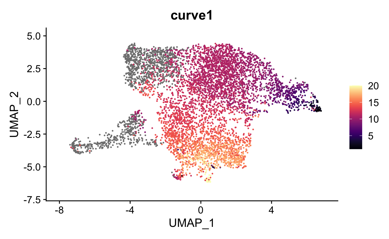
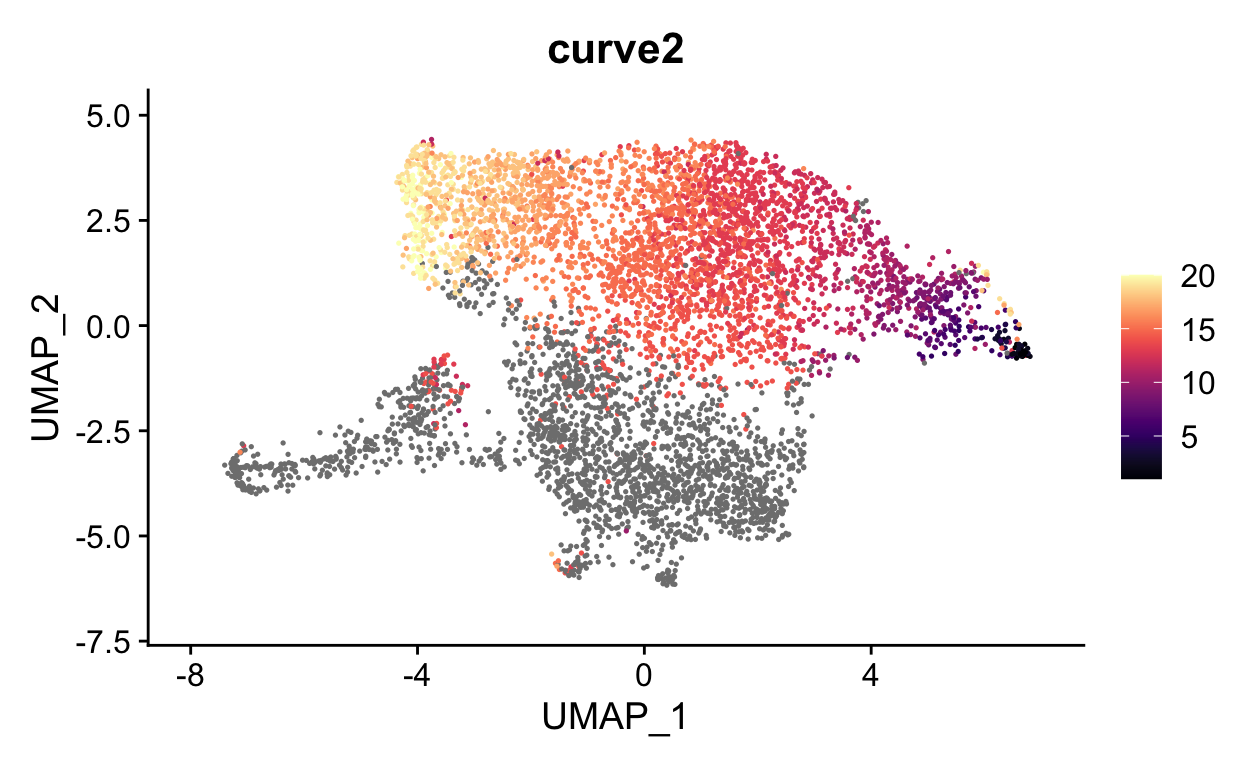
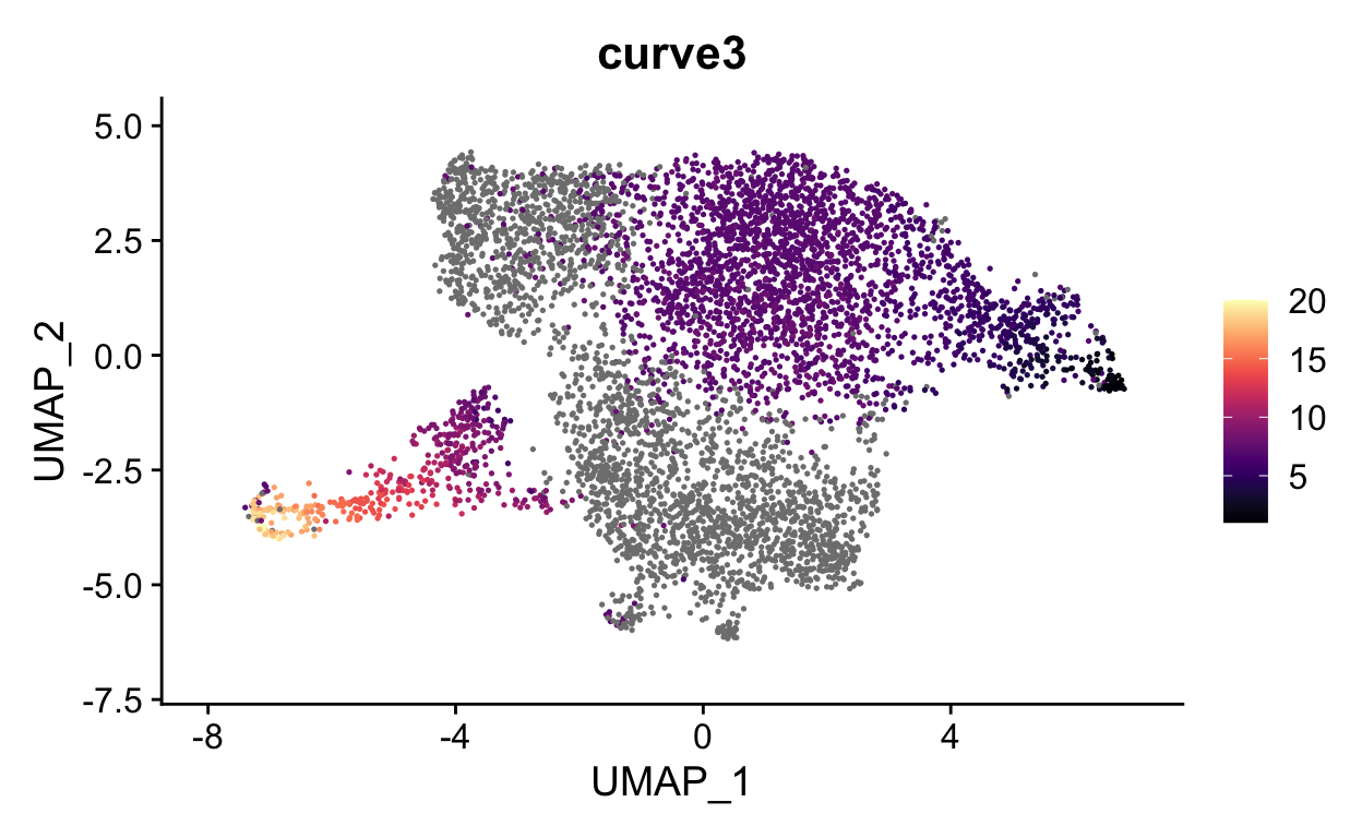
Curve3: Length: 78.562 Samples: 4604.8So cluster 5, 1 and 0 start all lineages.
Pseudotime algorithims identify cells with similar transcriptional profiles to create a likely order of cell relationships. Unfortunately, there is no way to do this with a definite direction. For example, the curves above could either start or end at cluster 0, we don’t know.
One nice thing about slingshot is that you can include known biology to improve the ability to identify correct lineages that go in the correct direction. For example, without any input, slingshot defined cluster 0 as the first cluster, but we know that the cells at the latest timepoint are in cluster 0 while the earliest is in cluster 2. We can repeat with cluster 3 as the starting cluster
We can then input these into slingshot
show
mac_slingshot_2 <- slingshot(data = pca_coords, clusterLabels = clusters,
                             start.clus = 3)
We still find 3 lineages, but this time, all lineages start with cluster 3.
show
print(mac_slingshot_2)
class: SlingshotDataSet

 Samples Dimensions
    5975         15

lineages: 3
Lineage1: 3  0  1  5
Lineage2: 3  0  2
Lineage3: 3  0  4

curves: 3
Curve1: Length: 57.994  Samples: 4688.6
Curve2: Length: 46.386  Samples: 3683.64
Curve3: Length: 90.59   Samples: 3188.61
We can extract pseudotime values using slingPseudotime and add this to the metadata. This is the way that you would do it if you were running your own analysis…
show
################################## DO NOT RUN ##################################
pseudotime <- data.frame(slingPseudotime(mac_slingshot_2))
seurat_mac <- AddMetaData(seurat_mac, metadata = pseudotime)
… but to keep our analysis consistent, you will add in my values here
show
seurat_meta_data <- readRDS(file.path(base_dir, "data", "meta_data.rda"))
seurat_mac <- AddMetaData(seurat_mac, metadata = seurat_meta_data)
And now we can visualize each curve
show
FeaturePlot(seurat_mac, features = "curve1", cols = viridis::magma(20))
show
FeaturePlot(seurat_mac, features = "curve2", cols = viridis::magma(20))
show
FeaturePlot(seurat_mac, features = "curve3", cols = viridis::magma(20))
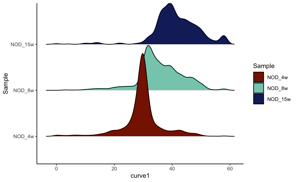
We can now visualize the psuedotime across our timepoints. Below you can see that the cells nicely transition between timepoints along pseudotime.
show
meta_data <- seurat_mac[[]]
meta_data$Sample <- factor(meta_data$Sample,
                           levels =c("NOD_4w", "NOD_8w", "NOD_15w"))

# Subest to only cells with value for curve 1
meta_data <- meta_data %>%
  dplyr::filter(!is.na(curve1))

density_plot <- ggplot2::ggplot(data = meta_data,
                                ggplot2::aes(x = curve1,
                                             y = Sample,
                                             fill = Sample)) +
  ggridges::geom_density_ridges() +
  ggplot2::scale_fill_manual(values = sample_colors)

density_plot
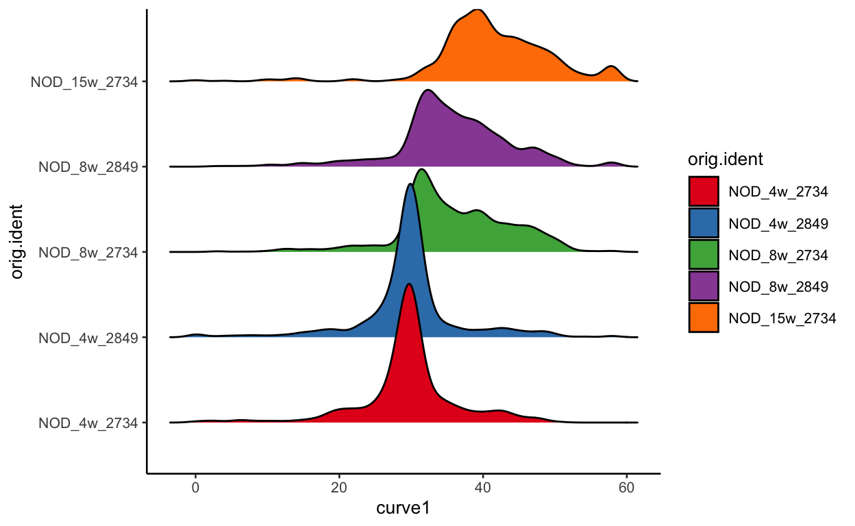
As discussed before, this could be completley due to batch effect, but we can plot each batch separetly to see if there is much difference in terms of pseudotime. As you can see, the batches look nearly identical indicating that the changes we see are likely due to the timecourse.
show
meta_data <- seurat_mac[[]]
meta_data$orig.ident <- factor(meta_data$orig.ident,
                           levels =c("NOD_4w_2734", "NOD_4w_2849",
                                     "NOD_8w_2734", "NOD_8w_2849",
                                     "NOD_15w_2734"))

# Subest to only cells with value for curve 1
meta_data <- meta_data %>%
  dplyr::filter(!is.na(curve1))

density_plot <- ggplot2::ggplot(data = meta_data,
                                ggplot2::aes(x = curve1,
                                             y = orig.ident,
                                             fill = orig.ident)) +
  ggridges::geom_density_ridges() +
  ggplot2::scale_fill_manual(values = colors)

density_plot
Genes that correlate with pseudotime
We can also identify genes with expression patterns that correlate with pseudotime.
For each gene, we will fit a general additive model (GAM) using a negative binomial noise distribution to model the (potentially nonlinear) relationship between gene expression and pseudotime. We will then test for significant associations between expression and pseudotime using the associationTest This requires the package tradeSeq
This function takes a long time to run (about 30 minutes) so I have already run it for you. The steps are below. I only ran it on the top 2000 variable genes as these are the most likely genes to also correlate with pseudotime.
show
################################## DO NOT RUN ##################################
variable_features_pattern <- paste0("^", VariableFeatures(seurat_mac), "$")
genes_use <- grep(paste0(variable_features_pattern, collapse="|"),
                  rownames(seurat_mac))
# fit negative binomial GAM
mac_sce <- fitGAM(counts = GetAssayData(object = seurat_mac,
                                                slot = "counts"),
                          sds = mac_slingshot_2,
                          genes = genes_use)

saveRDS(mac_sce, file.path(base_dir, "data", "mac_sce.rda"))
We can load in this saved object and run an association test to identify what genes correlate best with pseudotime. The output of this assocaition test is a data frame that includes p values and wald statistics for each lineage.
show
mac_sce <- readRDS(file.path(base_dir, "data", "mac_sce.rda"))
pseudotime_genes <- associationTest(mac_sce, lineages = TRUE)
head(pseudotime_genes)
                waldStat df       pvalue waldStat_1 df_1     pvalue_1
2610203C22Rik  57.393916 13 1.528750e-07 47.3931492    4 1.262831e-09
Crispld1        1.392254 13 9.999722e-01  1.2694737    4 8.665331e-01
Mcm3          243.363823 13 0.000000e+00  3.9649927    4 4.107643e-01
Prim2          96.215024 13 8.992806e-15  7.2718169    4 1.222024e-01
Arhgef4         5.729941 13 9.554316e-01  0.1094587    4 9.985559e-01
Kansl3         11.489114 13 5.699136e-01  2.2217701    4 6.950457e-01
              waldStat_2 df_2  pvalue_2   waldStat_3 df_3
2610203C22Rik 5.53169442    4 0.2369575   4.46907210    5
Crispld1      0.04703618    4 0.9997277   0.07574365    5
Mcm3          4.95251819    4 0.2922042 234.44631244    5
Prim2         5.11069663    4 0.2761268  83.83251057    5
Arhgef4       0.56266118    4 0.9671211   5.05782073    5
Kansl3        7.32038404    4 0.1198954   1.94695982    5
                  pvalue_3 meanLogFC
2610203C22Rik 4.840321e-01 0.3605775
Crispld1      9.999183e-01 0.2334851
Mcm3          0.000000e+00 0.6827228
Prim2         1.110223e-16 0.7987538
Arhgef4       4.088645e-01 1.3436817
Kansl3        8.564344e-01 0.2269093
Let’s first pull out the top genes associated with the first curve.
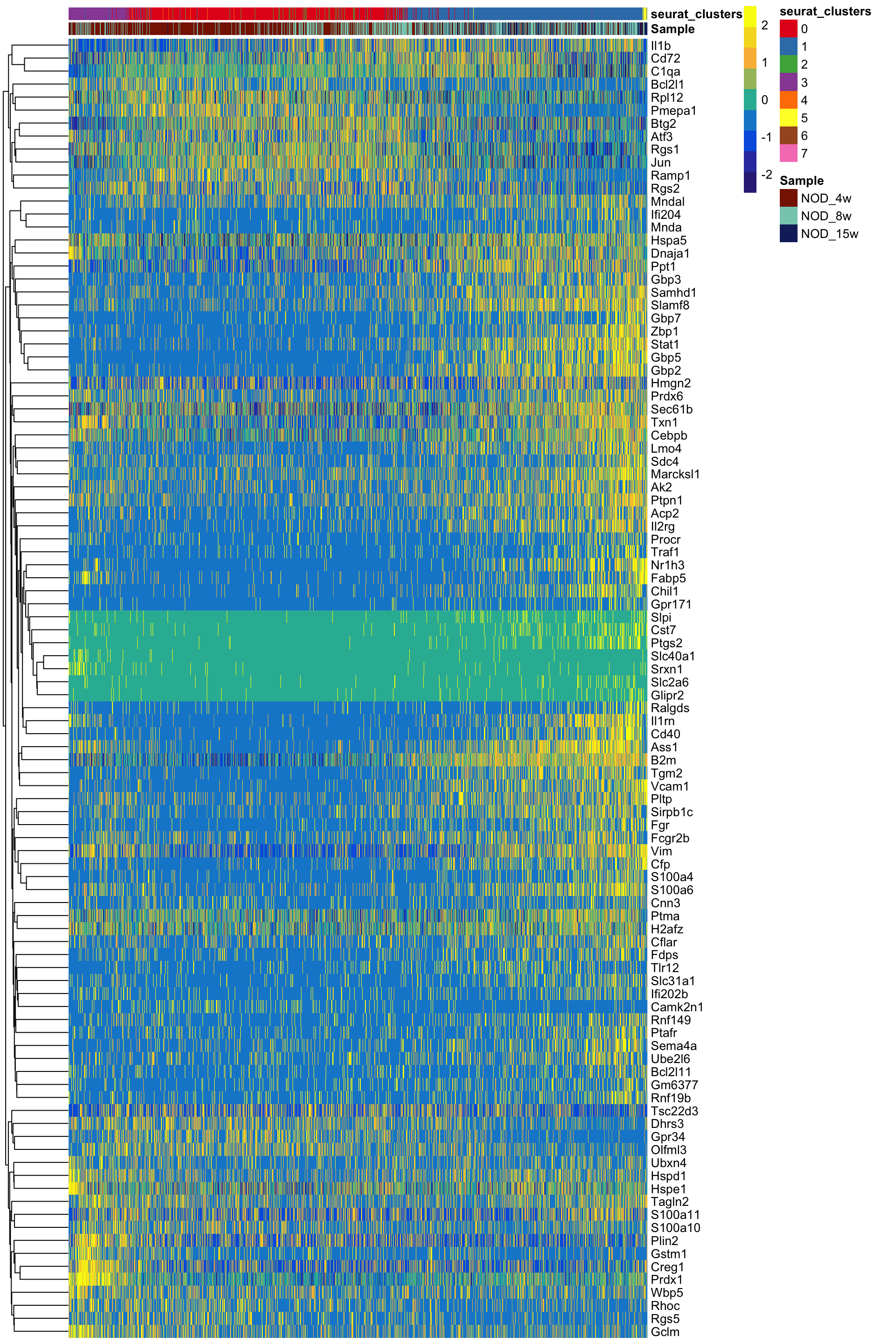
We can now plot these genes in a heatmap to show the expression over time.
show
# Get the information for curve 1 so we can find what cells to keep
cell_info <- seurat_mac[["curve1"]]

cell_info <- cell_info %>%
  dplyr::filter(!is.na(curve1))

# Get the data for all cells
heatdata <- GetAssayData(object = seurat_mac, slot = "data")

# Subset to only genes and cells we want
heatdata <- heatdata[rownames(heatdata) %in% topgenes,
                     colnames(heatdata) %in% rownames(cell_info)]

# Order the data based on the pseudotime ordering of the cells
heatdata <- heatdata[ , order(cell_info$curve1)]

## Color the clusters and samples ##
# pull out the sample information and make cell order the same as the heatmap
# data
sample_info <- seurat_mac[[c("Sample", "seurat_clusters")]]
sample_info <- sample_info[colnames(heatdata) , ]

# Set colors
cluster_colors <- RColorBrewer::brewer.pal(8, "Set1")
names(cluster_colors) <- c(0:7)

samples <- unique(seurat_mac$Sample)
sample_colors <- LaCroixColoR::lacroix_palette("Coconut", 3)
names(sample_colors) <- samples

# We make a list of the colors, make sure the names match the sample info we
# created
color_list <- list(Sample = sample_colors, seurat_clusters = cluster_colors)

## Prepare heatmap values ##
# Scale the heatmap values
heatmap_scale <- t(scale(t(as.matrix(heatdata)), scale = TRUE))

# Colors for heatmap (from the ArchR package)
blueYellow <- c("#352A86", "#343DAE", "#0262E0", "#1389D2", "#2DB7A3",
                "#A5BE6A", "#F8BA43", "#F6DA23", "#F8FA0D")

# Add cutoffs for visualization. I actually stole this line of code from the
# Seurat heatmap functions. Without it you can only see some genes
heatmap_scale <- ifelse(heatmap_scale > 2.5, 2.5, heatmap_scale)
heatmap_scale <- ifelse(heatmap_scale < -2.5, -2.5, heatmap_scale)

# Make the heatmap
pheatmap(heatmap_scale, cluster_rows = TRUE,
         cluster_cols = FALSE,
         show_rownames = TRUE,
         show_colnames = FALSE,
         annotation_col = sample_info,
         annotation_colors = color_list, color = blueYellow,
         border_color = NA, clustering_method = "complete")
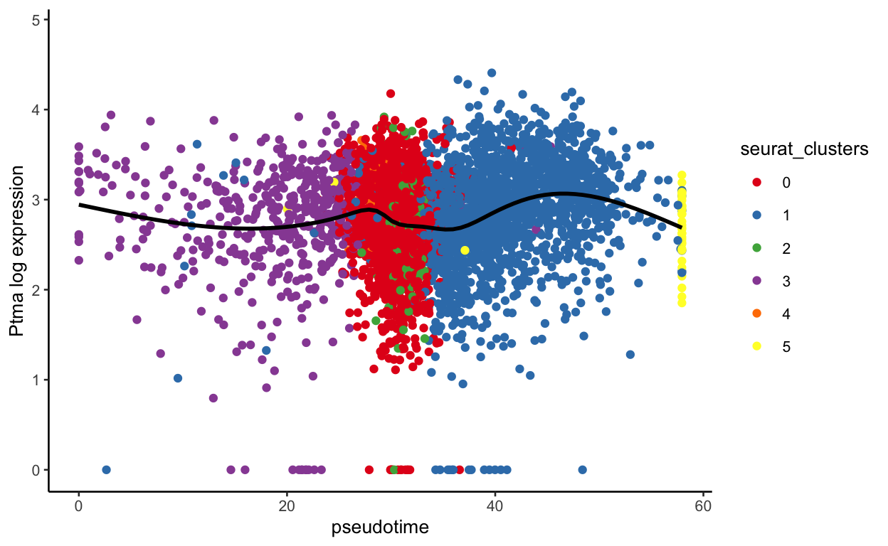
We can also visualize the expression of certain genes across pseudotime. I am going to write a function for this because we will do it several times. This is a quick function that could be easily improved to also be able to color by a continuous variable –> feel free to take this and modify as you please.
show
plot_pseudotime <- function(seurat_object, pseudotime_name,
                            gene_name, col_by = "seurat_clusters",
                            colors = NULL){
  plot_info <- FetchData(seurat_object, c(pseudotime_name, gene_name,
                                          col_by))

  colnames(plot_info) <- c("pseudotime", "gene", "color")

  # Set colors if not set already
  if(is.null(colors)){
    colors <- RColorBrewer::brewer.pal(length(unique(plot_info$color)))
    names(colors) <- unique(plot_info$color)
  }

  plot <- ggplot2::ggplot(plot_info, ggplot2::aes(x = pseudotime,
                                                  y = gene,
                                                  color = color)) +
    ggplot2::geom_point() +
    ggplot2::scale_color_manual(values = colors, name = col_by) +
    ggplot2::ylab(paste0(gene_name, " log expression")) +
    ggplot2::geom_smooth(se = FALSE, color = "black")

  return(plot)
}
Let’s run this with a few genes
show
plot_pseudotime(seurat_mac, pseudotime_name = "curve1", gene_name = "Ptma",
                col_by = "seurat_clusters", color = cluster_colors)
show
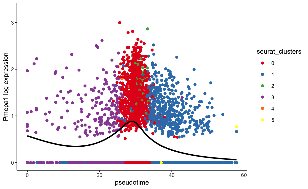
plot_pseudotime(seurat_mac, pseudotime_name = "curve1", gene_name = "Pmepa1",
                col_by = "seurat_clusters", color = cluster_colors)
show
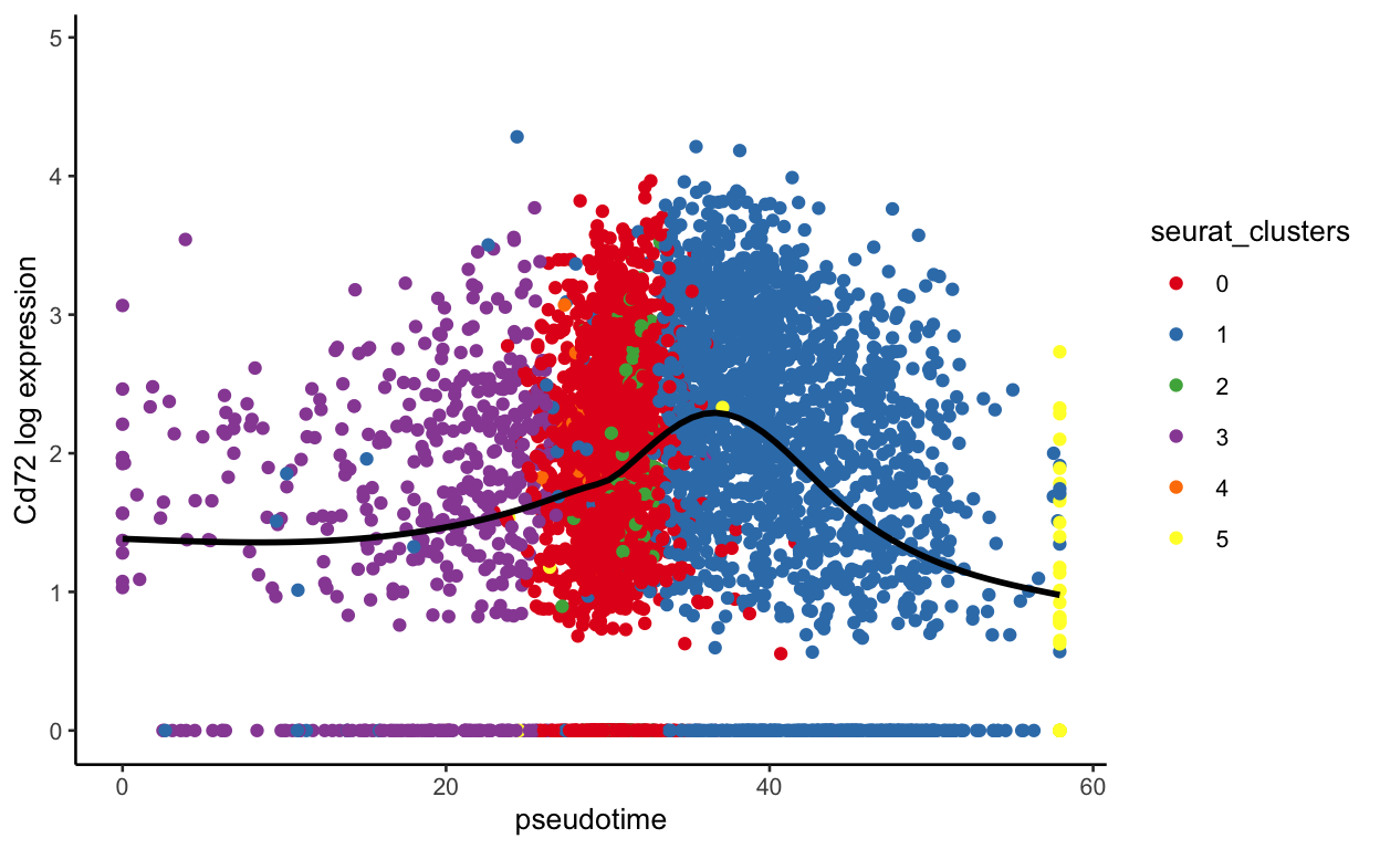
plot_pseudotime(seurat_mac, pseudotime_name = "curve1", gene_name = "Cd72",
                col_by = "seurat_clusters", color = cluster_colors)
show
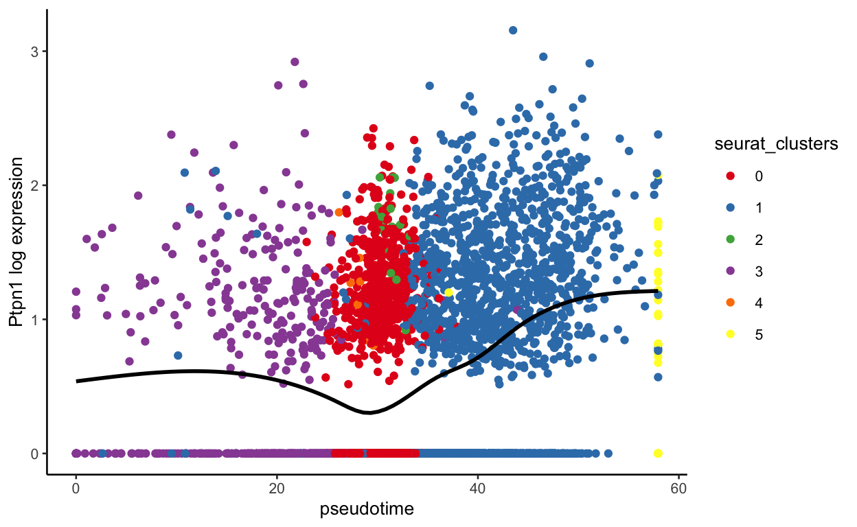
plot_pseudotime(seurat_mac, pseudotime_name = "curve1", gene_name = "Ptpn1",
                col_by = "seurat_clusters", color = cluster_colors)
show
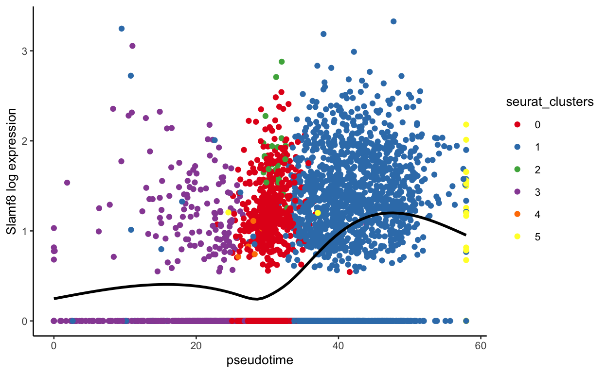
plot_pseudotime(seurat_mac, pseudotime_name = "curve1", gene_name = "Slamf8",
                col_by = "seurat_clusters", color = cluster_colors)
With this function, we can also see expression by sample
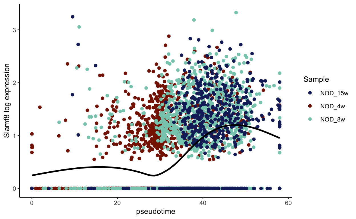
show
plot_pseudotime(seurat_mac, pseudotime_name = "curve1", gene_name = "Slamf8",
                col_by = "Sample", color = sample_colors)
But maybe you are more interested in groups of genes that change. We can find clusters of genes that change using the tradeSeq package as well. If you could not install clusterExperiment, don’t run this secton (it’s our last section)
show
library(clusterExperiment)
topgenes <- rownames(pseudotime_genes[order(pseudotime_genes$pvalue_1), ])[1:250]

# This clusters genes based on their expression across pseudotime
cluster_patterns <- clusterExpressionPatterns(mac_sce, nPoints = 20,
                                              genes = topgenes)
36 parameter combinations, 36 use sequential method, 36 use subsampling method
Running Clustering on Parameter Combinations...
done.
show
# We can pull out the labels and map genes to labels using the yhatScaled output
cluster_labels <- primaryCluster(cluster_patterns$rsec)
names(cluster_labels) <- rownames(cluster_patterns$yhatScaled)
# The -1 means the gene was not clustered
cluster_labels <- cluster_labels[cluster_labels != -1]
# Now let's make lists of genes based on the clusters
cluster_genes <- lapply(unique(cluster_labels), function(x){
names(cluster_labels[cluster_labels == x])
})
# We can now make module scores with all of these lists
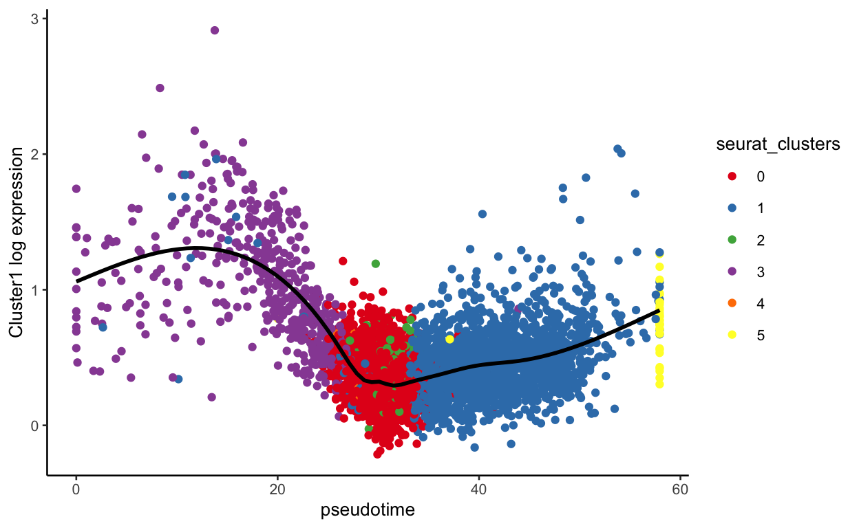
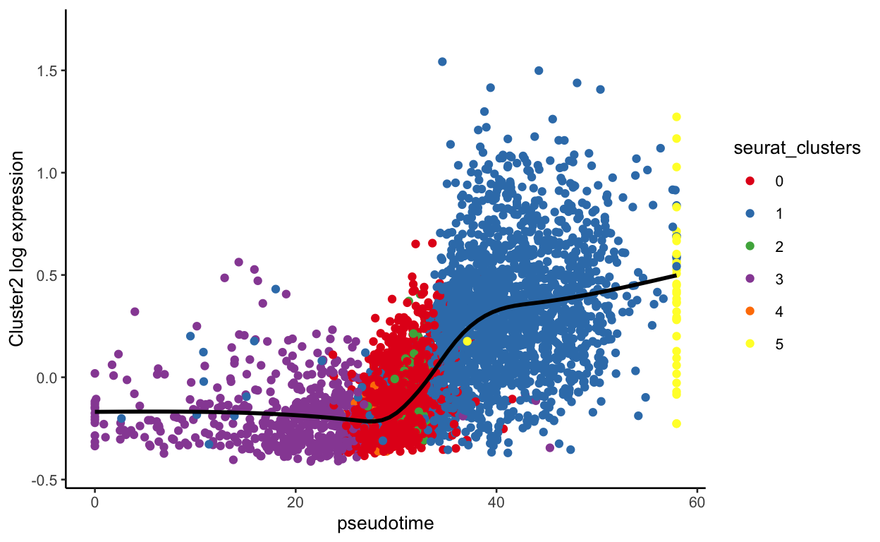
seurat_mac <- AddModuleScore(seurat_mac, features = cluster_genes)
We now have module scores for each gene list
                      orig.ident nCount_RNA nFeature_RNA
TGTGGTACAATGAAAC-1_1 NOD_4w_2734       5504         2104
TTAGGCAGTTGTTTGG-1_1 NOD_4w_2734       7174         2452
TTAGGCATCATCACCC-1_1 NOD_4w_2734       6893         2398
AAACGGGAGCTGAACG-1_1 NOD_4w_2734       1306          639
AAACGGGAGGACGAAA-1_1 NOD_4w_2734       1074          523
AAACGGGCAAGCTGAG-1_1 NOD_4w_2734       6761         2073
                                Barcode Cells Sample Batch Library
TGTGGTACAATGAAAC-1_1 TGTGGTACAATGAAAC-1   Mac NOD_4w  2734       6
TTAGGCAGTTGTTTGG-1_1 TTAGGCAGTTGTTTGG-1   Mac NOD_4w  2734       6
TTAGGCATCATCACCC-1_1 TTAGGCATCATCACCC-1   Mac NOD_4w  2734       6
AAACGGGAGCTGAACG-1_1 AAACGGGAGCTGAACG-1   Mac NOD_4w  2734       6
AAACGGGAGGACGAAA-1_1 AAACGGGAGGACGAAA-1   Mac NOD_4w  2734       6
AAACGGGCAAGCTGAG-1_1 AAACGGGCAAGCTGAG-1   Mac NOD_4w  2734       6
                     percent.mt     S.Score    G2M.Score Phase
TGTGGTACAATGAAAC-1_1   3.143169 -0.03649368 -0.004545299    G1
TTAGGCAGTTGTTTGG-1_1   2.815723 -0.11072854  0.019745783   G2M
TTAGGCATCATCACCC-1_1   3.003047 -0.01443779 -0.040919110    G1
AAACGGGAGCTGAACG-1_1   6.125574  0.08270126  0.001381862     S
AAACGGGAGGACGAAA-1_1   3.351955 -0.01197605  0.005858639   G2M
AAACGGGCAAGCTGAG-1_1   3.283538 -0.03344977 -0.067185912    G1
                     RNA_snn_res.0.4 seurat_clusters   curve1
TGTGGTACAATGAAAC-1_1               0               0 28.47263
TTAGGCAGTTGTTTGG-1_1               0               0 27.58648
TTAGGCATCATCACCC-1_1               1               1 37.36389
AAACGGGAGCTGAACG-1_1               2               2       NA
AAACGGGAGGACGAAA-1_1               2               2       NA
AAACGGGCAAGCTGAG-1_1               0               0 26.34186
                       curve2   curve3   curve4   Cluster1
TGTGGTACAATGAAAC-1_1 28.49546 28.95305 5.676088 0.33377979
TTAGGCAGTTGTTTGG-1_1 27.79235 27.71710 7.219584 0.38056921
TTAGGCATCATCACCC-1_1       NA       NA       NA 0.28216979
AAACGGGAGCTGAACG-1_1 43.01743       NA       NA 0.47671832
AAACGGGAGGACGAAA-1_1 43.83676       NA       NA 0.06774771
AAACGGGCAAGCTGAG-1_1 26.51367 26.37878 7.359532 0.56675710
                        Cluster2    Cluster3    Cluster4   Cluster5
TGTGGTACAATGAAAC-1_1 -0.23338713 -0.10060188 -0.23857820 0.41524500
TTAGGCAGTTGTTTGG-1_1 -0.23831449 -0.12499315  0.22431976 0.10885173
TTAGGCATCATCACCC-1_1  0.62293815 -0.01931329  0.04288274 0.42151581
AAACGGGAGCTGAACG-1_1  0.16418156 -0.20755213 -0.22779036 1.29609586
AAACGGGAGGACGAAA-1_1 -0.15662373 -0.06056986 -0.22113347 0.63430366
AAACGGGCAAGCTGAG-1_1 -0.01334378 -0.17748735  0.19737181 0.07542681
                        Cluster6    Cluster7    Cluster8   Cluster9
TGTGGTACAATGAAAC-1_1  0.13847398  0.03839144  0.11999734 -0.2470514
TTAGGCAGTTGTTTGG-1_1 -0.08947706  0.04199360 -0.20888382 -0.1627223
TTAGGCATCATCACCC-1_1 -0.19591516  0.05584320 -0.00663408 -0.0650443
AAACGGGAGCTGAACG-1_1 -0.46639265 -0.65554214 -0.17521994 -0.4202507
AAACGGGAGGACGAAA-1_1 -0.38300833 -0.85337909 -0.10676373 -0.1782299
AAACGGGCAAGCTGAG-1_1 -0.24384909  0.10882146 -0.17399804 -0.0341841
                     Cluster10    Cluster11   Cluster12  Cluster13
TGTGGTACAATGAAAC-1_1 0.9955797 -0.314083542 -0.48168935 -0.1045330
TTAGGCAGTTGTTTGG-1_1 0.4621835 -0.132375413 -0.26626727  0.2829529
TTAGGCATCATCACCC-1_1 0.4400951 -0.004010838 -0.56302972 -0.3860754
AAACGGGAGCTGAACG-1_1 1.4501060  0.071832631  0.04211701 -0.3410378
AAACGGGAGGACGAAA-1_1 0.6367916 -0.115808177 -0.78597350  0.5741420
AAACGGGCAAGCTGAG-1_1 0.4356141 -0.073272605  0.03863495  0.3324352
                       Cluster14  Cluster15
TGTGGTACAATGAAAC-1_1 -0.32764880 0.30151699
TTAGGCAGTTGTTTGG-1_1 -0.30099317 0.19211639
TTAGGCATCATCACCC-1_1 -0.14009347 0.04622538
AAACGGGAGCTGAACG-1_1  0.04676656 0.23903855
AAACGGGAGGACGAAA-1_1  0.57718761 0.34490931
AAACGGGCAAGCTGAG-1_1  0.47818854 0.18783371
We can plot these the same way we plotted the genes
show
plot_pseudotime(seurat_mac, pseudotime_name = "curve1", gene_name = "Cluster1",
                col_by = "seurat_clusters", color = cluster_colors)
show
plot_pseudotime(seurat_mac, pseudotime_name = "curve1", gene_name = "Cluster2",
                col_by = "seurat_clusters", color = cluster_colors)
show
plot_pseudotime(seurat_mac, pseudotime_name = "curve1", gene_name = "Cluster10",
                col_by = "seurat_clusters", color = cluster_colors)
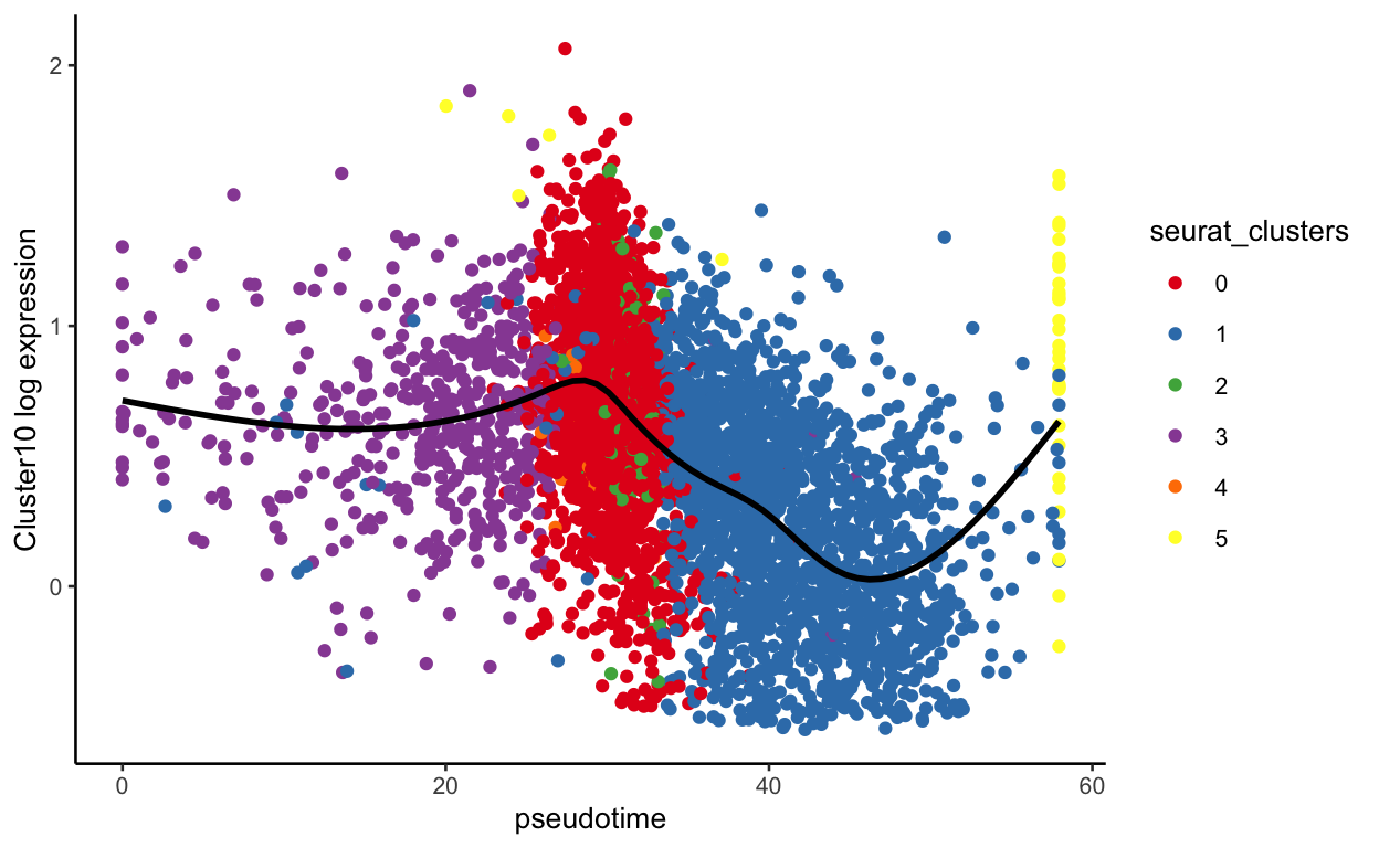
show
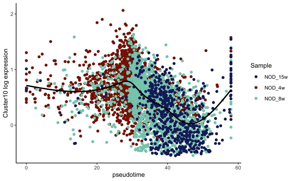
plot_pseudotime(seurat_mac, pseudotime_name = "curve1", gene_name = "Cluster10",
                col_by = "Sample", color = sample_colors)